AAChartKit
 AAChartKit copied to clipboard
📈📊🚀🚀🚀An elegant modern declarative data visualization chart framework for iOS, iPadOS and macOS. Extremely powerful, supports line, spline, area, areaspline, column, bar, pie, scatter, angular ga...
不支持macOS

pod install 之后提示: [!] The platform of the target `AAChartTest` (macOS 11.3) is not compatible with `AAChartKit (6.0.0)`, which does not support `macOS`.
Hey guys, i want to know how to set tooltip position on the top of each bar column range? Please help me, thank you!!
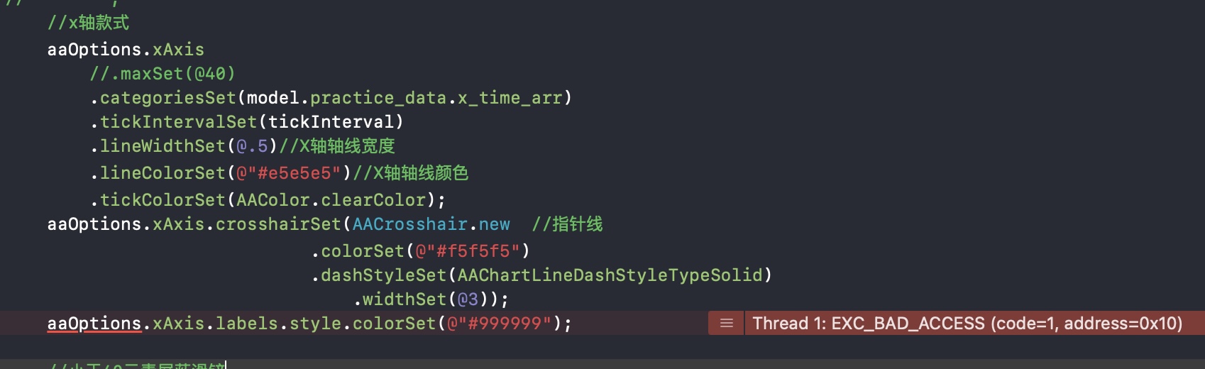 aaOptions的某些设置会返回这个错误,用pod6.0.0
关于背景色调试
使用 AAChartModel *aaChartModel = AAChartModel.new .chartTypeSet(chartType)//图表类型随机 .xAxisVisibleSet(true) .yAxisTitleSet(@"摄氏度") .backgroundColorSet(@"#FF0000") 设置颜色之后,如果滚动,还是会有部分颜色没有设置到 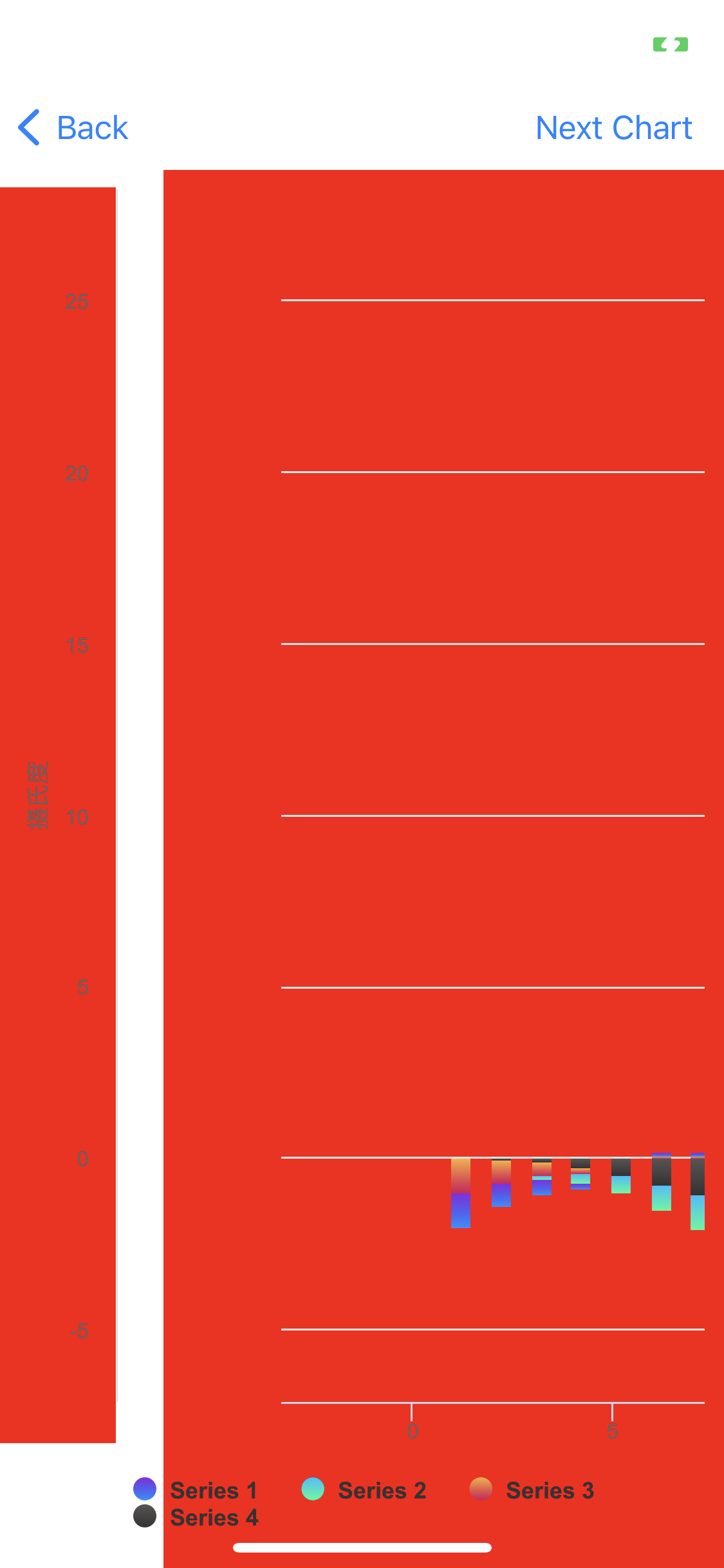
比如设置x轴data为0到11,然后让我的数据项,例如0.1,1.2,3.4等等分布在这个区间内。谢谢
dataLabels.formatter = @AAJSFunc(function (){ let length = this.points.length; for (let i = 0; i < length; i++) { let thisPoint = this.points[i]; let yValue = thisPoint.y; if (yValue != 0)...
 ru'h如何才能绘制出上图中这种标准左右对称的正态分布图呢
Is it possible to modify the maximum value of the yAxis dynamically?
 代码如下 :` AAChartModel *aaChartModel= AAChartModel.new .chartTypeSet(AAChartTypePie) .colorsThemeSet(colorArr) .titleSet(@"") .subtitleSet(@"") .tooltipEnabledSet(NO) .legendEnabledSet(NO) .dataLabelsEnabledSet(YES) .seriesSet( @[ AAObject(AASeriesElement) .nameSet(@"") .innerSizeSet(@"30%")//内部圆环半径大小占比 .sizeSet(@130)//尺寸大小 .lineWidthSet(@1) .borderWidthSet(@0)//描边的宽度 .allowPointSelectSet(NO)//是否允许在点击数据点标记(扇形图点击选中的块发生位移) // .statesSet(@{@"hover":@{@"enabled": @(NO)}})//禁用点击区块之后出现的半透明遮罩层 (先定义bool变量的原因是,直接用true,false,处理完成之后容易变成0或者1。https://www.cnblogs.com/haojuncong/p/4652998.html ) .dataSet(titleArray) .dataLabelsSet((AAObject(AADataLabels) .enabledSet(YES)...
Metadata
Owner
Metadata
📈📊🚀🚀🚀An elegant modern declarative data visualization chart framework for iOS, iPadOS and macOS. Extremely powerful, supports line, spline, area, areaspline, column, bar, pie, scatter, angular ga...