AAChartKit
 AAChartKit copied to clipboard
📈📊🚀🚀🚀An elegant modern declarative data visualization chart framework for iOS, iPadOS and macOS. Extremely powerful, supports line, spline, area, areaspline, column, bar, pie, scatter, angular ga...

I need to change different aligns for categories to get this effect, by edges it will be right and left align, others it center I have code like this, but...
图例的同一个文本可以设置为不同的颜色吗 
https://www.highcharts.com.cn/demo/highcharts/heatmap/sand-signika 官方效果图我看是有的,请问大佬支不支持这种 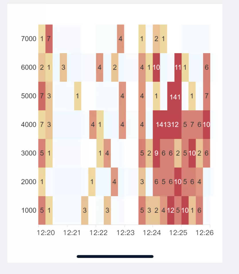

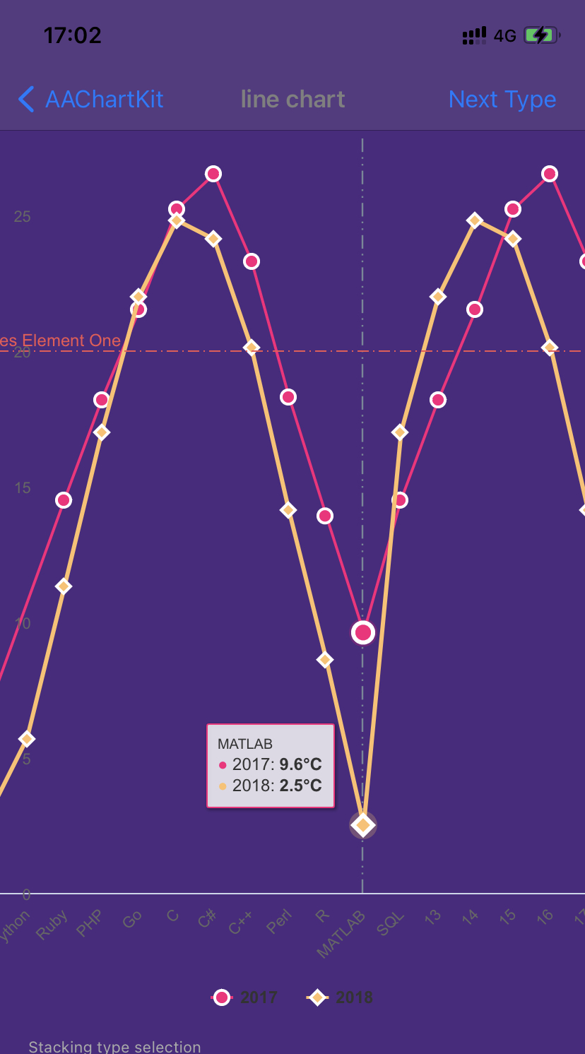
我使用的折线填充图,设置了lineWidth,但是显示出来确粗细不一(如图) 有的可能一开始是ok的,但是滑动后,粗细也会变。 设置的代码如下:
如何实现在x的数据滚动时,y轴的数据也跟着滚动,类似这种图表,在滑动x轴时,y轴的数据随着x轴的数据进行滚动,图如下: 
是什么原因呢? 像官网例子这样 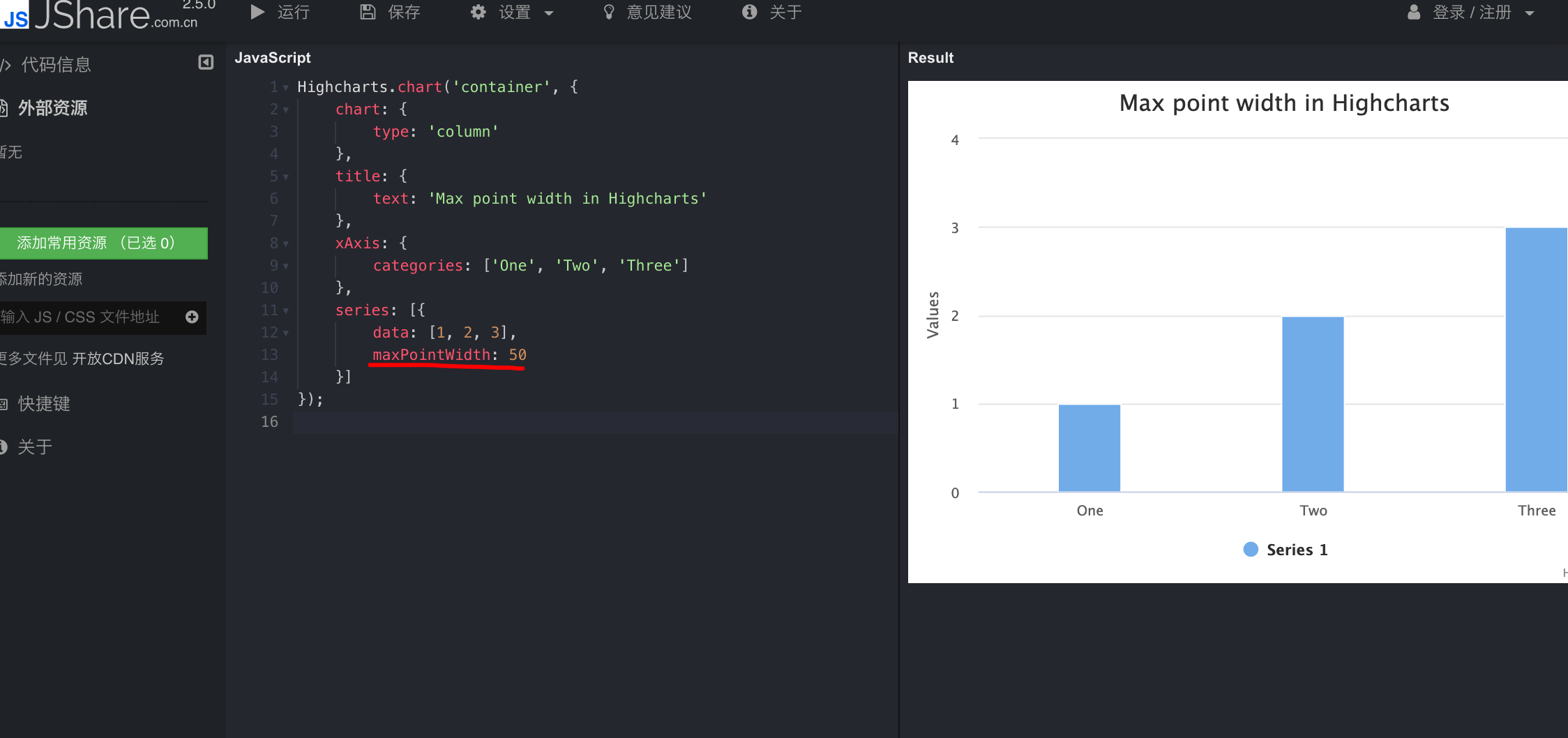
Metadata
Owner
Metadata
📈📊🚀🚀🚀An elegant modern declarative data visualization chart framework for iOS, iPadOS and macOS. Extremely powerful, supports line, spline, area, areaspline, column, bar, pie, scatter, angular ga...