Witt Witsan
Witt Witsan
**Proposed design for language navigation** - dropdown at the bottom of left sidebar 
**Proposed design for WordPress Version single page (Desktop)** - Sidebar navigation for HelpHub (match DevHub and overall wp.org Meta) - Add breadcrumb - The right sidebar should be more selective...
Screenshots  Current design patterns from the site. 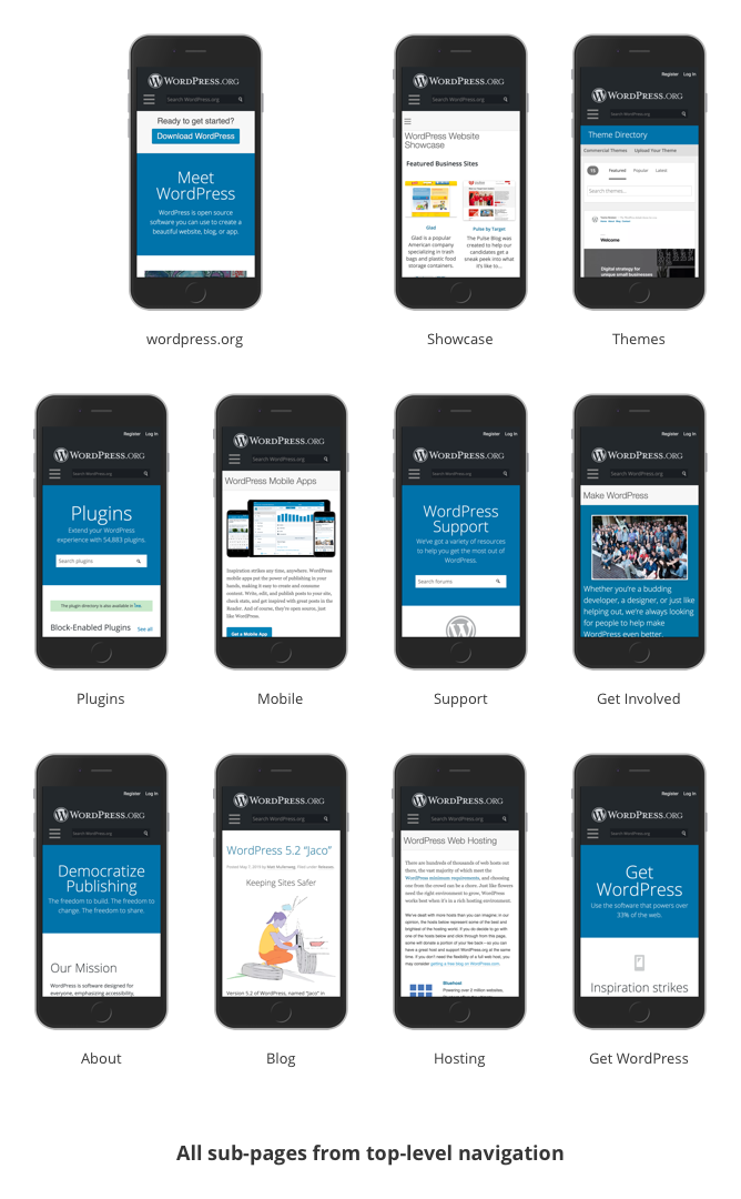
I agree that the search box in the blue prominent area should cover more than just forums. This will be the same "above the fold" approach as the Plugins page.
I did a mockup for Themes page, adding more container for auto-updates before theme-id-container. 
This is a solution that I'm thinking of for the auto-update status indicators.  There is a design exploration in Gutenberg for using the blue dot as an indicator. (https://github.com/WordPress/gutenberg/issues/19909)...
From the UX point of view, I agree to delay the updates to 1-2s. (https://www.nngroup.com/articles/response-times-3-important-limits/)
There is an audit /wp-admin ticket [#49616](https://core.trac.wordpress.org/ticket/49616) about sentence-case UI elements.