pv4
pv4
... or something closer to this (looks terrible by itself, but shows the idea of connecting legs to hands): 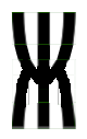
@be5invis The total width (top and bottom) is still smaller in curly variant than in symmetric-connected one. Can you fix this too? 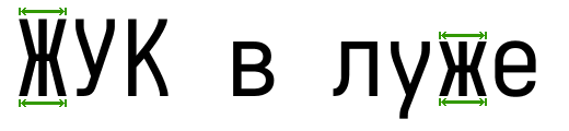
@be5invis Now it's IDEAL. Thanks!
> a programming font won't need to support these Excuse me for interrupting, but I think Iosevka is too good now to be just a "programming" font. It is far...
@dieggsy I absolutely agree with what you say. Creator is always the person who knows what is better for his product. I just wanted to point that Iosevka has overgrown...
> The Mononoki font has a “half-serif” capital `D` and `B` letters @be5invis , this looks like motion-serif variants for `D` and `B`.
I have the same issue. Any progress on this? This doesn't look like a hard-to-fix issue.