Style Documentation pages
Need to make some adjustments/add some CSS to the content in the documentation pages like https://sonarwhal.com/docs/developer-guide/events/list-of-events.html
All the bullets for list items make the page look cluttered. Also the subcontent of each 'event' could use some clearer hierarchy created through Typography and spacing.
-
[x] Style List items at top of the page
-
[x] Dev Guide: Style event content: the 'When?' and 'Remarks'
-
[x] Dev Guide: remove bullets from event content
-
[ ] Add next/previous buttons as secondary navigation through documentation (see comps)
-
[ ] Research UI patterns for Table of Contents
Will probably add more here as the pages are filled with content.
@ststimac are you working on this now? If not we can move it to after the summit.
Different documentation page screenshots:
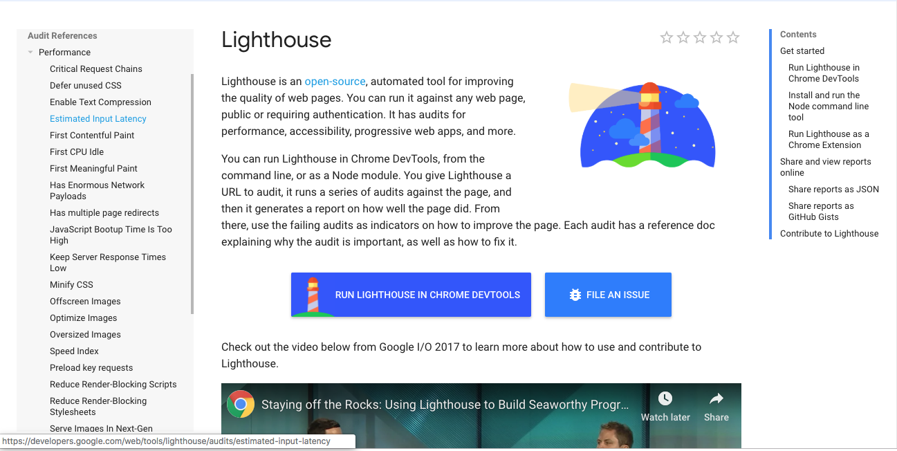
Lighthouse
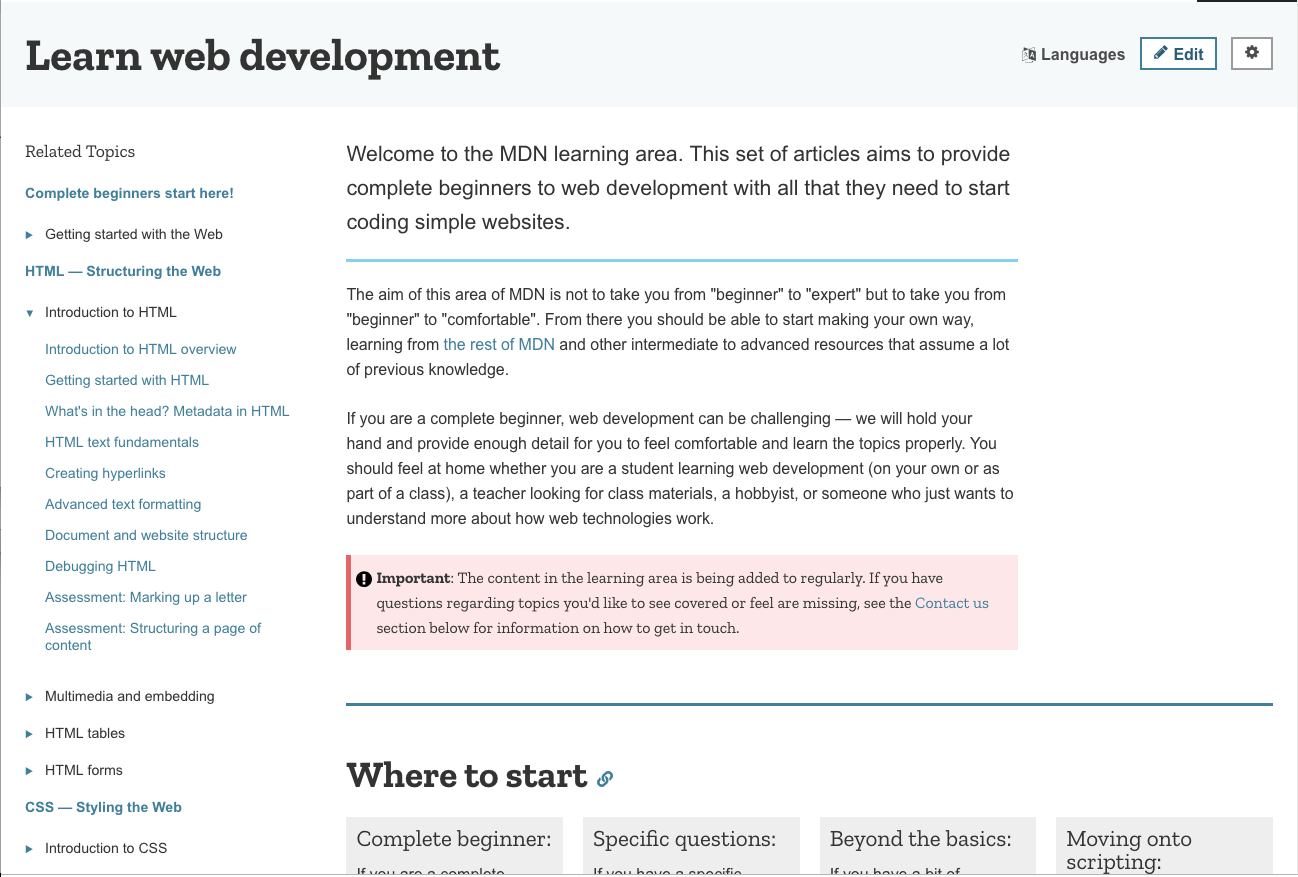
Mozilla
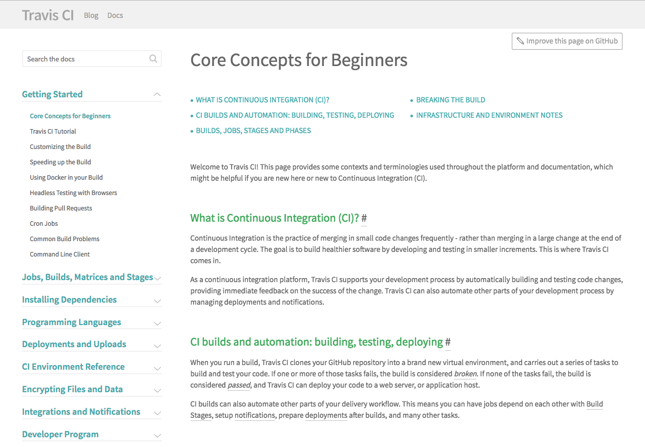
Travis
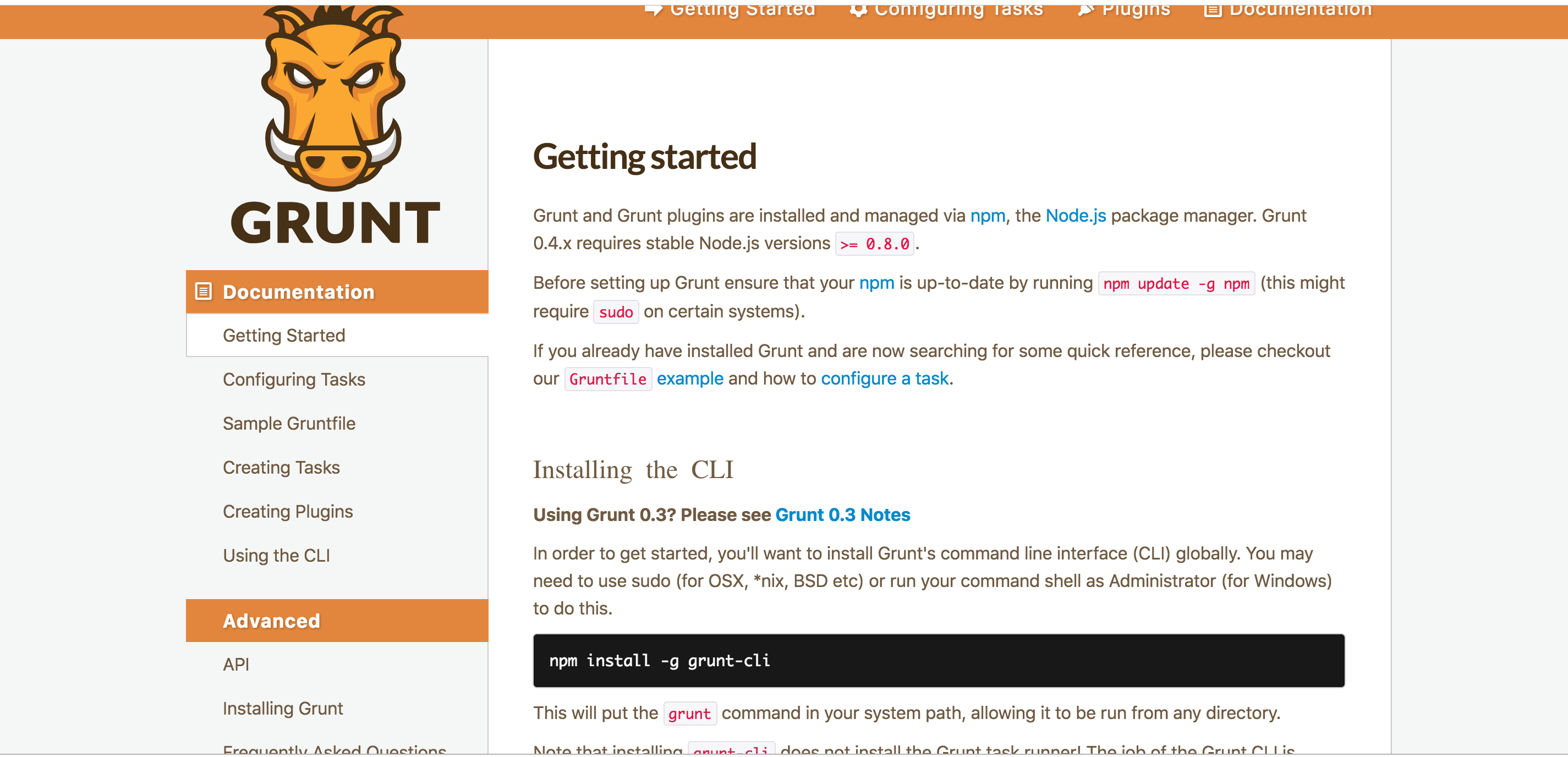
Grunt
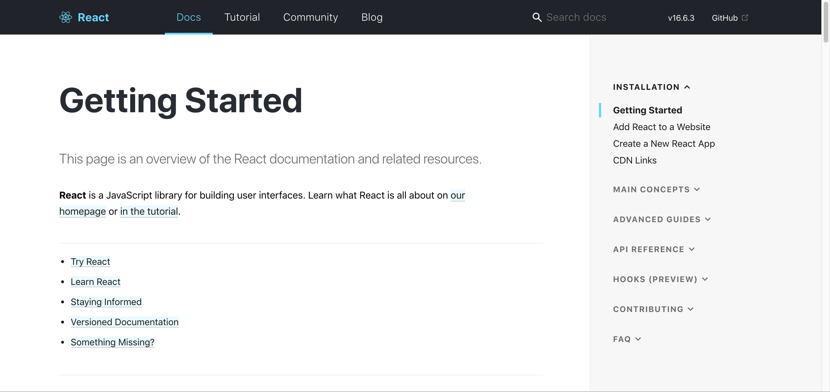
React
webpack

Lighthouse, React and webpack all share a feature that I think would work well for our documentation table of contents UI. They're separate from the main content in terms of scrolling so when you're scrolling down the rest of the page, you don't lose your location or have to scroll back up. We have so many pages of documentation I think this would be helpful. The sites with less documentation don't have two separate panes that scroll.
Then adding something similar to what was explored before with a "in this article" mini sidebar on the right like this:

That stays with you while you scroll.
Also just assessing how the documentation is currently laid out, we could move the page headings over the actual main content body and have the top of the text align with the table of contents.
I think the next step is working on a mockup. I can start with a low fidelity one but for processes' sake, I'd like to build a mockup in Figma since that's what a lot of the design team uses.
@antross @molant not sure how this gets tracked since the research bit was one of a subset of issues. Unless there's additional questions for just the research sub-task, that can be marked as completed.
Great! @antross can you please sync with Stephanie and explain how to track the time spent in this task?
Thank you!
From: Stephanie [email protected] Sent: Wednesday, December 12, 2018 15:16 To: webhintio/webhint.io Cc: Antón Molleda; Mention Subject: Re: [webhintio/webhint.io] Style Documentation pages (#52)
Different documentation page screenshots:
Lighthouse [screen shot 2018-12-11 at 10 21 52 am]https://user-images.githubusercontent.com/18073131/49900775-61e50480-fe14-11e8-9979-4de9250a8f86.png
Mozilla [screen shot 2018-12-11 at 10 23 16 am]https://user-images.githubusercontent.com/18073131/49900777-61e50480-fe14-11e8-8a7a-946f7a8efa79.png
Travis [screen shot 2018-12-11 at 10 24 57 am]https://user-images.githubusercontent.com/18073131/49900778-61e50480-fe14-11e8-8616-eb417074b612.png
Grunt [screen shot 2018-12-12 at 1 12 50 pm]https://user-images.githubusercontent.com/18073131/49900779-61e50480-fe14-11e8-8ee4-ae31fb8e2ff5.png
React [screen shot 2018-12-12 at 1 21 42 pm]https://user-images.githubusercontent.com/18073131/49900781-61e50480-fe14-11e8-9eda-e8929483a6f3.png
webpack [screen shot 2018-12-12 at 1 30 26 pm]https://user-images.githubusercontent.com/18073131/49900782-61e50480-fe14-11e8-9144-f9d5f271cda8.png
Lighthouse, React and webpack all share a feature that I think would work well for our documentation table of contents UI. They're separate from the main content in terms of scrolling so when you're scrolling down the rest of the page, you don't lose your location or have to scroll back up. We have so many pages of documentation I think this would be helpful. The sites with less documentation don't have two separate panes that scroll.
Then adding something similar to what was explored before with a "in this article" mini sidebar on the right like this:
[screen shot 2018-12-12 at 1 51 33 pm]https://user-images.githubusercontent.com/18073131/49904497-361b4c00-fe1f-11e8-8d20-3918ebc21ed4.png
That stays with you while you scroll.
Also just assessing how the documentation is currently laid out, we could move the page headings over the actual main content body and have the top of the text align with the table of contents.
I think the next step is working on a mockup. I can start with a low fidelity one but for processes' sake, I'd like to build a mockup in Figma since that's what a lot of the design team uses.
@antrosshttps://github.com/antross @molanthttps://github.com/molant not sure how this gets tracked since the research bit was one of a subset of issues. Unless there's additional questions for just the research sub-task, that can be marked as completed.
— You are receiving this because you were mentioned. Reply to this email directly, view it on GitHubhttps://github.com/webhintio/webhint.io/issues/52#issuecomment-446780725, or mute the threadhttps://github.com/notifications/unsubscribe-auth/AAlBgsckpZoJ1b5gHmv23XO4WkrfTzUSks5u4Y5agaJpZM4Nbb9x.