that icon!
folks -- I love Wallabag. I pay for app.wallabag.it. But that Chrome toolbar icon is hideous and somewhat inappropriate. Can we change it, please? I am happy to design another based on the kangaroo figure and generate the files if that's acceptable.
thanks!
I think we should make an option, smth like "icon theme" to choose icon from several variants
I disagree with the idea to let users changing the icon. We should avoid making code that is not necessary. I like the KISS principle. We don't want to deal with spaghetti code. We should do a vote for our users to choose the right icon and close this topic once and for all (or a long period at least :D). What do you think about this @nicosomb @j0k3r @tcitworld ?
Why it is going to be a spaghetti code? icon name will be stored in options and set by api.
You'll add extra code for such a minor functionality. Plus, I think a single icon is important for branding.
We can provide a different icon set if it’s only related to changing color or really minor update.
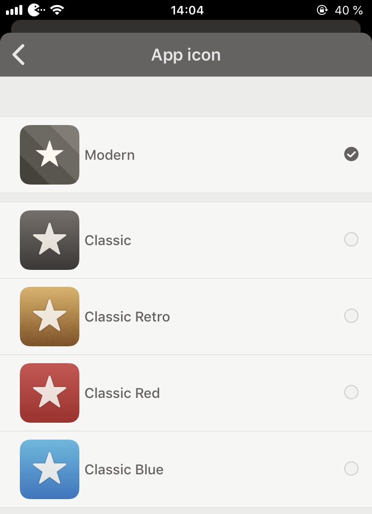
For example Reeder on iOS:
Meanwhile I think the icon should be more in relation with the real wallabag logo instead that W (my personal though).
I think the icon should be more in relation with the real wallabag logo instead that W
I'd agree with that. It does look a little out of place.