 vtex
vtex
Review shadows
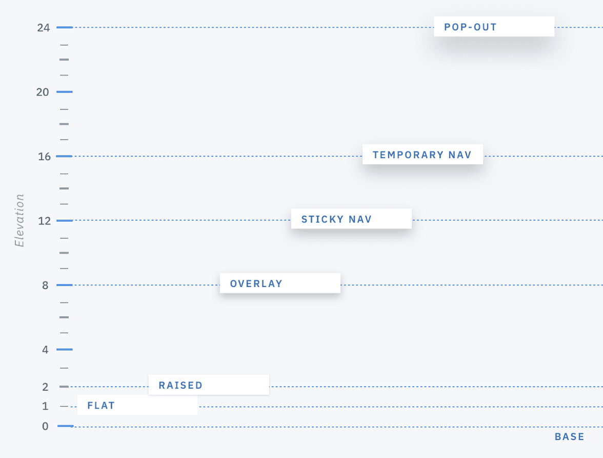
Our shadows are currently kinda ugly, and differ completely from the shadows being used by the designers on Figma. Moreover, the there are only two shadows being used on Figma (according to @cmdalbem), whereas our Tachyons scale contains 5 shadows.
Did a quick benchmark here to see how other big Design Systems are handling it and if they're exposing shadow styles to the public.
Polaris (Shopify)
Nothing.
Atlassian
Nothing.
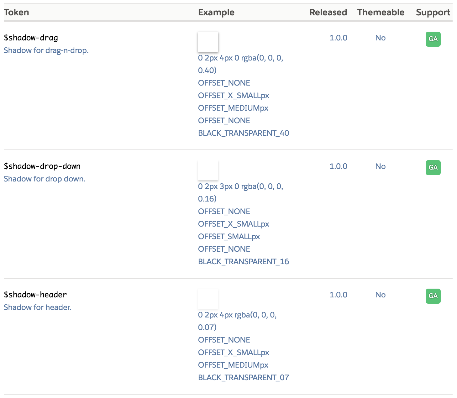
Carbon (IBM)
They have a scale for depth, similar to the famous Material one, but not much guiding on how and when to use each of them.
 https://www.carbondesignsystem.com/guidelines/layer/overview
Lightning (Salesforce)
Under their Design Tokens documentation they expose 3 shadow styles.
 https://www.lightningdesignsystem.com/design-tokens/#category-shadow
Pluralsight
Nothing.
Quickbooks
Nothing.
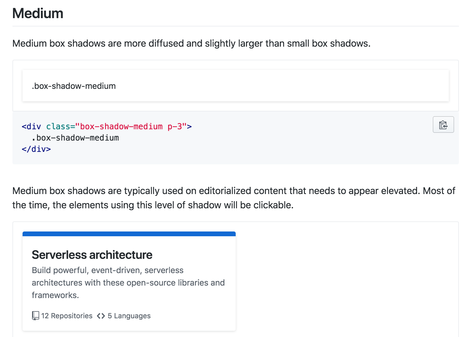
Primer (GitHub)
⭐This was my personal favorite here
There are 4 levels of shadow, with some nice principles on how and when to use each.
https://styleguide.github.com/primer/utilities/box-shadow/