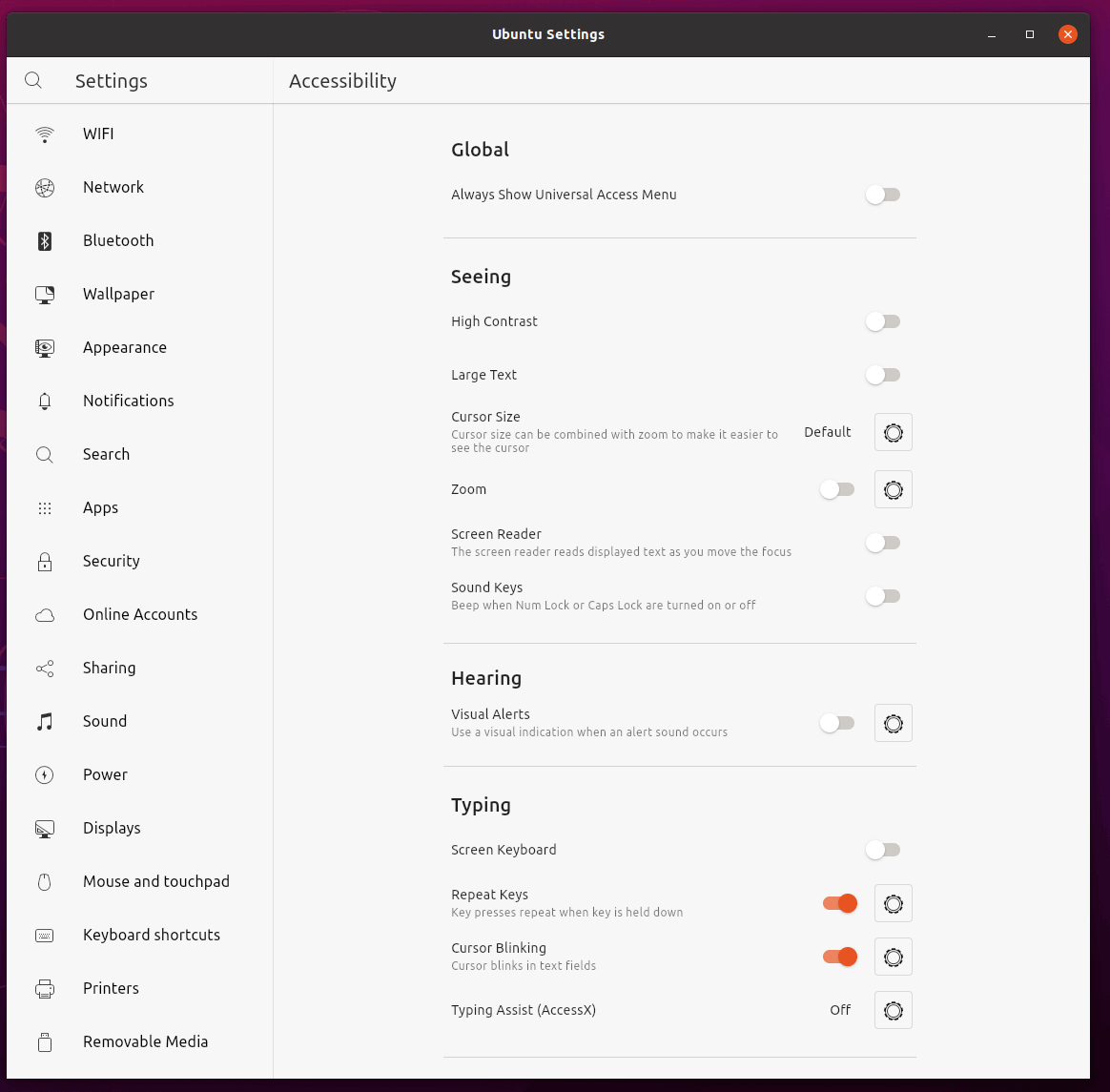
Idea/discussion: less boxes
Some pages have a lot of boxes/lines. I know this helps group and frame the controls together, but it also makes the UI look a bit cluttered IMHO. I wonder if just something like this could work. WDYT?
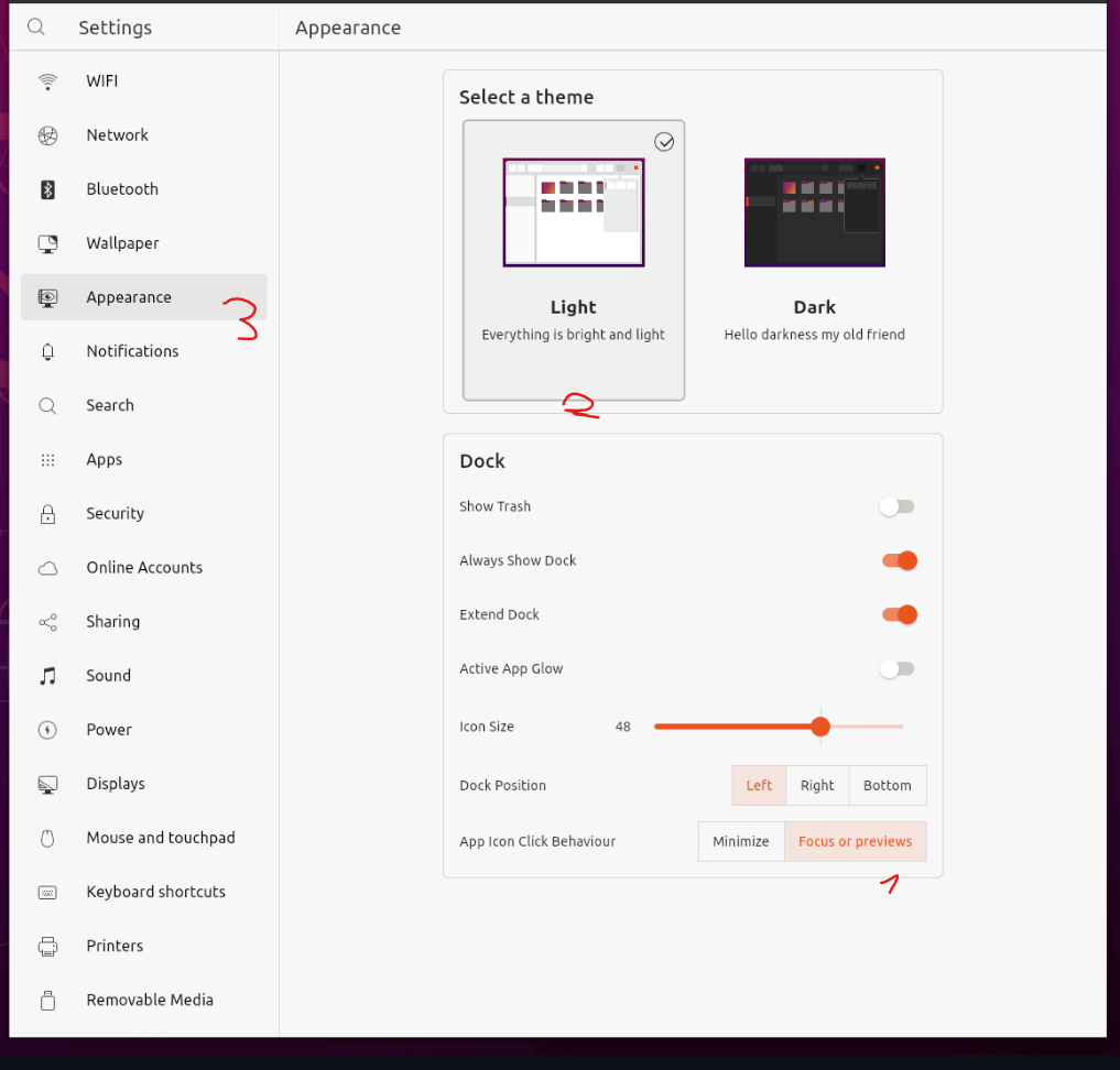
Another example, same idea...

I am not sure But I agree that the optioncard boxes inside the settingssection looks weird.
optioncard boxes inside the settingssection looks weird
Exactly!
I am not sure
I am not sure either 😄
also we have three different versions of selecting stuff
 I would just go back to the normal list tile look honestly (like the toggle buttons). everything looks a bit mixed up at the moment
I still think this idea is worth exploring. However I am torn and I know that I am not neutral to this anymore because I've stared on the YaruSections for so long and like it. Maybe we should show this idea to someone who never saw this app before and ask him/her which version makes it easiert to focus individual sections. Als I've added the option to use YaruSections without a headline which is very useful for some cases (security page, date and time page). I am not sure if those simple separators would be enough then. Also I don't know if maybe mixing the two "container" stylings would work