"Run" button position
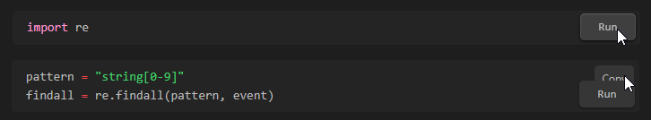
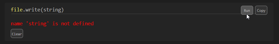
Please add position of the "Run" button into the settings. In case of short (one or two-line) snippet/code it overlays the "Copy" button:
I see, thank you for reporting this.
I can think of a few options for the positioning. Which one of these do you think is the best for you?
- below the code block (inside code block)
 -below the code block (outside code block)
- to the right of the code block (as an icon) -- might misbehave with themes that have minimal page margin

- Another option-- please feel free to propose something! :)
I'm not sure if we'll change the default behaviour, but it's always good to offer other choices. Thank you! :)
Hi, I tried your options 1 and 2 by custom CSS just after I send this issue and I was not happy with the result :-)
I like the third option - the "play" icon but maybe place it at the left (before the code block).
My proposals are there. I think that the first one is most "easy to do", the second one looks nice but it can break the design. The third one is good because you can put the position in the settings (left top, left bottom, ...) but it looks different and may make users upset :-) On the other hand, the third option can be always displayed (not just by hovering).

As you wrote - the default option should be still available because a lot of users can be familiar/happy with this. Maybe not many users use one-line snippets. I have some powershells scripts for automating my daily tasks so I have some of them.
Thanks for your proposals!
I worry that the first one would hide the code. Maybe that's not as much of an issue if it's only visible on hover?
The second one would be a good match with the running indicator!
I think that the third option's positioning versatility is good, but I agree that users might dislike it because of the styling. We should also worry about accessibility -- to me, at least, they don't appear to be buttons, and that's very important to keep consistency across themes (i.e. we should be able to use the theme's "button" style)
I just realized that we could also make an option to allow double-clicking on the box itself to run, rather than a visible button. What do you think?
I thought about this too but I don't think it's a good idea. You can accidentally double-click and in that case, it would be unexpected behavior.
I would prefer something like rust by example site
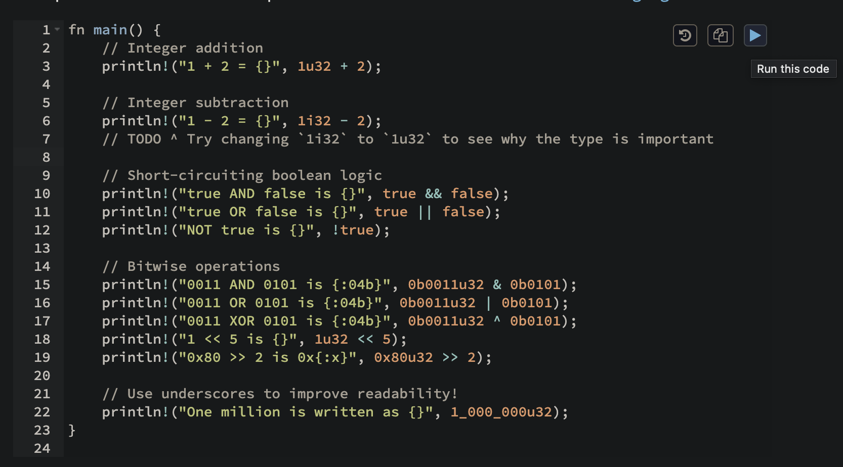
Can take a look here: https://doc.rust-lang.org/stable/rust-by-example/primitives/literals.html#literals-and-operators
I would prefer something like rust ...
I agree but this will change also the default behavior and design of Obsidian's copy button.
I made a temporary solution with custom CSS for myself. It's ugly (I am too lazy to solve all CSS issues so I override them by "!important") but I can live with it :-)
button.run-code-button, button.copy-code-button, button.clear-button {
    border:1px solid #888;
    box-shadow: none !important;
    background: #333 !important;
    margin:0 !important;
    padding:0 !important;
    width:32px !important;
    height:24px !important;
    line-height: 24px;
    font-size:0.6em !important;
    text-align: center;
    position: absolute !important;

}
button.run-code-button, button.copy-code-button {
    top: 8px !important;
}
button.copy-code-button {right:16px !important;}
button.run-code-button {right:53px !important;}
button.clear-button {
    position: absolute !important;
    left: 16px !important;
    bottom: 8px !important;
}

button.run-code-button:hover, button.copy-code-button:hover, button.clear-button:hover {
    background:#555 !important;
}
I agree but this will change also the default behavior and design of Obsidian's copy button.
That's true-- we can always make it available as an option, but maybe not a recommended one?
I agree but this will change also the default behavior and design of Obsidian's copy button.
would changing the default copy be a bad thing? default copy overlaps with code sometimes. which is not ideal for readability. If the copy button had a solid background if would already be cleaner, even if it still overlapped.
e.g. when hoverring the copy button, it's cleaner

I discovered that some other extensions also change the default copy button style so it can be messy in general :-)
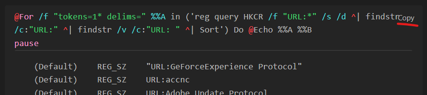
Is there a way to try out the "play" button icon (instead of Run button) right now using a fork or editing the CSS? I have the same problem of lots of little 1-liners in my notes that I try to copy but the "Run" button from this extension is overlapping/blocking it... 🙏
Hi @luckman212, I update my CSS snippet for replacing the "Run" text with "play" icon:
button.run-code-button, button.copy-code-button, button.clear-button {
    border:1px solid #888;
    box-shadow: none !important;
    background: #333 !important;
    margin:0 !important;
    padding:0 !important;
    width:32px !important;
    height:24px !important;
    line-height: 24px;
    font-size:0.6em !important;
    text-align: center;
    position: absolute !important;

}
button.run-code-button, button.copy-code-button {
    top: 8px !important;
}
button.copy-code-button {right:16px !important;}
button.run-code-button {right:53px !important;}
button.clear-button {
    position: absolute !important;
    left: 16px !important;
    bottom: 8px !important;
}

button.run-code-button:hover, button.copy-code-button:hover, button.clear-button:hover {
    background:#555 !important;
}
/* Play icon */
button.run-code-button {
    width:32px;
    overflow:hidden;
    font-size: 0 !important;
}
button.run-code-button::before {
    content: '\25B6';
    font-size: 16px;
    position: absolute;
    top: 50%;
    left: 50%;
    transform: translate(-50%, -50%); /* Center the icon */
}
This is how it looks:
How to "install":
At the bottom of Settings > Appearance you can find a "CSS snippets" section - click on the folder button (open snippets folder) on the right side and place the CSS file with this content in the folder that was opened. You can change CSS properties to match your theme/preferences (color, size, ...). You can ask ChatGPT to change the CSS as well :-)