 system-ui
style-guide: ColorPalette doesn't show color labels
Describe the bug The ColorPalette component from the style-guide package is not showing labels for my colors like in the style-guide docs
To Reproduce Steps to reproduce the behavior:
- Create a react project
- Add theme-ui and create a theme
- Make a page that uses the
ColorPalettecomponent - See the colors, but no labels below them. On hover, see the label
undefined
Note: This might not be all the steps required to reproduce the issue. I will attempt to create a minimal reproduction of the issue and update the issue later.
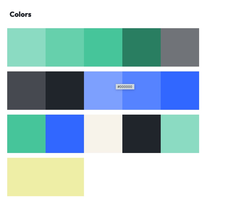
Expected behavior I would expect to see the name of the colors (the key in the theme file) below the colored squares, as seen in the style-guide docs.
Screenshots
 As we can see in the screenshots, there is space below the swatches where the label should be. I believe the label ends up being
 undefined for some reaason or other.
Additional context See the theme page where the issue is seen. See also the github repository with the source code.
Here's the source code where the color palette is declared:
          <Card>
            <Heading>Colors</Heading>
            <ColorPalette
              omit={[
                'modes',
                'placeholder',
                'twitter',
                'instagram',
                'facebook',
              ]}
            />
          </Card>
I've tried playing around with the colors object in the theme file with no effect, so I don't think it is relevant to the issue.
Are the docs using an unreleased version of the package, perhaps?
I've tried writing my own render method but I'm just getting #000000 on hover instead
            <ColorPalette
              omit={[
                'modes',
                'placeholder',
                'twitter',
                'instagram',
                'facebook',
              ]}
              render={value => {
                const { name, color, key, swatch } = value;
                return (
                  <>
                    <ColorSwatch
                      name={name}
                      color={color}
                      key={key}
                      size={'8rem'}
                      label={true}
                    />
                  </>
                );
              }}
            />
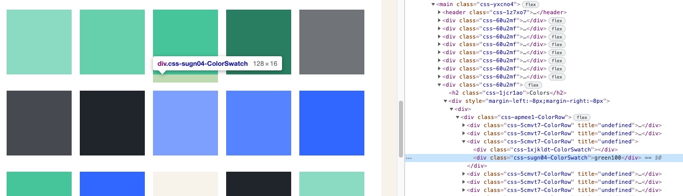
Interestingly, there is a div element there containing the correct label, but it's not being rendered as text by the browser.
In this example theme, the labels work correctly. The reproduction of the issue lies in the difference between how these two projects are set up.
Some differences
- The Indiv theme uses an older version of Theme UI.
-
makeThemefrom@theme-ui/css/utilsis used in Bjerk brand (the theme where the issue apprears).
Interesting, thanks for the report! I suspect this is an issue with configuration & not with the library, as https://theme.hackclub.com/ & our site, which both use the published package versions, show the labels. I'll need to spend some time looking into this.
I've managed to find a clue: The fontSize of the text is 0 when inspecting in chrome. If I change that to something else the labels show up correctly.
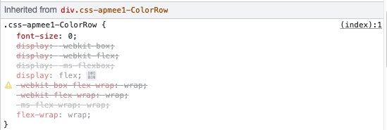
Perhaps we want to change the current behaviour, so that if you have a fontSizes array that starts with the value 0 you can still see the labels.
One approach would be to have the color swatch labels use the same fontSize as normal <p> or <span> elements, I suppose?
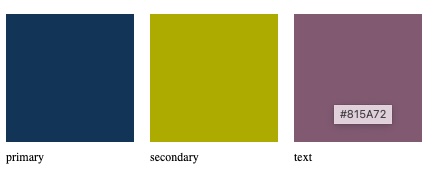
I'm working on setting up some unit testing in style-guide, and my test outputs this:
Here's the source code:
/** @jsx jsx */
import { renderToString } from 'react-dom/server'
import { ColorPalette } from '../src/ColorPalette'
import { jsx } from 'theme-ui'
import { ThemeProvider } from '@theme-ui/core'

test('ColorPalette renders correctly', () => {
  expect(
    renderToString(
      <ThemeProvider
        theme={{
          colors: { primary: '#123456', secondary: '#acab00', text: '#815a72' },
        }}
      >
        <ColorPalette />
      </ThemeProvider>
    )
  ).toMatchSnapshot()
})
So this test is unable to reproduce the behaviour. I'll have to look into this further.
I have still not managed to pinpoint why this goes wrong, but I have found a fix that works. If I use getColor from @theme-ui/color instead of get from theme-ui to get the colors inside the ColorSwatch component, the titles are defined correctly.
I made these changes in the javascript dist files in the bjerkio/brand project:
node_modules/@theme-ui/style-guide/dist/theme-ui-style-guide.cjs.dev.js (and a couple of other similarly named files)
// add import
var themeUiColor = require('@theme-ui/color')

// the relevant part of the code I have modified
const ColorSwatch = ({
  color,
  name,
  size = 128,
  label = true,
  ...props
}) => {
  // this is how it was before
  // const {
  //   colors
  // } = useTheme();
  // const value = themeUi.get(colors, color);

  // here is my fix
  const theme = useTheme();
  const value = themeUiColor.getColor(theme, color);

  return themeUi.jsx("div", _extends({}, props, {
    title: `${toHex(value)}`
  }), themeUi.jsx("div", {
    sx: {
      width: size,
      height: size,
      bg: color
    }
  }), label && themeUi.jsx("div", {
    sx: {
      py: 2
    }
  }, name || color));
};
Here is what the changes would look like if added to the style-guide tsx source code:
packages/style-guide/src/ColorSwatch.tsx
line 20, replace
  const { colors } = useTheme()!
  const value = get(colors!, color)
with:
  const theme = useTheme()!
  const value = getColor(theme, color)
(and add import { getColor } from '../../color/src')
I'm not sure of the implications of adding this dependency. Is this problematic?
Anyway, I hope this info could be useful in finding the bug, at least.
Are there any maintainers who could comment on whether adding the import (import { getColor } from '../../color/src') to ColorSwatch.tsx is okay or not?
Would the style-guide still work if the user hasn't installed the @theme-ui/colors package?
@braaar TBH I'm not sure if it would build at all if you mean the deep import ../../color. I see no reason not to import { getColor } from '@theme-ui/color' though.
In that case I suppose I could write a PR with the fix I described?
Or should we rather take this opportunity to investigate why exactly get() fails when getColor() succeeds?
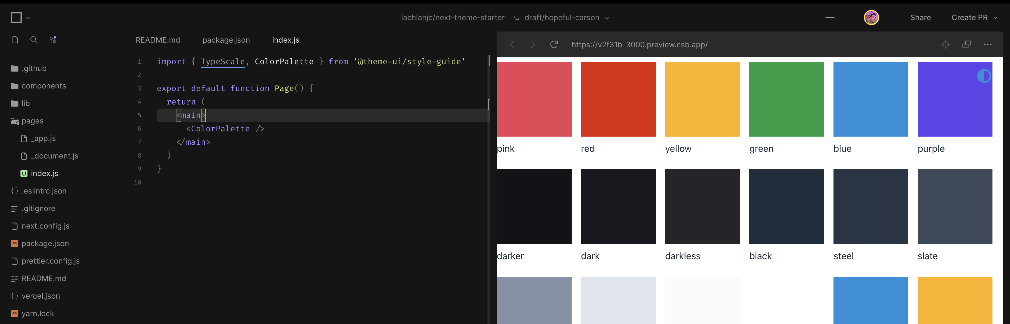
I just set up my next-theme-starter & used the ColorPalette component; everything's working as expected: https://v2f31b-3000.preview.csb.app/
Did we figure out if there's a widespread issue here? Or can we close this issue?
This issue contains two different problems, one of which has been fixed. The other problem that is still unsolved is that when you hoved the color swatches, you see undefined, rather than the hex color value of that color.
I made a PR for this just now.