website

website copied to clipboard
Update and restyle subscribe buttons
Hi @wesbos and @stolinski,
Long time listener, first time contributor.
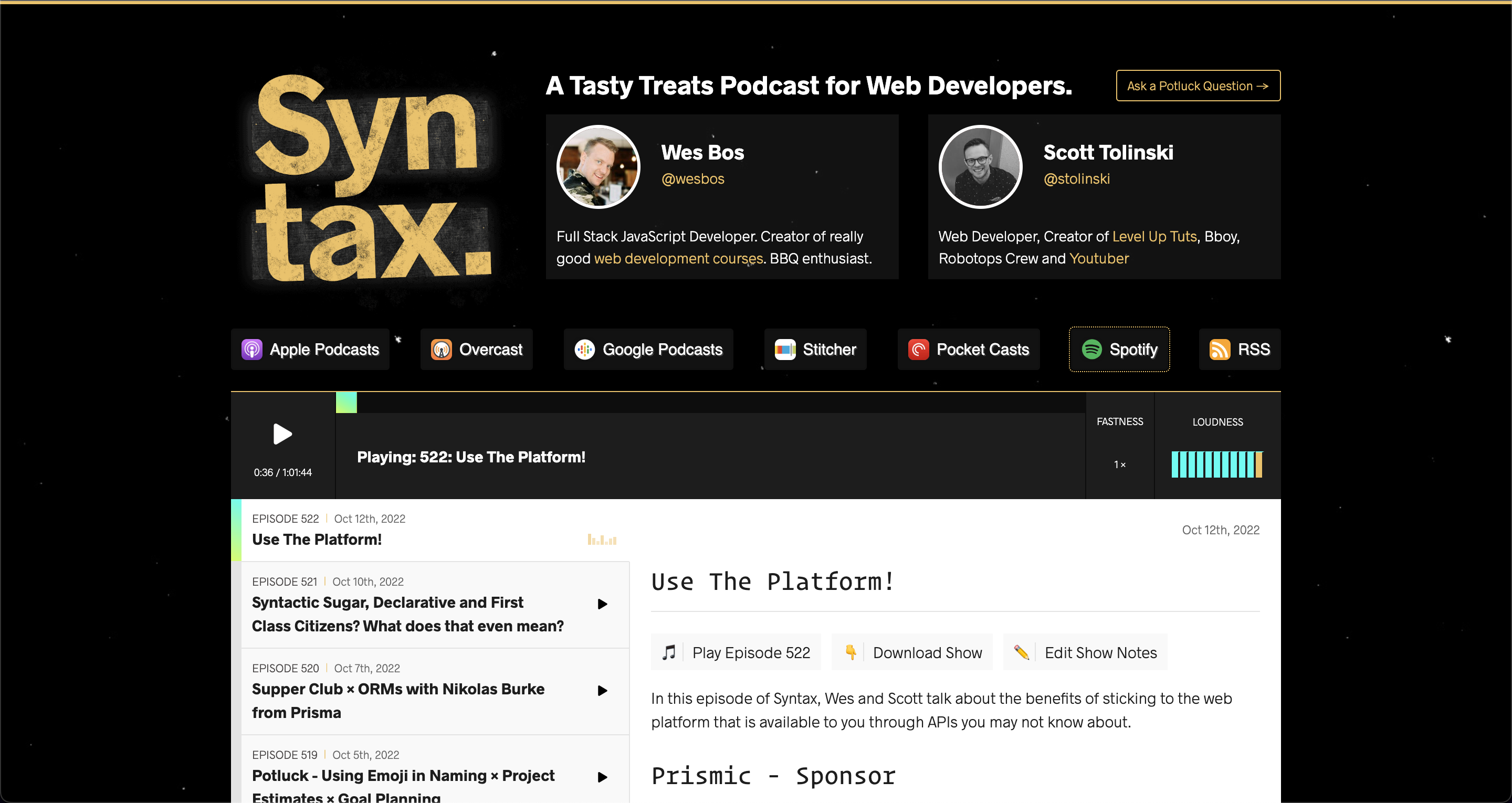
Not sure how attached you are to the existing subscribe buttons, but I found that the logos blend into the button backgrounds a bit too much and that the labels are a bit hard to read. So this PR is a proposed simple redesign which IMO looks a bit cleaner and fits in well with the rest of the site :)
It also corrects Google Podcast > Google Podcasts & PocketCasts -> Pocket Casts and closes #790.
PS: A side effect of doing this was that the focus outline is now visible when you navigate by hitting tab.
The latest updates on your projects. Learn more about Vercel for Git ↗︎
| Name | Status | Preview | Updated |
|---|---|---|---|
| syntax | ✅ Ready (Inspect) | Visit Preview | Oct 14, 2022 at 0:34AM (UTC) |