Unexpected display with LogarithmicAxis, SplineAreaSeries (SfCartesianChart)
I am comparing SplineAreaSeries (red curve), AreaSeries (green curve), and ScatterSeries (orange dots), in SfCartesianChart with parameter primaryYAxis: LogarithmicAxis().
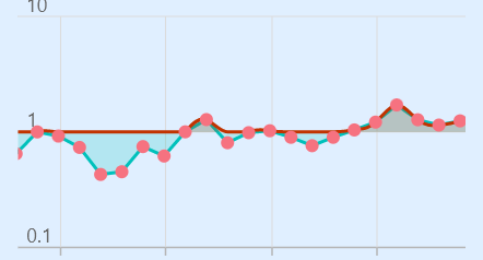
The redering of SplineAreaSeries seems to behave unexpectedly as it does not reder data below 1 properly.
Version: 20.1.57
When using SplineAreaSeries with LogarithmicAxis I get this Exception (not with any other combinations of series type / axis type -- NumericAxis works well):
════════ Exception caught by rendering library ═════════════════════════════════ Null check operator used on a null value
Hi @benjamingaudin ,
We tried to replicate the scenario which you have mentioned but it wasn’t reproduced on our end. We have provided the sample which we have used in the testing phase. It would be helpful if you reproduce your issue on that sample and revert us with it.
Sample: spline_with_logarithmic.zip
Thanks, Marismathan G
Hi,
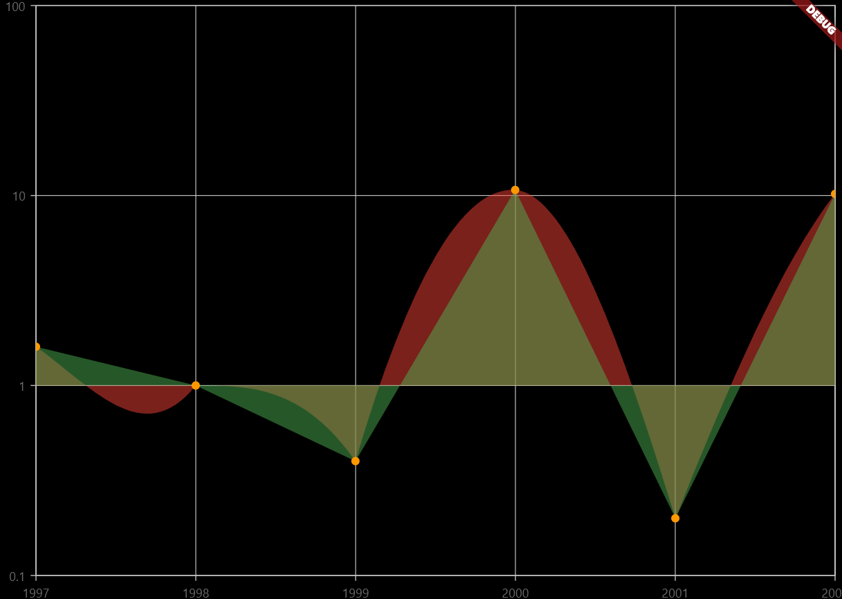
thank you for your quick response. I am getting this image with your sample. Note the odd tooltip display, the data shown does not match the value.
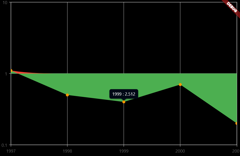
I changed the data a bit and made the color transparent. The spline does not go below 1, and the values in the tooltips are not correct.
List<ChartSampleData> sampleData = <ChartSampleData>[ ChartSampleData(x: DateTime(1997), yValue: 1.6), ChartSampleData(x: DateTime(1998), yValue: 0.5), ChartSampleData(x: DateTime(1999), yValue: 0.4), ChartSampleData(x: DateTime(2000), yValue: 10.7), ChartSampleData(x: DateTime(2001), yValue: 0.2), ChartSampleData(x: DateTime(2002), yValue: 10.2), ];
@Marismathan I opened a PR to fix the tooltip display: https://github.com/syncfusion/flutter-widgets/pull/770.
Regarding the data below 1, there is an explicit modification of the y value in file https://github.com/syncfusion/flutter-widgets/blob/master/packages/syncfusion_flutter_charts/lib/src/chart/utils/helper.dart on line 155:
y != null ? y.isInfinite ? 0 : y < 0 && yAxis is LogarithmicAxis && (series is SplineSeries || series is SplineAreaSeries || series is SplineRangeAreaSeries) ? 0 : y : y,
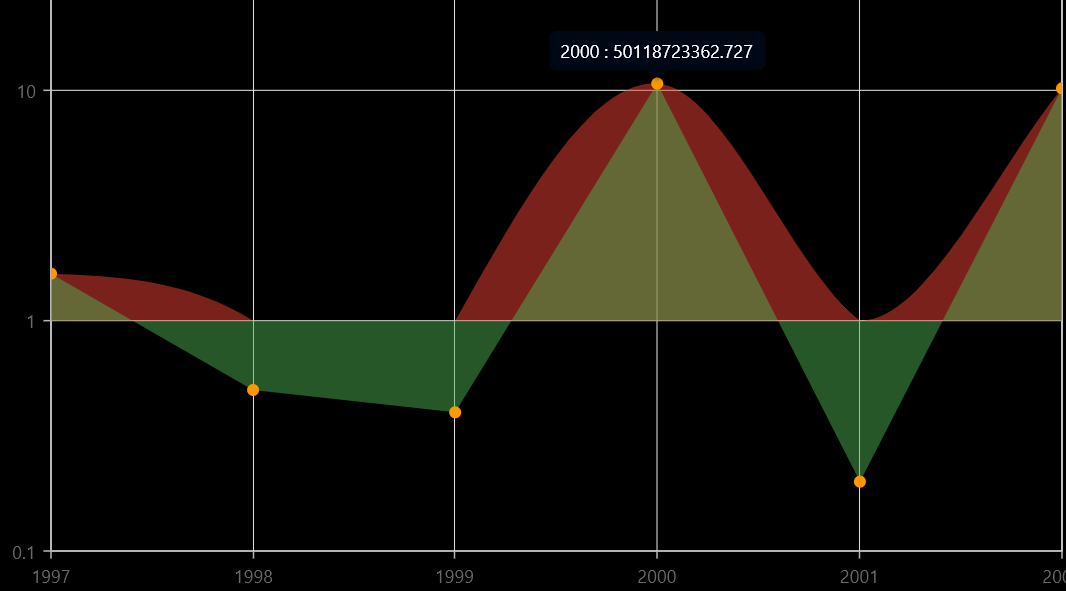
If I remove it, the data points are shown properly, however the spline does not behave nicely.
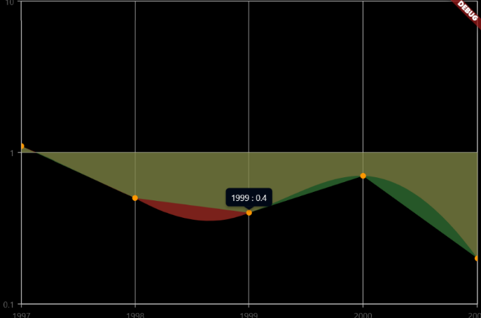
It works well with your example data:
Not with my data (the points are correct but the spline is not smooth between some points):
Hi @benjamingaudin,
Thanks for the patience. The reported issue regarding spline series rendering in the logarithmic axis has been fixed and rolled out in our weekly patch release. To avoid this, please upgrade the chart package to the below latest version.
Version: https://pub.dev/packages/syncfusion_flutter_charts/versions/20.2.36
Regards, Yuvaraj.