 stoplightio
Dark theme colors are not readable in some places
Context
Using the latest spotlight elements package: ^7.6.0.
If you are in dark mode, a few of the colors are not much readable.
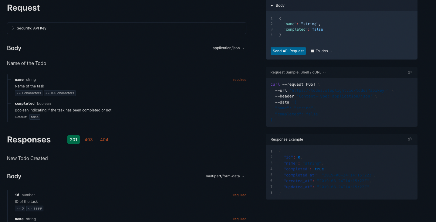
Current Behavior
Dark theme colors aren't readable.
Expected Behavior
Use lighter color shades in dark theme in specified places as shown in screenshot.
Possible Workaround/Solution
Use lighter color shades.
Steps to Reproduce
- Open https://elements-demo.stoplight.io/?_ga=2.58732269.1764023179.1656936474-1096342679.1656936473#/operations/post-todos
- Change
data-theme="light"todata-theme="dark" - Now browser UI to see the dark text
Environment
- Version used:
^7.6.0. - Environment name and version (e.g. Chrome 39, node.js 5.4): Chrome 103
- Operating System and version (desktop or mobile): macOS/desktop
- Link to your environment/workspace/project: N/A
No, I have used the same approach as you and applied my own lighter colours. 😄
For others coming across this, just wanted to point out @matthewmuscat's answer:
<html lang="en" data-theme="dark">
(or in Next.js document page)
<Html data-theme="dark">
[data-theme='dark'] .elements-container :is(.token.string, .token.function, .token.property) {
  color: var(--ifm-color-primary) !important;
}
and component
  <div className="elements-container">
      <StoplightElements
        apiDescriptionDocument={oasData}
        router="hash"
      />
  </div>
Works great, thanks!
Apparently, not all the theme styling respects <html data-theme>. A slightly more effective, but still hacky workaround is to use:
localStorage.setItem('mosaic-theme', '{"mode":"dark","version":0}')
Which results in a much nicer color scheme:
I propose a feature request to add a prop to the Elements web component(s) that sets the theme natively.
I am using this with litestar library with python. How do I enable darkmode?