stash

stash copied to clipboard
[Feature] [UI] Scene/Performer Tagger Configuration UI Refactor
Is your feature request related to a problem? Please describe. The tagger configuration requires more mouse clicks and modals than necessary. The layout is also inconsistent between the scenes and performer taggers. Addressing these two factors may contribute to ease-of-use for new/non-power users.
Describe the solution you'd like
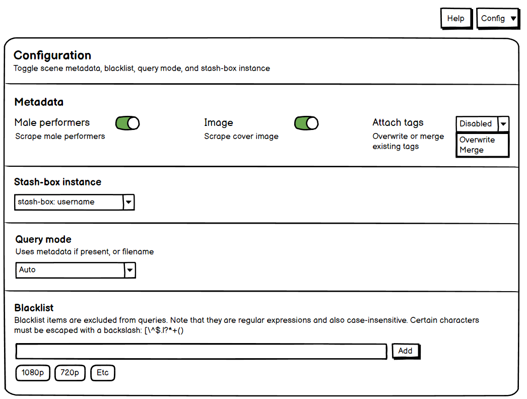
- Consistency with placement of buttons common to both scene and performer tagger
- Add a visual indicator to the config button that shows it can be collapsed when it's expanded.
- Replace the use of modals with switches, and display fields with a flex (column) layout.
- Make it clear each sub-heading is its own distinct section with a full-bleed horizontal line
See wireframe of performer tagger for a visual demonstration of the above

Edit: The term tagger fields in the above example isn't that clear, especially if you're not as familiar with Stash as a power user. The term should probably be changed to something more explicit such as performer metadata.
| Old value | New value |
|---|---|
| Enabled tagger fields | Toggle performer metadata |
| Tagger fields [sub-heading] | Performer metadata [sub-heading] |