New Stacks symbol

What is the use case for this design? When and where will this be visible?
Timeframe in which this could be first visible is 3 weeks at the earliest - 6 months at the latest.
Places it will be visible:
- Token exchanges
- Token listing sites
- Blockstack apps
- Blockstack wallets (including in the product)
- News articles (often rendered as an actual coin)
ADA uses the Cardano Foundation logo on exchanges to represent the token. Does Blockstack specifically want a different logo for the token?
Its a tough decision because you're fragmenting your brand by having a different logo. Could argue for both sides there, what do you think?
It comes down to the desired effect. Do you want people to think of Blockstack as a platform for Dapps or a cryptocurrency?
I would imagine you want people to think of STACK as the cryptocurrency and Blockstach as the platform, so I would advocate for two different logos. I think this is actually a weak point in Cardano's brand.
Like we did with the Blockstack Apps logo, we should keep it obviously inspired by the Blockstack logo with its own subtle uniqueness.
cc'ing @shea256 @muneeb-ali @yknl to comment/watch as this is a fairly important conversation around brand.
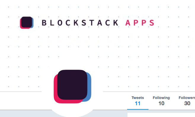
Preston's design of Blockstack Apps brand for reference:
I could* see a world where the brand is inspired by Blockstack but unique in conveying its theme. My sense is we may* want to go down that route and make this more cryptocurrency-focus as a token representing utility on the new internet.

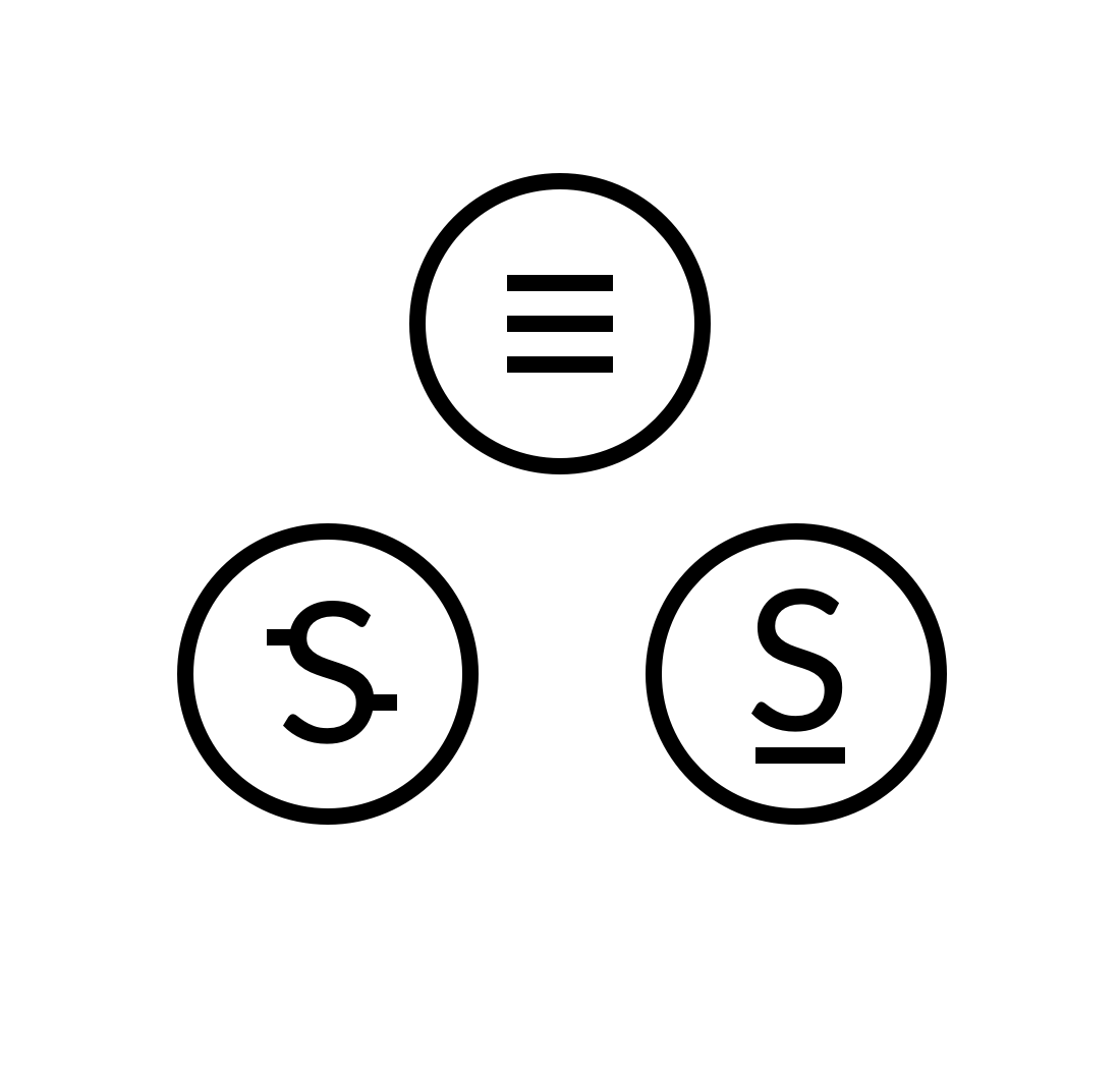
One thought would be using this as the token logo. It would represent being a crucial component of the Blockstack ecosystem--one of four crucial components.
It's simple and clean, but may not communication enough info.
Overall, I would suggest moving away from imagery that resembles that Bitcoin clip-art with all the text and random lines.
Ok so here is what that looks like as a "coin" which is the circular shape it may be forced into as a function of how people compare these things:

Agree with the simplicity and clean aspects, as well as lack of information relayed.
The "S" designs above do more to accomplish all three aspects.
Guy: Another thought on branding for Blockstack is to use a logo along with Blockstack, Blockstack Stacks token, Stacks token ....
I came up with slogan(s)/logo(s) and having been using them on The Stacks Cafe™(e.g., let's make a new internet The Decentralized Way™). Perhaps we might find it a place in the Blockstack landscape (Blockstack, Stacks token,... etc.)(e.g., Blockstack - The Decentralized Way™, Stacks token - The Decentralized Way™ - The Blockstack Way™ shortened version, and other ways - e.g., here https://twitter.com/Grid_dles/status/959505658721849346 and https://thestackcafe.com/blockstack-signature-bounties-two-weeks-to-go/).
Thoughts?
see also Brand re: Stacks token design idea - #614
Hey everyone. Just got word in Blockstack Slack #design channel from @pstan26 about timing for this. 3wks - 5mo.
This is an important piece to the Blockstack brand and should be executed through a proper design process as it will be very difficult to iterate on after the token gets launched.
I’ll draw up the process and then the Creative Brief so that everyone has the requirements for tackling this issue
Very kind of you Guy and couldn't agree more on all the points you've made.
On Fri, Feb 2, 2018 at 4:02 PM, Guy Lepage [email protected] wrote:
Hey everyone. Just got word in Blockstack Slack #design channel from @pstan26 https://github.com/pstan26 about timing for this. 3wks - 5mo.
This is an important piece to the Blockstack brand and should be executed through a proper design process as it will be very difficult to iterate on after the token gets launched.
I’ll draw up the process and then the Creative Brief so that everyone has the requirements for tackling this issue
— You are receiving this because you were mentioned. Reply to this email directly, view it on GitHub https://github.com/blockstack/designs/issues/535#issuecomment-362706575, or mute the thread https://github.com/notifications/unsubscribe-auth/AFWIsLGGsXmbH005n30FDI7n-fgxQsb9ks5tQ3f_gaJpZM4QG6Re .
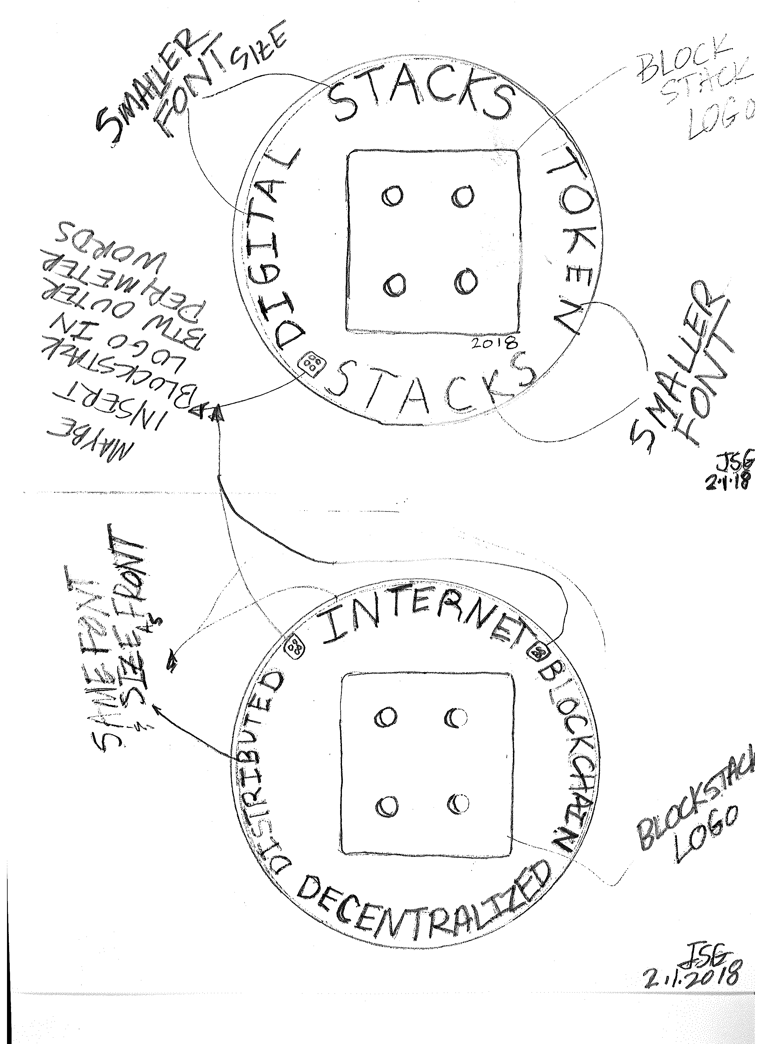
Guy - Some thoughts on the Stacks token design/logo... (see attached pencil sketch). A few thoughts on the space Blockstack is occupying in connection with brands and/or logos for Stacks token - Brand the Stacks token along with the four foundational pillars (internet, blockchain, distributed, decentralized... (also others-vc,bns,atlas,gaia) but subsume those four foundational pillars within/under the architecture/ecosystem of Blockstack.
See pencil sketch:
- Blockstack logo (along with the four dots (four foundational pillars reference) as one focus (centered) - with a focus hook to Stacks (token))( in larger font then "digital token" etc. - these can all be tiered layer of fonts size and type used, color etc.) (placed properly)
- along with those four foundational pillars on the perimeter of the token (maybe smallest font size) that make up the new internet (e.g., internet, using distributed blockchain to achieve the ultimate goal a - decentralized internet using decentralized applications on the Blockstack w/ Stacks token(s) and/or Blockstack Stacks token(s)). (Fonts, size, color (can (should) follow Blockstack schemes) etc.)
- have the Blockstack logo (four dots in white and color) placed between the perimeter words (four foundational pillars)
- date it
See thoughts on Logo too - https://github.com/blockstack/designs/issues/615
Looking forward to reading the full design brief and thinking up a few options. Ping me when it's live!