reactdevske-website

reactdevske-website copied to clipboard
 reactdeveloperske
[feature] create hero header section
Fixes Issue
Closes #77
Changes proposed
This PR fulfills the following requirements:
- [x] Create a component named
HeroHeaderin thecomponentsfolder that implements the screenshots/design given. - [x] It should make use of the existing
Navbarcomponent - feel free to adjust theNavbarcomponent to match the requirements in this ticket. - [x] The menu items are anchor links which should smoothly scroll to the relevant section when clicked.
- [x] Reuse the
LogoandButtoncomponents. - [x] Include the component in
index.page.tsx. - [x] Create a new test file in the
e2efolder namedhero-header.spec.tsand add a test that verifies that clicking each of the 5 links in the component navigates to the correct URLs. - [x] When the "About Us" menu is clicked, the URL changes to
/#about-us. - [x] When the "Events" menu is clicked, the URL changes to
/#events. - [x] When the "Contact" menu is clicked, the URL changes to
/#contact-us. - [x] When the "Join Community" button is clicked, the page opens
https://bit.ly/joinreactdevskein a new tab. - [x] When the "Join ReactDevsKE" button is clicked, the page opens
https://bit.ly/joinreactdevskein a new tab. - [x] The implementation should match the design - text content, typography, capitalization and spacing.
- [x] The UI should be responsive and work well on both desktop and mobile viewports.
- [x] The
hero-header.spec.tstest should pass on both Chrome, Firefox and Safari.
Check List (Check all the applicable boxes)
- [x] My code follows the code style of this project.
- [ ] My change requires changes to the documentation.
- [ ] I have updated the documentation accordingly.
- [x] All new and existing tests passed.
- [x] This PR does not contain plagiarized content.
- [x] The title of my pull request is a short description of the requested changes.
Screenshots
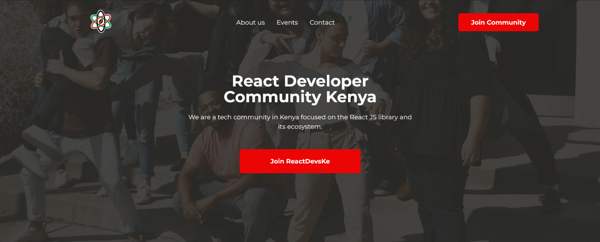
Hero Header on Large Screen
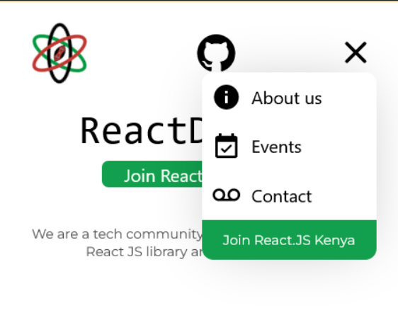
Hero Header on Mobile Screens

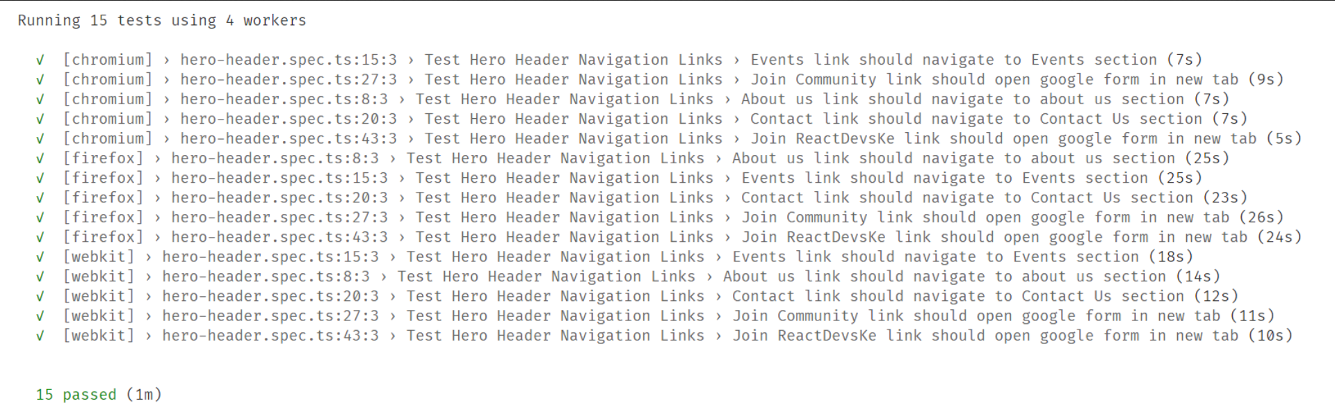
Passing Tests
Note to reviewers
- In the design the mobile version has a link to github while the desktop version doesn't. Is this the design or is it an omission?
- I made an adjustment on the
DropdownMenu. The design places theclose icon/buttonin almost the same line as theAbout uslink. This, in my view, would precipitate a situation whereby a user accidentally clicks on theAbout uslink with the intention of clicking theclosebutton and vice-versa. Similarly, since the design does not explicitly show the interaction between theHeroHeaderand theDropdownMenuI opted to move theclosebutton to display where themenuicon shows and toggle them accordingly. I welcome your thoughts on this approach. - I added a box shadow on the
DropdownMenuto differentiate it from the rest of the page as they have the same background color.
The latest updates on your projects. Learn more about Vercel for Git ↗︎
| Name | Status | Preview | Updated |
|---|---|---|---|
| reactdevske-website | ✅ Ready (Inspect) | Visit Preview | Oct 31, 2022 at 8:44AM (UTC) |
![vercel[bot] avatar](https://avatars.githubusercontent.com/in/8329?v=4 "Published by a pub.dev verified publisher")
- In the design the mobile version has a link to github while the desktop version doesn't. Is this the design or is it an omission?
I would say it is an inconsistency in the design. We should address it in another round of contributions. Thanks for pointing it out.
- I made an adjustment on the
DropdownMenu. The design places theclose icon/buttonin almost the same line as theAbout uslink. This, in my view, would precipitate a situation whereby a user accidentally clicks on theAbout uslink with the intention of clicking theclosebutton and vice-versa. Similarly, since the design does not explicitly show the interaction between theHeroHeaderand theDropdownMenuI opted to move theclosebutton to display where themenuicon shows and toggle them accordingly. I welcome your thoughts on this approach.
Looking good. Thanks 👍
- I added a box shadow on the
DropdownMenuto differentiate it from the rest of the page as they have the same background color.
👍