 react-native-segmented-control
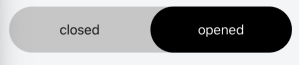
Large variant
Feature request
In a lot of apps I'm seeing a slightly larger / bigger variant of the segmented control. See for e.g.:
- The GitHub iOS app if you navigate to Home > Issues.
- Safari > Bookmarks.
Why it is needed
When using the segmented control as top tab navigation it's ux wise nice to have bigger buttons.
Possible implementation
I think the native module has some way of adding more padding / adjusting the height.
Code sample
<SegmentedControl
    large={true}
/>
EDIT: seems you can already do this by providing a style prop:
style={{ height: 40 }}
Maybe this should be more clear in the docs.
@dylancom thanks for the suggestion! I'll add info about styling in the docs
Is there a way to add a backgroundColor to the active Tab?
Edit
i see I can add color for tintColor prop
now if I want to add some style for this tab "active tab" like border Radius!
when I add it for the style prop, it's applied for the Tab container itself 😅
here's a snack as you have seen the end of active tab not curved 😅
What expected behavior