Please clarify behaviour of UI elements
First of all, many thanks for this great extension, I was happily using it for more than a year now (with PAC file based configuration, see below)! Unfortunately I ran into problems lately ...
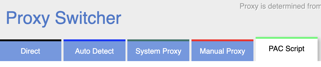
For me it is hard to detect which configuration is active and how to select the proper one. I understand that the currently selected configuration option is shown by the color of the proxy icon in the toolbar, e.g.,
But for some reason it seems to change arbitrarily, e.g., from PAC script to manual proxy configuration. I was thinking that the last selected configuration in the tab is used until I change it?
Final question would be how I can activate PAC scripts by local URL? Next to the Configuration there are three icons where I have no idea of the semantics:

What does the
- Reload Button mean: Do I have to press it every time I change the file on the disk?
- X-Button mean: Can I cancel something, what?
- Check-Button mean: Do I have to confirm my settings/filename changes or what?
Playing around with them didn't help very much.
For PAC-Scripts: The only thing that always works, is to copy/paste my script from the file to the inline section. However I would appreciate to maintain my changes in a file which is subject to version control.
For completeness: I use v0.6.0 on the latest Brave browser (Chrome engine with more privacy).
I hate to bring this up but the UI is just not well designed. I'm trying this extension now since the other one I used for several years refuses to work after a recent Chrome update.
Straight to the point - the most intuitive way to use a proxy switcher is when it is a dropdown menu. Like this. Extension itself here.
What I'm seeing now works like this:
- There is a selection of tabs.
- There is a dropdown menu with current profile name that probably should have been an input box instead.
- There is a down button that brings up the real dropdown menu with proxy profiles.
- There is a green checkmark button that has to be pressed after a profile is changed in order to confirm new selection.
I know "make it work like the other extension" is not a good advice. But just consider how much clicks a user makes when using your extension every day. A simpler UI will remove confusion and make it easier to use.