Dealing with date/time stamps as a continuous variable
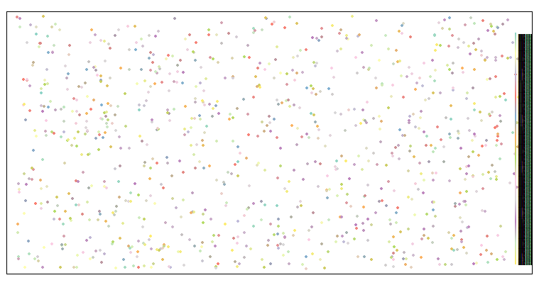
I'm having trouble understanding how best to have tmap interpret a time stamp (eg. POSIXct) as a continuous rather than a categorical variable. As the example below shows, attempting to plot a time field as a colour results in a legend with 1,000 entries being created - I can't force it to treat the variable as continuous by using style="cont", nor can I define the break points, or use max.categories to limit the number displayed in some way.
library(tidyverse)
library(sf)
library(tmap)
datx = tibble(x = runif(1000,-180,180),
             y = runif(1000,-90,90),
             Ptime = seq(as.POSIXct("2010-01-01 00:00:00"),
                         as.POSIXct("2015-01-01 00:00:00"),
                         length.out = 1000))
datx = st_as_sf(datx,coords=c("x","y"),crs=4326)
tm_shape(datx) + tm_dots(col="Ptime")

I'm not sure if this is expected behaviour. What's the best way to deal with a time field like this? Convert to numeric, and attempt to assemble the legend classes manually?
Thanks for issuing this!
To explain the (odd) behaviour: currently, tmap only considers categorical and numeric variables. Date/time variables are cast to categorial variables. For categorical variables there are a couple of arguments that control the breaks/categories, mainly max.categories and auto.palette.mapping. When auto.palette.mapping = TRUE, a new the palette is created with colorRampPalette. Since this can be applied to any desired number of colors, max.categories is disabled. This is clearly not desirable. By setting is to FALSE, the categories are combined to max.categories categories, where the palette is repeated:
tm_shape(datx) + tm_dots(col="Ptime", style="cat", n=8, auto.palette.mapping=FALSE)
- So, it would be better to treat categorical variables with many categories differently.
- Regarding data/time variables: how would you like to process them? Maybe we could make use of existing solutions, like the
scalespackage does forggplot2. - This issue is related to other non-standard numeric/categorical data, like units (#143)
Thanks for that excellent explanation. Ideally, I guess I would like time to be dealt with internally as if It were a continuous numeric value (as the POSIXct format is internally, for example). That way, much as I could specify this for a continuous numeric variable:
tm_shape(datx) + tm_dots(col="numeric_column",breaks=c(-Inf,5,10,15,20,Inf))
For a timestamp, I could do:
time_breaks = as.POSIXct("2010-01-01","2011-01-01,"2012-01-01","2013-01-01",Inf)
tm_shape(datx) + tm_dots(col="time_column",breaks=time_breaks)
In this case, I would end up with five visual classes, each representing a range of dates (a year). Of course, dates and times are always complicated to deal with, and maybe wanting to plot them by colour is an edge-case. I'm sure others have different ways they would like them dealt with! I could, of course, just classify these categories before hand, but tmap is so good at creating simple, pretty legends I was hoping it would work for date/times too.