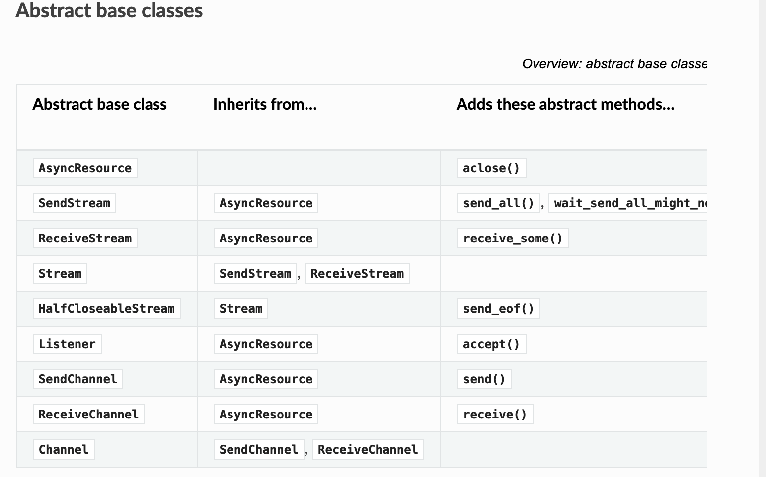
Improve Wide Table Handling in Docs
- Allows text to wrap in table rows
- Allows text to wrap in table headers
- Forces overflow to be visible (ugly, but at least the table is readable on large screens... Not sure if this makes things worse for small screens though)
https://github.com/python-trio/trio/issues/1210
Codecov Report
All modified and coverable lines are covered by tests :white_check_mark:
Project coverage is 99.64%. Comparing base (
e94e92a) to head (e57733c). Report is 3 commits behind head on master.
Additional details and impacted files
@@           Coverage Diff           @@
##           master    #1233   +/-   ##
=======================================
  Coverage   99.64%   99.64%
=======================================
  Files         117      117
  Lines       17594    17594
  Branches     3171     3171
=======================================
  Hits        17532    17532
  Misses         43       43
  Partials       19       19
Thanks for your work here! Great documentation is all about attention to detail.
I asked ReadTheDocs to generate your PR so that we can easily compare the two versions:
- before: https://trio.readthedocs.io/en/latest/reference-io.html#abstract-base-classes
- after: https://trio-pquentin.readthedocs.io/en/1233/reference-io.html#abstract-base-classes
For some reason, this pull request does not make any difference on mobile. On large desktop screens, the result is better. Here are Firefox screenshots:
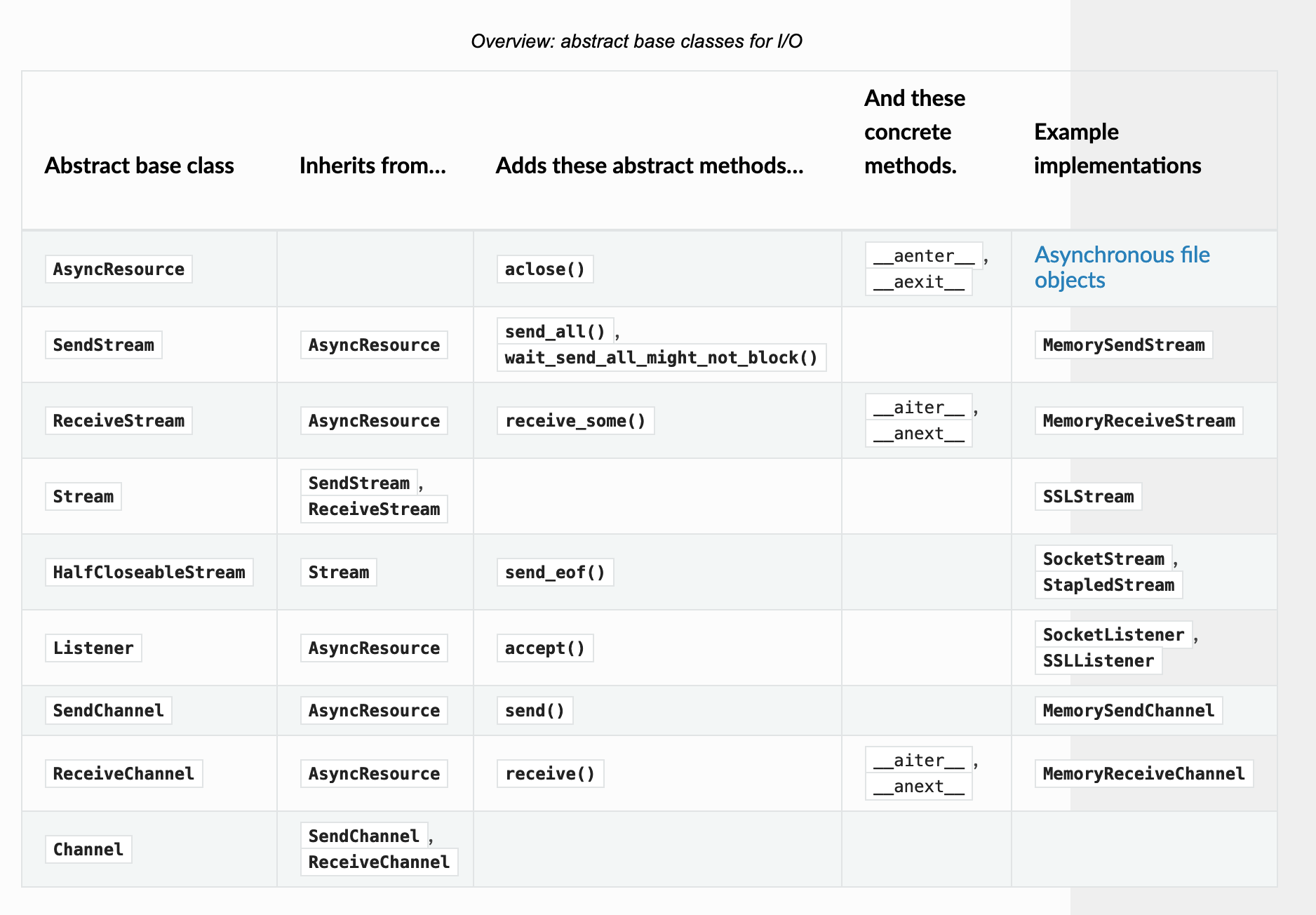
However, on a small dekstop screen (eg. if I have a browser on the left and a terminal on the right, the width of the window is smaller than the maximum ReadTheDocs width), then it's not possible to scroll to see the rest of the table. :(
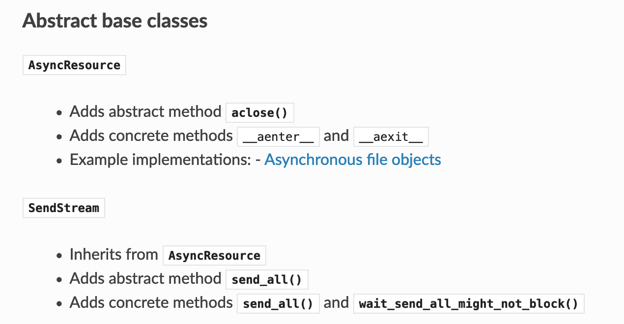
Maybe the solution here is to stop displaying this is as a table but with lists? Something like:
@pquentin I just realized a comment I thought I added to this PR, I had actually left on the issue instead:
Original Text Follows
I gave it a try. I'm not happy with how it looks right now, but I'm not sure how to make it better.
The overflow: visible is very ugly as the table hangs past the white background), but it may be more usable even if it's ugly. The wrapping within table cells is a definite improvement. The wrapping of text within table headers is somewhere in between. It also looks awkward but is probably worth it to have a table that isn't so wide and make it easier to actually use (especially if the overflow visible gets removed).
I think the best way to avoid the overflow vs scrollbar issue is just to have narrower tables. The text wrapping helps, but because long function references like wait_send_all_might_not_block() are over 200 px (and cannot be broken across lines), 5 column tables can still end up over 1000 px after padding which is obviously way above the 800 px background.
I tried looking for a way to make these references smaller, but you get into so many tradeoffs I'm quickly getting out of my depth: 1.) You could try to display first 10 characters only with "<...>" appended as in wait_send_<...> to limit the worst case to something more manageable. I don't even know how to do this, but it would probably be my preference, hopefully it could expand on mouseover (not having seen it actually implemented, take that with a grain of salt). 2.) You could make text smaller obviously, but I have no idea whether to make all table text smaller, all text in the offending table smaller, all text in the offending column smaller, or all text in just the offending cell smaller (consistency is nice, but so are tables actually being displayable all at once)... The advantage here is you can see (and copy paste) the entire function name at once, but it looks weirder IMO
I thought of other options I can't remember now, but none that seemed like clear winners.
End Original Text
In other words, I agree that basically as it stands it's probably not merge-able. Converting it to a list is a good idea! Do you think any of my other suggestions are worth exploring, or is using a list just superior? (Even removing the forced overflow but keeping the text wrapping does improve things a bit for all screen sizes, so that could be a third option between "keep status quo" and "convert to list")
I do like think the wrapping within cells is a good improvement over the current default (and maybe headers also)? Even if we end up avoiding tables altogether for this piece of the docs (because this table is really huge), would it still make sense to include that change in this PR so more borderline tables can stay as tables?
Yes, I'd like to see a pull request with only the wrapping so that we can merge that quickly.
I'm not a huge fan of making the font size smaller or shortening the function names. But using a list is certainly not just superior as it's more verbose, so in a sense harder to read. Oh, and we can probably make the visible overflow proposal less ugly by fixing the background color.
I removed the forced overflow, so you can view the text-wrapping in isolation. After looking back at the code I copied and the discussions in other projects who adopted it, it appears that
@media screen and (min-width: 767px) {
is supposed to ensure the overflow only goes into effect if the width of the browser meets a minimum threshold (thus it shouldn't be a problem even on vertical monitors or with terminal beside the browser). If you shrink the window enough (down to about 749 px on my screen), two things happen: The left nav bar collapses, and the forced overflow automatically turns off (and you can scroll again to see the whole table. Hooray! So it actually works for both very large and very small screens.
Unfortunately, if you're above 767 px, but only by a little bit, overflow is turned off, but the left nav bar takes up 320 px, so you have overflow=True in the ~447 px area that remains (which isn't enough to display the table).
I tried playing with the numbers some, but even with 1087 (320 from left nav bar + 767 that other projects use) there's still some mid-size configurations where it looks weird (though more small screens look good, and it still helps on the very large). HTML/CSS is really not my strong suit, as I mentioned in the related issue, so while I'm sure there is a more intelligent way to enable it on only the screens where it helps, it's eluding me so far.