 pyapp-kit
Default styling: Disabled PushButtons can't be distinguished from Labels
When using magicgui PushButton widgets in napari, the default styling of a disabled button is to not show the box around the button text. This essentially makes the widget look like a text Label widget.
I think this styling is unfortunate:
- Depending on the context, the user may not realize that there is a button that may become activated through some means.
- The user may mistake the button text as an explanatory label for a neighbouring widget, not as an action.
- It doesn't look nice.
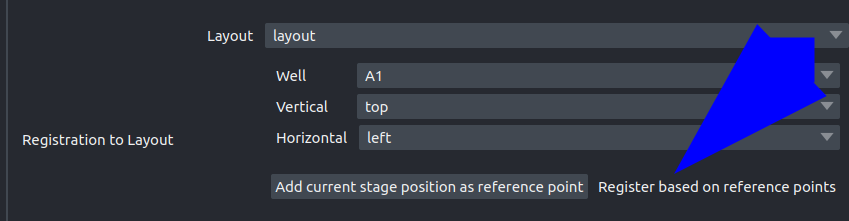
Here is an example where a disabled button looks a bit odd (the button only becomes visible once enough reference points have been selected)
Suggestion: Use a button styling that retains the button look but visually communicates the enabled/disabled status through other means such as greyed out text, or changed bg color. This is standard in many other UI frameworks. I realize that "graying out" the text in the napari context is not that trivial as the default styling already uses various shades of gray.