Dark mode `:hover` in `ActionList` component is not configurable
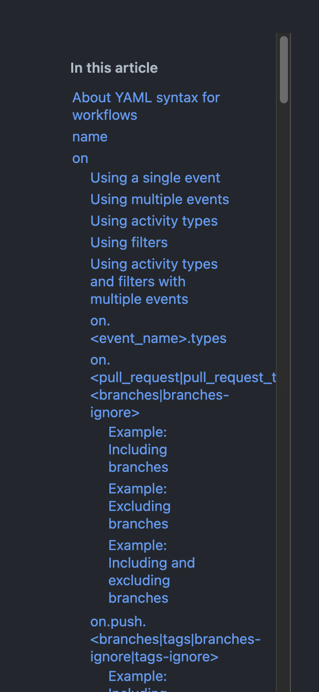
Per https://github.com/github/docs-engineering/issues/2007 the dark mode ActionList :hover is unreadable, see this screenshot.
We can override the :hover for the ActionList.Item in our codebase, but have to use !important to have the styles apply.
It would be ideal if we could configure these lines to be optional or to change the color to something that works better: https://github.com/primer/react/blob/40da598e8d41b688eba53f4c594bff66b269f5f4/src/ActionList/Item.tsx#L170-L174
Hi Evan!
I noticed that docs uses an a tag inside ActionList, which gets the global link color which ActionList doesn't optimise for right now (links in ActionList do not have accent color)
How do you feel about using ActionList.Link or even better NavList (which supports nesting), would that be a good fit for this use case?
Example of NavList in different github themes: https://primer.style/react/storybook/?path=/story/composite-components-navlist--with-sub-items&globals=colorScheme:all
Screenshot from docs:

Screenshot of ActionList with links:

👋🏻 Hi @Ebonsignori, did Sid's answer above help? Let us know if we be of further assistance.
Hi @lesliecdubs and @siddharthkp! I was working with @Ebonsignori and currently he's OOO, so I can take this one. NavList is awesome and works great! Thanks for the heads up. We'll use that!
Awesome, thanks for confirming @gracepark! I'm going to go ahead and close this issue, but please don't hesitate to reopen it or visit us in #primer if further questions come up.