plotly.py

plotly.py copied to clipboard
Fix "Update Button" example in Python custom buttons doc page
TL;DR
The annotations in the Update Button example in the Python docs do not update correctly when the buttons are clicked (see images below), apparently due to positioning the annotations using date values on a non-date xaxis. This pull request modifies the code defining the annotations so that the buttons update correctly.
Issue Description
Observed behavior:
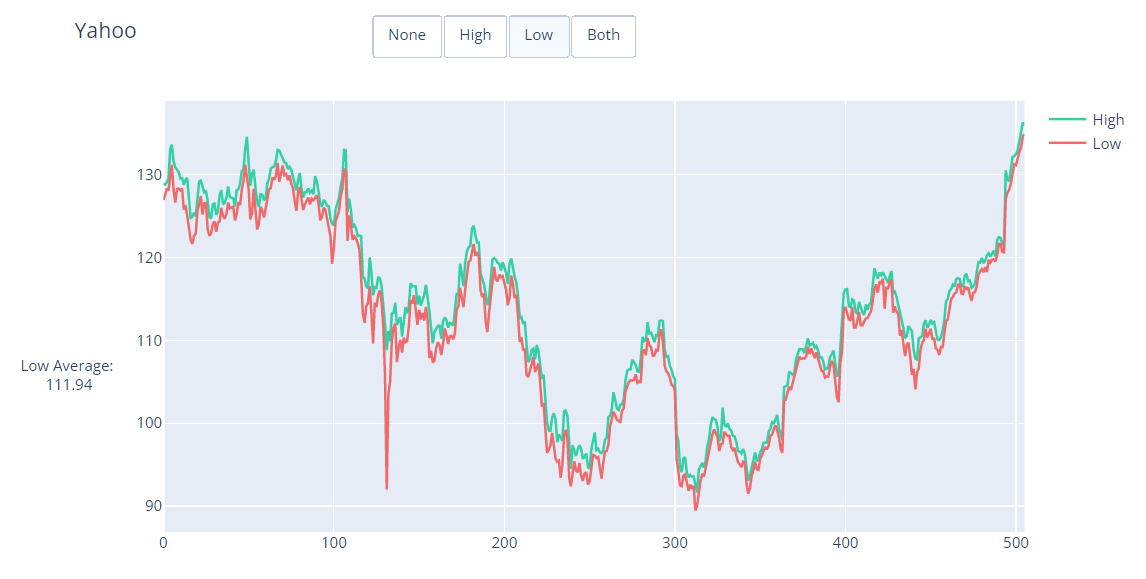
When the "High", "Low", and "Both" buttons are clicked:
- The "Low Min" and "High Max" annotations do not appear
- The "High Average" and "Low Average" traces do not appear
- The "High" and "Low" traces do not toggle visibility
The images below show the appearance of the plot
- In its initial state
- After clicking the "High" button
- After clicking the "Low" button
- After clicking the "Both" button
Initial state:

"High" clicked:

"Low" clicked:
"Both" clicked:

Expected behavior:
- When "None" is clicked, the plot will display the "High" and "Low" traces with no annotations
- When "High" is clicked, the plot will display the "High" and "High Average" traces, and the "High Average" and "High Max" annotations
- When "Low" is clicked, the plot will display the "Low" and "Low Average" traces, and the "Low Average" and "Low Min" annotations
- When "Both" is clicked, the plot will display all traces and annotations.
Proposed solution
- Change the
xposition of the "High Average" and "Low Average" annotations to use numerical values instead of date values. - Specify the
xanchor,yanchor,xref, andyrefattributes for the "High Average" and "Low Average" annotations to ensure correct positioning of the annotations to the left of the figure yaxis. - Eliminate usage of hex colors in the example.
Documentation PR
- [x] I've seen the
doc/README.mdfile - [x] This change runs in the current version of Plotly on PyPI and targets the
doc-prodbranch OR it targets themasterbranch - [ ] ~~If this PR modifies the first example in a page or adds a new one, it is a
pxexample if at all possible~~ Does not modify the first example or add a new example. - [x] Every new/modified example has a descriptive title and motivating sentence or paragraph
- [x] Every new/modified example is independently runnable
- [x] Every new/modified example is optimized for short line count and focuses on the Plotly/visualization-related aspects of the example rather than the computation required to produce the data being visualized
- [ ] ~~Meaningful/relatable datasets are used for all new examples instead of randomly-generated data where possible~~ No new examples added.
- [ ] ~~The random seed is set if using randomly-generated data in new/modified examples~~ No randomly-generated data is used.
- [ ] ~~New/modified remote datasets are loaded from https://plotly.github.io/datasets and added to https://github.com/plotly/datasets~~ No datasets added or modified.
- [x] Large computations are avoided in the new/modified examples in favour of loading remote datasets that represent the output of such computations
- [x] Imports are
plotly.graph_objects as go/plotly.express as px/plotly.io as pio - [x] Data frames are always called
df - [x]
fig = <something>call is high up in each new/modified example (eitherpx.<something>ormake_subplotsorgo.Figure) - [x] Liberal use is made of
fig.add_*andfig.update_*rather thango.Figure(data=..., layout=...)in every new/modified example - [ ] Specific adders and updaters like
fig.add_shapeandfig.update_xaxesare used instead of bigfig.update_layoutcalls in every new/modified example - [x]
fig.show()is at the end of each new/modified example - [x]
plotly.plot()andplotly.iplot()are not used in any new/modified example - [x] Hex codes for colors are not used in any new/modified example in favour of these nice ones