How to prevent varying thickness of bars in a Gantt/timeline diagram?
When using the px.timeline function I perceive varying bar thickness in the diagram (full code at bottom):

Code:
fig = px.timeline(df, x_start="Start", x_end="Finish", y="Workstation", color="Resource", text="Task", width=1600, height=800)
fig.write_html('test.html')
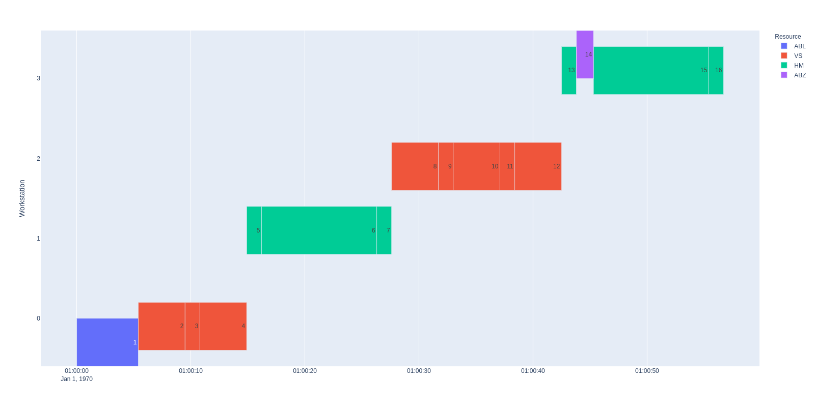
And when I use barmode="group" the result still varies in height (see jump from 1-2 or 13-14):
 Code:
Code:
fig = px.timeline(df, x_start="Start", x_end="Finish", y="Workstation", color="Resource", text="Task", width=1600, height=800)
fig.update_layout(barmode="group")
fig.write_html('test.html')
Sometimes I can fix this with
fig = fig.full_figure_for_development(warn=False)
fig.layout.barmode = "group"
but not always or in this example case. I think it has something to do with the resource names, yet I cannot find a pattern.
Plotly versions: 4.12 and 4.13 both show the same behavior.
Full code:
import pandas as pd
import plotly.express as px
from io import StringIO

csv = """Task,Start,Finish,Workstation,Resource
1,1970-01-01 01:00:00.000,1970-01-01 01:00:05.400,0,ABL
2,1970-01-01 01:00:05.400,1970-01-01 01:00:09.500,0,VS
3,1970-01-01 01:00:09.500,1970-01-01 01:00:10.800,0,VS
4,1970-01-01 01:00:10.800,1970-01-01 01:00:14.900,0,VS
5,1970-01-01 01:00:14.900,1970-01-01 01:00:16.200,1,HM
6,1970-01-01 01:00:16.200,1970-01-01 01:00:26.300,1,HM
7,1970-01-01 01:00:26.300,1970-01-01 01:00:27.600,1,HM
8,1970-01-01 01:00:27.600,1970-01-01 01:00:31.700,2,VS
9,1970-01-01 01:00:31.700,1970-01-01 01:00:33.000,2,VS
10,1970-01-01 01:00:33.000,1970-01-01 01:00:37.100,2,VS
11,1970-01-01 01:00:37.100,1970-01-01 01:00:38.400,2,VS
12,1970-01-01 01:00:38.400,1970-01-01 01:00:42.500,2,VS
13,1970-01-01 01:00:42.500,1970-01-01 01:00:43.800,3,HM
14,1970-01-01 01:00:43.800,1970-01-01 01:00:45.300,3,ABZ
15,1970-01-01 01:00:45.300,1970-01-01 01:00:55.400,3,HM
16,1970-01-01 01:00:55.400,1970-01-01 01:00:56.700,3,HM"""

df = pd.read_csv(StringIO(csv))
fig = px.timeline(df, x_start="Start", x_end="Finish", y="Workstation", color="Resource", text="Task", width=1600, height=800)
# fig = fig.full_figure_for_development(warn=False)
# fig.layout.barmode = "group"
fig.update_layout(barmode="group")
fig.write_html('test.html')
P.S.: Time starts in 1970 because of a workaround to only use seconds in the timeline diagram (not shown above). Is there a better way to achieve this?
fig.update_xaxes(
            dtick="1000",
            tickformat="%M:%S",
            ticklabelmode="instant")
In my case, I use "fig.update_traces(width= 0.6)" and the width is solved.
Seems to work fine without group-mode, thank you very much!
However, if we use barmoude=group the issue with jumping bars still remains... Not sure if this should be the case?
Edit: now version 5.13
@maralbus when barmode='group' this behavior makes sense: in that mode the bars are offset from the given vertical position so that traces from all bars can fit side-by-side at each distinct position (ie 4 bars at each integer, so each width a little less than 0.25 since there's also a gap between groups). You don't want grouping here, you want all the bars to be positioned vertically exactly at the values given by px.timeline.
I don't know much about px.timeline, but as unfortunate as this is, once its output gets to plotly.js it looks correct to me (with one caveat below), because it uses barmode='overlay'. In this mode each trace sets the width of its bars independent of all other traces. The blue and purple traces only have bars at a single position, so without anything else to go on (because in overlay mode we don't allow ourselves to interrogate the other traces) we assume a minimum position difference of 1, so they get a width 1*(1-bargap) = 0.8. The red and green traces have minimum position differences of 2 (they have positions {0, 2} and {1, 3} respectively) so they get width 2*(1-bargap) = 1.6
I would have thought though that you should be able to set barmode='stack'|'relative' and have all the traces considered together to get a minimum position difference - which would be 1, so they'd all get a default width of 0.8. That doesn't work though, setting one of those barmodes doesn't change anything, so that definitely looks like a bug to me. Maybe we ignore stacking modes when the bars have base set? Also I guess since px.timeline has given all these traces the same alignmentgroup='True' we could argue that even with barmode='overlay' they should all pick the same width. But that's getting into the weeds and maybe we had a reason in overlay mode it should still behave this way?
I have a similar issue and I was wondering if anyone had any thoughts on this.
My timeline plots work fine on their own, everything is aligned.
When I add the timeline to a subplot the height of the bars decreases so small you can't see them.
I can increase the height of the bars using
fig.update_traces(width=1)
However this makes the bars offset slighlty.
The larger the trace width the more they overlap.
    def plot_gantt_chart(self, return_figure=False):
        # Create a Gantt chart using Plotly Express
        gantt_fig = px.timeline(self.events, x_start='start', x_end='end', y='location', color='asset',
                                labels={'location': 'Location'}, title='Gantt Chart',
                                hover_data=['task_code', 'base_heads'])

        # Create a subplot figure with 2 rows
        fig = make_subplots(rows=2, cols=1, shared_xaxes=True, vertical_spacing=0.1,
                            subplot_titles=("Gantt Chart", "Labor Hours"), row_heights=[0.8, 0.2])

        # Add the traces from the Gantt chart to the first row of the subplot
        for trace in gantt_fig.data:
            fig.add_trace(trace, row=1, col=1)

        fig.update_traces(width=1)

        labor_data = self.facilities['LOCATION'].to_pandas_dataframe()

        if not labor_data.empty:
        # Aggregate labor data by datetime
            labor_data = labor_data.groupby('datetime').sum().reset_index()

            # Add the line chart to the second row for labor data
            fig.add_trace(go.Scatter(x=labor_data['datetime'], y=labor_data['Available Hours'],
                                     mode='lines', name='Labor Available'), row=2, col=1)
            fig.add_trace(go.Scatter(x=labor_data['datetime'], y=labor_data['Allocated Hours'],
                                     mode='lines', name='Labor Allocated'), row=2, col=1)

        # Update the layout and axes
        fig.update_layout(title_text="Gantt Chart with Labor Hours")
        fig.update_yaxes(title_text='Location', row=1, col=1)
        fig.update_yaxes(title_text='Labor Hours', row=2, col=1)
        fig.update_xaxes(type='date')

        # Use the Gantt chart's x-axis range for the line chart
        gantt_xaxis_range = gantt_fig.layout.xaxis.range
        fig.update_xaxes(range=gantt_xaxis_range, row=2, col=1)

        if return_figure:
            return fig

        # Show the figure
        fig.show()
Hi - we are trying to tidy up the stale issues and PRs in Plotly's public repositories so that we can focus on things that are still important to our community. Since this one has been sitting for a while, I'm going to close it; if it is still a concern, please add a comment letting us know what recent version of our software you've checked it with so that I can reopen it and add it to our backlog. Alternatively, if it's a request for tech support, please post in our community forum. Thank you - @gvwilson