Common hover label for hovermode = 'closest'
For scatter plots with hovermode == closest, the current default behavior for hover labels is to only show one hover label near the data point, representing the X and Y data information. However, me (and maybe others?) think that this behavior doesn't look good. The labels is too cluttered and shows too much information, which makes it difficult to interpret.
At the moment, the hover label is rather complex and visually, the labels are much easier to understand if they'd work similarly to hovermode == x, meaning that the X value is shown as hover label near the X axis and the Y value is shown in the hover label near the data point.
I already implemented this locally, but I wanted to bring this back upstream, as I think it is generally desired. I found multiple threads around the internet where people wanted to have this behavior.
As-is

To-be

(Screenshots taken from this interactive version: https://stackoverflow.com/a/39259137/6156346)
Benefits
- Better consistency with other plot types, most of them (like bar plots, boxplots, etc.) show a common label on the x axis.
Discussion
- Do you think this could be a meaningful default behavior?
- Or should we add an option for it?
- Is there another way to achieve common x label without modifying the plotly library?
The behaviour of the hoverlabel can be controlled by the layout.hovermode attribute. The default in Plotly.js 1.x was x and the default was changed in 2.x to be closest. It seems like you prefer the x mode and you can force it by setting layout.hovermode='x' but we will not be changing the default back in the foreseeable future :)
Better consistency with other plot types, most of them (like bar plots, boxplots, etc.) show a common label on the x axis.
I'm not sure what this refers to... Plotly.js doesn't really have "plot types" as any cartesian subplot can host multiple traces of mixed types, and the hovermode is globally set and globally defaults to closest (in v2). If you look at the sample plots in the documentation for bar charts for example, you'll see that they are all in closest mode: https://plotly.com/javascript/bar-charts/
Hi @nicolaskruchten, thanks for your answer:
It seems like you prefer the x mode and you can force it by setting layout.hovermode='x' but we will not be changing the default back in the foreseeable future :)
Actually, I like the hovermode == closest. It makes much more sense than x. I just don't like the visual representation of the hover label, as it is quiet cluttered with too much data and difficult to read. What I would prefer is having hovermode == closest with the hover label style of hovermode == x.
Interesting... To me the difference between the two is basically only the visual style... Can you describe what in closest mode you like that you don't have in x mode?
It's just the style.
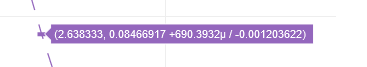
If you look at the two exemplary screenshots above, you'll notice that the label in the first screenshot is longer. Also, it is not clear whether the first of the second number is related to the X or Y axis. For the user, this causes some mental burden, which is not present in the lower plot. There, it is clear on a first sight that the label on the X axis is refering to the value on the X axis and that the label near the data point shows the Y value.
There are examples, where this difference becomes even more obvious. If you add error bars, the label becomes even longer. If there are many decimal digits, the label becomes bigger and more complex again:
E.g.:
This is an extreme example, but it's a really long label and difficult to understand. For now, we are using another hovertemplate to split-up the information into multiple lines. But actually, what we'd really like, is to have just the same label style (the split-up label) as it already exists in the hovermode == x.
Yes, hovertemplate is the recommended way to control the hoverlabel, no matter the mode. If you like the presence of the label on the axis, can I ask then what you don't like about x mode?
@nicolaskruchten if there are multiple traces with similar X value, then the x mode becomes rather difficult to use, as too many labels are shown at the same time. The closest mode does exactly what we expect, just we are not a fan of the current hover labels.
OK, makes sense. We're not going to change the default behaviour for now, but if you're interested in submitting a PR that adds a new attribute (default false) that would activate the x/y axis hoverlabels even in closest mode, that seems like it would meet your needs, right?
Could this be treated as a new hovermode? It also occurs to me it may be nice to have formatting like x unified mode, but with point selection like closest, like "closest unified" or something...
@nicolaskruchten would be great! My thoughts:
As you said, I believe it would make sense to have new attribute to independently control which labels are highlighted on hover.
It is possible to want to use hovermode "closest" but need to highlight a particular tick label that helps the user better grasp the position of the datapoint. Without this feature one might opt to print the x or y values into the hover template itself, however I think this detracts from the user experience by adding clutter when there is already significant hovertemplate information to digest. (my current situation)
Conversly, there is no assumed reason you would need the tick label highlighting that automatically comes with hovermode "x" or "y". This way you could turn them off when not wanted.
Attribute use:
hoverticklabel = "y"
hoverticklabel = "x"
hoverticklabel = "x+y"
hoverticklabel = "none"
hoverticklabel="automatic"
Perhaps by having a default option as automatic/inherit we can avoid having to break any existing expected behaviour.
@valentinstn How did you go with your previous implementation? Are you able to share the code please?
Hi - we are trying to tidy up the stale issues and PRs in Plotly's public repositories so that we can focus on things that are still important to our community. Since this one has been sitting for several years, I'm going to close it; if it is still a concern, please add a comment letting us know what recent version of our software you've checked it with so that I can reopen it and add it to our backlog. Thanks for your help - @gvwilson