stemplot or lollipop plot examples
in signal processing, a "stem plot" is pretty popular. see e.g. https://www.mathworks.com/help/matlab/ref/stem.html
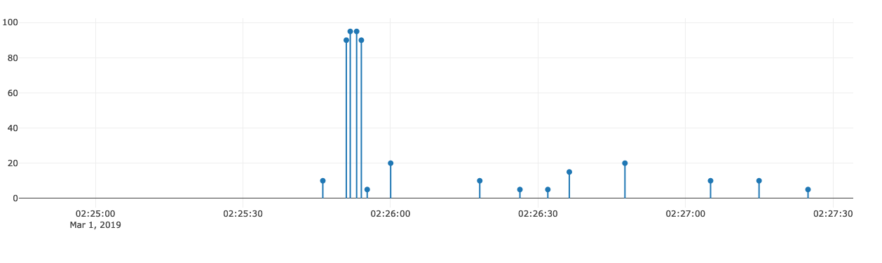
i just realized that we can make these charts with an error bars hack: assymetric error bars where errorminus is the same as y
since this is often considered a chart of its own, it should have it's own page, something like "Python Stemplot or Lollipop Plots | Plotly"
example:
        dcc.Graph(figure={'data': [
            {
                'x': df['date'],
                'y': df['time_on_page'] + granularity,
                'text': df['pathname'],
                'hoverinfo': 'text',
                'type': 'scatter',
                'mode': 'markers',
                'error_y': {
                    'type': 'data',
                    'symmetric': False,
                    'arrayminus': df['time_on_page'] + granularity,
                    'array': [0] * len(df['time_on_page']),
                    'width': 0
                },
                'marker': {
                    'size': 8
                }
            },
        ], 'layout': {'yaxis': {'title': 'time on page'}}})
I would use a scatter trace plus a bar trace actually because the error information appears in the tooltip which might be odd...
There is a helpful Dash Needle Plot example on the Dash Bio (Suite of bioinformatics components compatible with Plotly's Dash.) website.
i just realized that we can make these charts with an error bars hack: assymetric error bars where errorminus is the same as y
@chriddyp Is there a another workaround which allows to visualize the errors?
@chriddyp How can we give different colors to the sticks according to the categorical variable?
@nicolaskruchten from your comment on Mar 1, 2019 about the error information appearing in the tooltip, you can customize the information that appears in the hoverinfo, as shown on here: https://plotly.com/python/hover-text-and-formatting/
example:
        dcc.Graph(figure={'data': [
            {
                'x': df['date'],
                'y': df['time_on_page'] + granularity,
                'text': df['pathname'],
                'hoverinfo': 'text',
                'type': 'scatter',
                'mode': 'markers',
                'error_y': {
                    'type': 'data',
                    'symmetric': False,
                    'arrayminus': df['time_on_page'] + granularity,
                    'array': [0] * len(df['time_on_page']),
                    'width': 0
                },
                'marker': {
                    'size': 8
                }
            },
        ], 'layout': {'yaxis': {'title': 'time on page'}}})
Is it possible to change so the lines start from a different y value? For example, I would want the lines to start from y=-10 and not y=0?
I figured it out, you can subtract the value from "array" and then the base value will start from there.