Form UI/UX issues
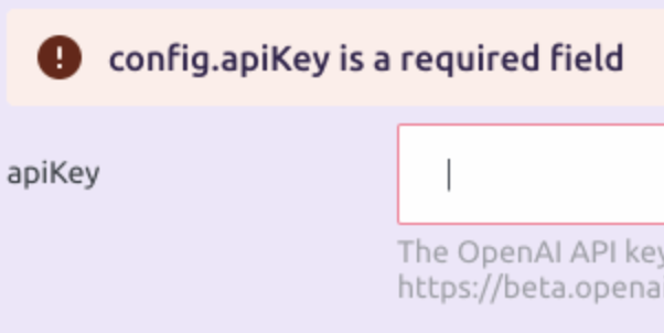
The validation starts too early. In this case it should probably start when the form is submitted or at least after the user empties it.

Testable on https://app.pixiebrix.com/activate?id=@pixies/content-management-demo
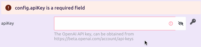
The PasswordWidget styling is a bit off, the border sometimes appears inside the field, sometimes it doesn't, and the eye icon is always outside it. We need to find a way to position the icon inside the field, where the "info" icon is.
Testable on https://app.pixiebrix.com/activate?id=@pixies/content-management-demo
The error banner should not mention config. to the user:
Testable on https://app.pixiebrix.com/activate?id=@pixies/content-management-demo
This issue will be closed in 7 days unless the stale label is removed, or a comment is added to the issue.
The validation starts too early. In this case it should probably start when the form is submitted or at least after the user empties it.
The current logic is that the error will be show when the user has touched the field. We could potentially only show on dirty and if the form has been submitted. But we should look at this holistically across forms to not introduce consistent behavior. Not a priority at the moment
The concept of user-invalid should be applied when it becomes higher priority: https://web.dev/articles/user-valid-and-user-invalid-pseudo-classes