piccolo_admin

piccolo_admin copied to clipboard
Update image or button for media storage
I just realised that the screenshot in the media storage docs no longer reflect how the UI actually looks.
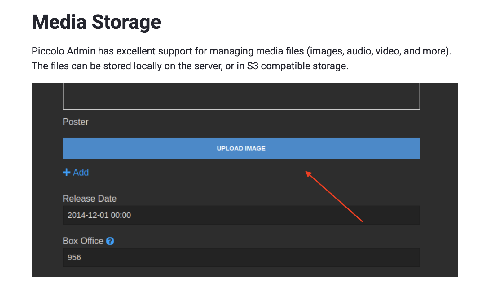
The options are: add a new screenshot and / or make the button UI match.
The problem with using native input select widgets, is they do look out of place. But I think having a big button could be confusing, as it looks visually too similar to the main save button.
Maybe the button is just underlined text, instead of a solid button.
Maybe we just update the docs for now in a quick PR, and then think about a better design?