 patternfly
dropdown and menu items - danger state (for delete / remove actions)
Is this a new component or an extension of an existing one?
Existing component would be the dropdown and menu items.
Describe the feature
When there's a delete or remove action on a kebab menu, it should communicate that it's a dangerous action.
Are there visuals for this feature? If applicable, please include examples for each state and for varying widths
For Cockpit, we have been changing the color of the text.
We have local overrides for this that look like this:
.pf-c-dropdown__menu-item.pf-m-danger {
    color: var(--pf-global--danger-color--200);
}
However, the background of a hovered icon could (and probably should) change in addition to the text itself.
We might want something like isDangerous for the react select item.
Any other information?
Color blind red/blue differentiation works for all forms of color blindness. Even full color blindness can determine different shades of luminance. Additionally the color is just an enhancement of the descriptive text to remove or delete.
Full color

Deuteranomaly
Red-green, most common

Protanomaly
Red-green, less common

Tritanopia
Blue-yellow color blindness

Monochromacy
Complete color blindness, extremely uncommon

@garrett this is an interesting idea. But shouldn't any destructive action require a confirmation dialog before proceeding? Do you have a use case where a delete would take place immediately?
We actually do have a confirmation dialog on these danger/destructive states within Cockpit.
If there's a destructive action that can be undone with an undo action, then having a danger dropdown or menu action could bypass a confirmation dialog, of course. (We don't generally have undos in Cockpit, however, as we usually need to depend on the existing lower-level system services which do not provide a means to undo actions.)
@garrett while I'm not against adding this feature in theory, I'm a bit reluctant to add this as it then begs for clear guidelines about when to use the danger action vs a confirmation dialog. If you still feel strongly about the need for this, I'd encourage you to put this as an item on the PF design share agenda to see if other projects would use this. If there is a more general need demonstrated, then I can get it on our feature roadmap.
@mcarrano: This feature doesn't have anything to do with avoiding confirmation dialogs. It's just marking dangerous actions with a visual style.
A dangerous action would still need to have either a confirmation dialog or an undo, but that's outside of marking something as a dangerous action.
What I'm suggesting here is just visually distinguishing a dangerous action from other sibling widgets (in this case: menu and dropdown items), just like how buttons can look dangerous compared to other buttons.
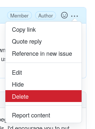
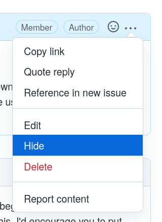
Several other systems have this implemented... a great example is that GitHub does this with their widgets. It's in the ... menu for comments as well as elsewhere:
versus:
@garrett OK. We will take a further look at potential usage and get this on our roadmap.
Examples and possible options: https://marvelapp.com/prototype/1803675e.
Update: go with option 1 in the link
Sketch editable link: https://www.sketch.com/s/82eb6c6a-5ae2-442c-952d-5c0d575f6b06
Apologies, but I can't see any of those mockups.
First mockup link:

Second mockup link:
Hi Garrett, sorry for the inconvenience. Could you try this link : https://marvelapp.com/prototype/1803675e
Thanks! That's a lot better.
Here's an inline image of both options:
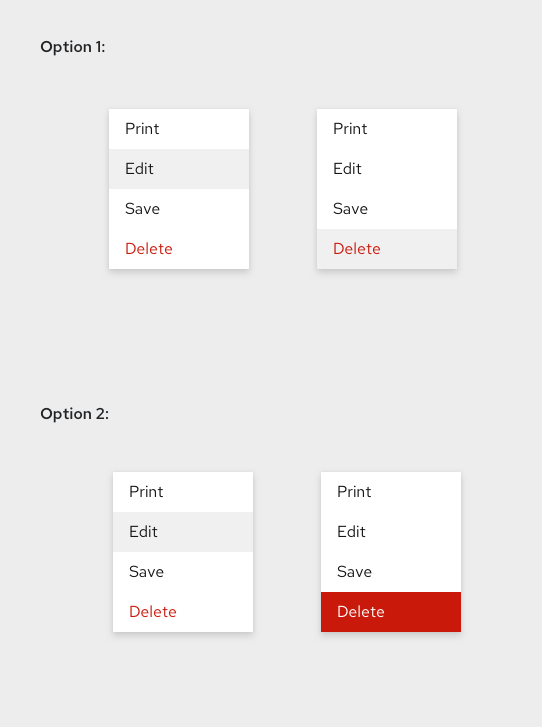
I think since it is a destructive action, it does make sense to highlight that — therefore I prefer option 2, with its hover state of a red background. As pointed out above in this thread, GitHub basically uses option 2.
@garrett thank you for sharing this at the design share today! I like option 2 because it matches the colors for the danger button in PF, as well as how it makes it clear that it is a dangerous action.
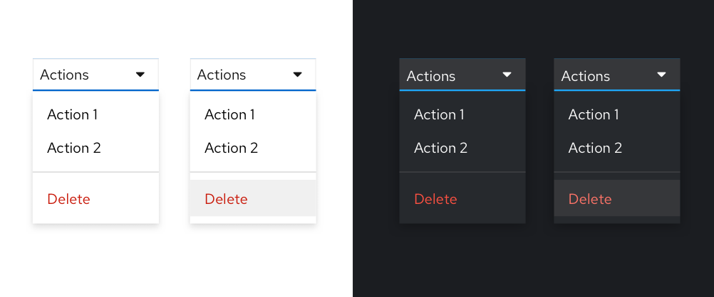
Here's a proposal for option 1 with dark theme as well, a few notes....
- Proposing we suggest to use a divider to separate destructive actions from non destructive actions when they coexist in a menu.
- Our lighter destructive color in dark theme actually wasn't accessible over the background highlight color (which it should be as that is our lightest bg color), so I'm proposing an update to red-8888 in dark theme which is shown in the screen below.
- I'm impartial to option 1 or 2 (agree with @imjoyjean's point above), but leaning towards 1 simply because we don't use a colored background fill as a hover state elsewhere in the system. Also the red text color + mandatory confirmation action should be enough weight to convey they destructive nature of the action.
- Not the strongest point, but it is what makes me lean towards keeping it simple. That being said if the majority prefers option 2 I'm ok with that, I don't have a strong preference.
@mmenestr can you open an issue to add design guidelines for this (if you haven't already done so). I think it makes sense for this to be part of the Menu component. Do you agree?
Yes I agree @mcarrano - opened this issue: https://github.com/patternfly/patternfly-org/issues/3165
Thanks @mmenestr . Closing the design issue in favor of https://github.com/patternfly/patternfly/issues/5057