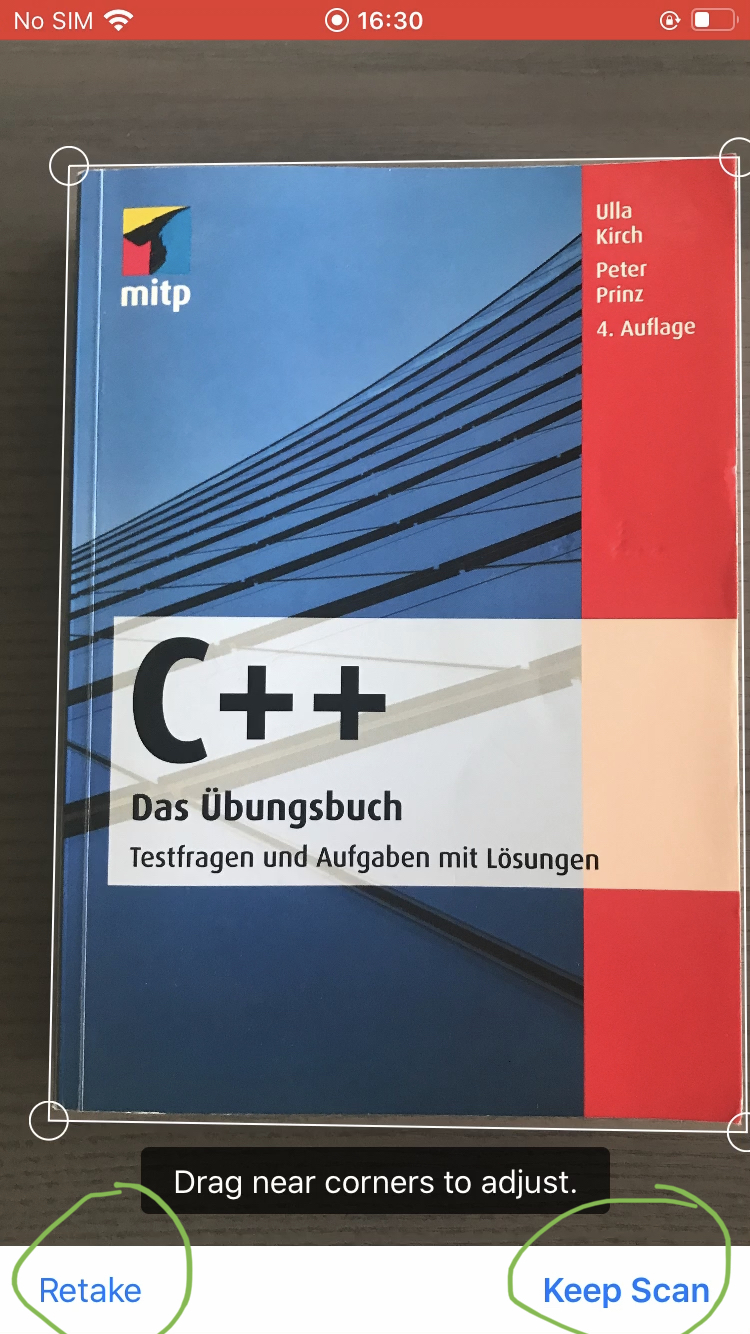
[UX] Users confused with "Retake" and "Keep scan" on refinement screen (shown after suboptimal scan result))
Users who only want to scan one File doesn't click on "Keep Scan (Scanning)" ~~as a consequence they loose the document.~~
"Keep scan" is ambiguous it could mean: a) Keep scanning to get more images b) Keep this scan permanently
Steps to reproduce
- Open the new iOS 1.3.2 App
- Connect to demo.owncloud.org
- List of Files and Folders showed
- Users presses "+" right corner and clicks on "Scan document"
- User scan a one document page
- If the feature detects some quality deficiencies the screen will show "Retake" on the left corner and "Keep Scan" on the right corner on the scan document
Expected behaviour
Users expect "Save" button
Actual behaviour
Based on the user research, participants feel confused and don't know what to do to save their document.
Reference: Video: Participant_SK Min. 0:28 Video: Participant_HP Min 2:44 Video: Participant_AB Min 0:34 Video: Participant_FA Min 8:12 (https://cloud.owncloud.com/index.php/f/5160419)
@CarolinaCst First of all, let me mention that we can't do anything about this screen, since the UI seen in the screenshot is maintained by system component we are using. This screen is actually only presented in case iOS is not able to detect document edges correctly and user has pushed camera trigger button manually.
Secondly, the whole document scanner flow is identical to what document scanner in the system Notes app is using. So, probably users familiar with document scanner in Notes will be just fine with an interface in ownCloud app.
We could put a guide or tutorial before when the user opens this feature the first time.
@CarolinaCst thanks for your proposal in https://github.com/owncloud/ios-app/issues/760