 objectivehtml
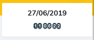
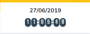
Responsive problems Chrome vs Firefox low resolutions
I'am testing new version js-es6 and on low resolutions, the design is not the same, and I can't see where the problem is. The first one is on Firefox and it's ok, and the second it's on chrome.
It's in the border-radius properties. The style is the same but when it gets resized for smaller screeens, the border radius appears to be more circle-ish because the number containers are smaller. You could change or get rid of the border-radius on the following classes altogether or comment out the properties in the original css file. Below are the classes I changed to make the number containers have regular 90 degree corners again.
 .flip-clock .flip-clock-group .flip-clock-list .flip-clock-list-item-inner .top {
      /*border-radius: .75rem .75rem 0 0;*/
      line-height: 1.33333; }

      .flip-clock .flip-clock-group .flip-clock-list .flip-clock-list-item-inner .top:after {
        /*border-radius: .75rem .75rem 0 0;*/ }

      .flip-clock .flip-clock-group .flip-clock-list .flip-clock-list-item-inner .top:before {
        background: #333;
        opacity: .4;
        bottom: 0; }

    .flip-clock .flip-clock-group .flip-clock-list .flip-clock-list-item-inner .bottom {
      /*border-radius: 0 0 .75rem .75rem;*/
      line-height: 0; }

      .flip-clock .flip-clock-group .flip-clock-list .flip-clock-list-item-inner .bottom:after {
        /*border-radius: 0 0 .75rem .75rem;*/ }`
It would probably be better to change those to em values versus rem values so that they scale correctly.
@tbone849 yes, I am aware. I am the one who committed those styles about 8 years ago. ;)
This was more just a helpful comment if someone wants to keep the rounded corners and have them scale properly. The styles probably need to be updated in the project itself... but I suspect this project has become dormant.