Wi-Fi / Ethernet Connection progress bar in left pane is not very relevant
Hey! I gave Resources a spin, and it looks superb!
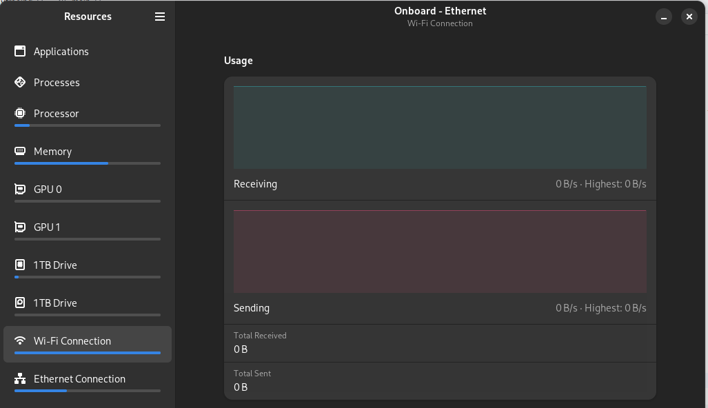
One thing that jumped out at me however is the Wi-Fi and Ethernet Connection progress bars. It's not very relevant beyond telling you that, yes, the network is being used.
It looks like it's a percentage between the current usage and the highest usage, but without knowing the highest usage (as you wouldn't when looking at the side bar), it's not very relevant.
I think it would be better if the actual speed were displayed in the left bar, or at least have a notch for 1, 10, 100 or 1 Gbps, depending on in what ballpark the "highest" value is.
Thank you so much!
Yeah, I agree, the progress bar for network interfaces is not the most useful. 😅 Though I feel like putting only text for network interfaces makes the sidebar look less uniform, and I'm already not too happy about the Processes and Applications sidebar items not having progress bars. Maybe I could add text to all sidebar items (Memory shows usage in GBs and so on), hopefully that won't look to cluttered?
It's hard to visualize what would be the best approach. Maybe a split on the side bar like "Ethernet | S: 0Kbps R: 0Kbps"? This could apply to everything like saying your write and read usage by the Drive. Using this method I think everything would be uniform while giving you that extra information.
It's hard to visualize what would be the best approach. Maybe a split on the side bar like "Ethernet | S: 0Kbps R: 0Kbps"? This could apply to everything like saying your write and read usage by the Drive. Using this method I think everything would be uniform while giving you that extra information.
I was thinking putting the speeds in small, light-coloured (and maybe bold) font where the progress bar currently is.
I don't think I'd be worried about uniformity since most machines have multiple network adapters, and so you'll be seeing this format multiple times in the side bar.
As for the terms to use, it could either be S or R for sending / receiving, or U / D for Upload / Download, or Rx / Tx for Receive / Transmit (which could be more language agnostic as those are industry terms, and thus you don't have to worry about translations messing up your spacing)
My concern here however is it might be too hard to read, and thus not accessible, but I don't know if someone with sight problems would be able to discern the blue from the gray on such a thin progress bar.
I do like the look of that. For the accessibility maybe make a larger pop-out text on hover?
For me personally I would just remove the progress bars completely as they add little to no information. I would much rather have the prior example on everything for quick and easy information. I'll see if I can do some tinkering and come up with some drafts.
Heya, I am just going to add here that I also find the progress bars to be a little of putting.
e.g. this is what I see when I have my wifi disabled:
Anyhoo, great stuff!
Heya, I am just going to add here that I also find the progress bars to be a little of putting.
e.g. this is what I see when I have my wifi disabled:
Anyhoo, great stuff!
Hi, I'm glad you like Resources! The full progress bar despite there never being any activity on the network interface should be fixed with Resources 1.1.0, which will be released on Flatpak in about less than three hours.
Oooh, looking good! Could you also add a setting to choose between bytes per second (B/s) and bits per second? (b/s or bps)
I still think the progress bars don't add any quick information for how much room they take up. Also, maybe change "GPU" to "Graphics" as "Processor" is not "CPU" same with "Memory" not being "RAM". Would look more uniform.
I have a lot of things to comment on about this application but I don't want to spam this repo. Do you have a Matrix channel or something where I can reach out Nokyan?
I mean that's what GitHub Issues are for, but my Matrix username is @nokyan:matrix.org
Closing this because sidebars have graphs now and I think the wanted features here are implemented now. ^^