[enhancement] Make it easier to change main graph X-axis
I find that I accidentally change from a 6 hour to 12 hour display when trying to scroll down to see the other graphs. If this happens, it takes some time to progress through the 18 and 24 hour displays as each takes a time to refresh and allow the next change. What about a pop-up menu or button bar on a long click -> 24 18 12 6 to allow an immediate switch to the required setting? xDrip and NightScout both provide similar buttons as UI options, but I don't think AAPS has room for permanent controls.
Previously it was possible to switch through the different time ranges quickly. Just in the past time it came that it take a long time also with an alert that the app isn't responding and if I want to close the app or wait. So I personally would be fine with both variants. 1. Klick and hold to quickly go through all time ranges or 2. Go with a pop-up to select it.
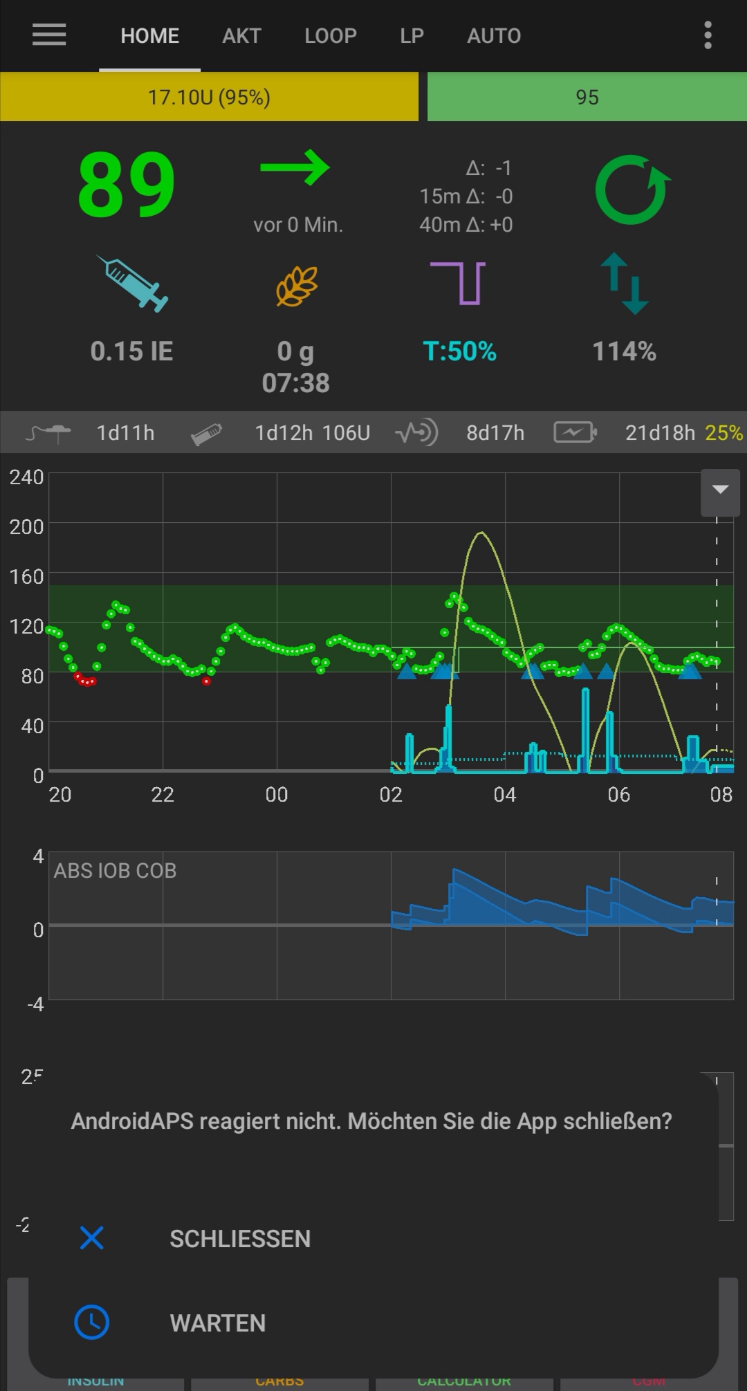
there is already some work in progress to improve this beavior. it's slow because if you switch rande to see mora data in the past, data must be calculated first. it may lead to unresponsive app on slow phones
Slow...slow phone. 🙁 @MilosKozak I think I got your broad hint to buy a new phone. 😉
Hey, I have a little suggestion for the graph: Why not enable (horizontal) scrolling and scaling and completely ditch the „hold to switch between the views” approach? You are using the the „GraphView”, which according to this Wiki already can easily enable this functionality: https://github.com/jjoe64/GraphView/wiki/Zooming-and-scrolling
there is already some work in progress to improve this beavior. it's slow because if you switch rande to see mora data in the past, data must be calculated first. it may lead to unresponsive app on slow phones
Also, in regards to this issue: this would no longer be a problem once you use this viewport + scrolling/zooming implementation, because the data will all be loaded fully, and you simply „zoom around in it”.
On modern multi-touch screens "pinch to zoom" is the usual way. The display does get crowded between the pump, insulin and algorithm data. This is not the feature to drop everything and fix, but the zoom level on the graph does not behave as expected in terms of what people are used to. When in a bit of a panic, multiple layers of text overlaid on top of each other is difficult to sort out.