react-datasheet-grid

react-datasheet-grid copied to clipboard
 nick-keller
How can I use default textColumn based on a row cell state focus and active but use my own component when its not
Due to the size of sting values I implemented a TruncatedText component that would show the rest of the string in a tool tip on hover, but what I want to do is to change the component back to default textColumn on focus & active,
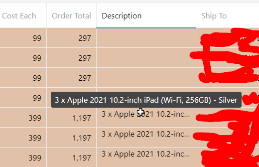
This is how my component looks like when hovered and focus & active = false
so when I click the cell I want the component to be textColumn type but I cant return that in my custom component.
function WithTooltipInput({ rowData, active, focus }: any) {
  console.log("INTPUT RENDER");
  console.log("focus", focus);
  console.log("active", active);
  if (focus && active) {
    console.log("RENDER INPUT textColumn ")
   // return textColumn({ rowData, active, focus });
  }

  return <TruncatedText text={rowData.description || ""} />;
}
and this is how I use my custom component
    {
      ...keyColumn<Row, "description">("description", textColumn),
      title: "Description",
      minWidth: 200,
      // component: ({ rowData }) => (
      //   <TruncatedText text={rowData.description || ""} />
      // ),
      component: ({ rowData, focus, active }) => (
        <WithTooltipInput rowData={rowData} focus={focus} active={active} />
      ),
    },