Suggestion for the UI for PiClock2
(Been a while since I commented on here!)
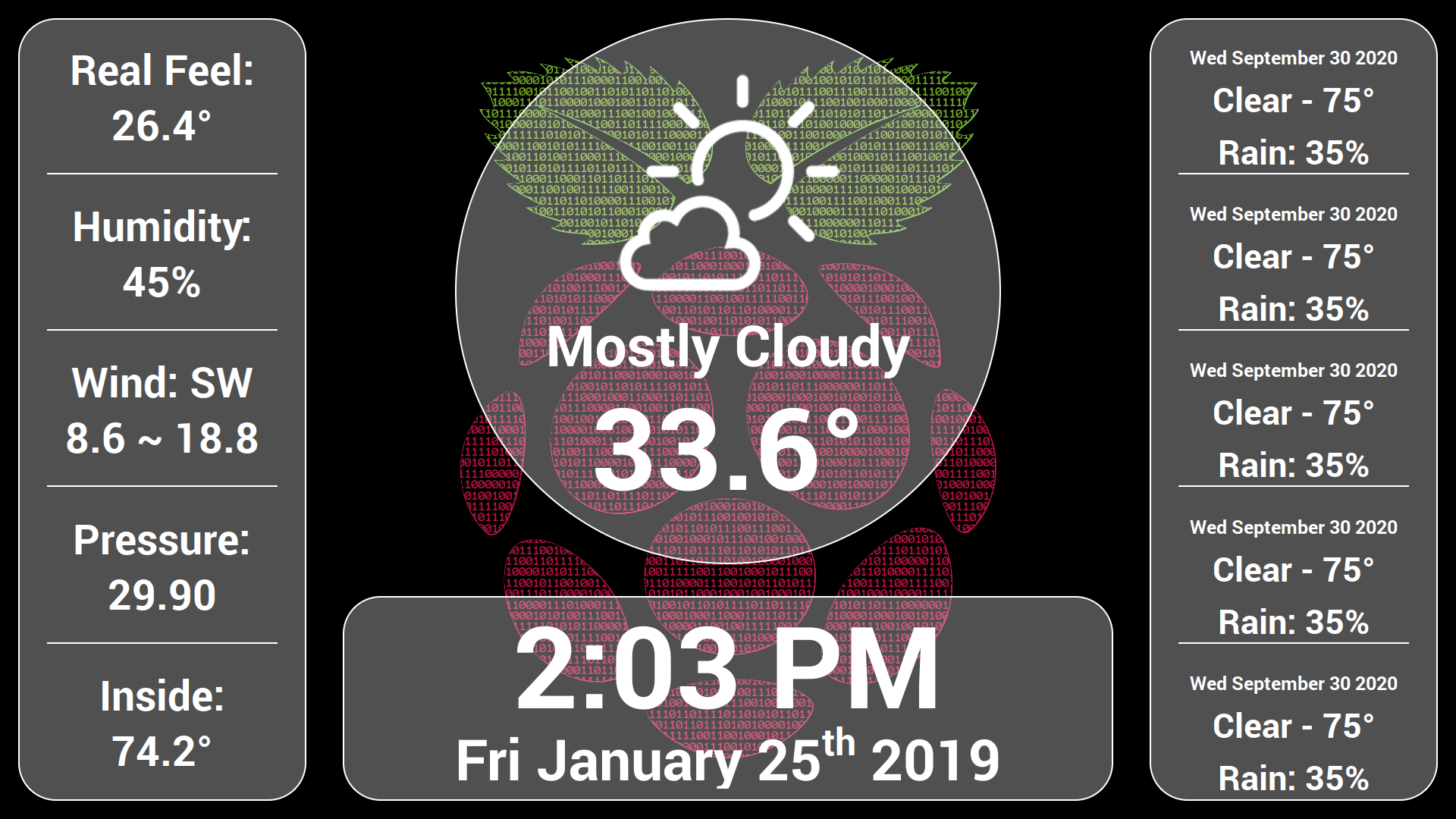
I was thinking recently how the new Ui could look for the PiClock 2, and I decided to create a mock up of what I believe would be a good looking design.
Here was my idea:
Some general things about this mock up:
- The background will be dynamic and will change according to the current weather conditions.
- The bar at the top is a "progress bar" that will show how long is left before the pages will switch, roughly like 10 seconds or so per page.
- There will be 3 pages, the front page for current conditions and the hourly forecast, a page displaying the 7 day forecast, and a page displaying the Radar for the current location.
- Between each page, preferably lasting no longer than a second, a transition of some kind would happen, with maybe the elements of the old page sliding off to the left, and the elements of the new page sliding in from the right.
If y'all like this idea, or want to see what the other pages might look like, I'll gladly create the mock-ups for those, as well as other scenes for different weather conditions.
Let me know what y'all think! 😃
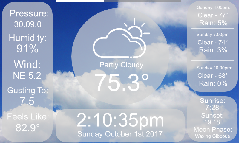
Could be a good layout for a small screen for people using the PiClock as an alarm clock, or just wanting a simplified layout. I wouldn't use it since it lacks the forecast and radar. Cycling through the screens is useful if they each provided different information, but this provides a subset of the same information as the main screen so I don't really see a use there. Being a layout option replacing the main screen seems like a better fit to me, but then I'd like to see another screen to handle the forecast data.
Even though I wouldn't use it, I would happily review a PR adding this screen as a module.
*cough* *cough* PR @hsoj95 *cough* ;-)
Yeah, it would work absolutely fantastic on the default 800x480 touch screen that the foundation sells with the Pi. It would have a forecast and radar section, hence the progress bar at the top. It would switch between the front/current conditions page, the forecast page, and the radar page every ten seconds. For the Americans reading this, yes I was aiming for a "Local on the 8's" style weather lineup! 😜
I'd love to do a PR on this, but, um... this is just an artistic mock-up I made in Affinity Photo. I know barely any Python code, and no UI code whatsoever in Python at least. I'd love to see something like this made into a user interface, but I definitely won't be the guy who can make it. Now, I could probably build this in Node.js and Electron pretty easily! But then that'd be a TOTALLY different app to begin with. In all honesty, it's flattering that you thought I actually hard coded that artistic mockup! 😄
Anyways, this was just my idea for what I thought would make a stylish, yet functional, replacement for the user interface. One that'd be more responsive, interactive, and more modern looking! I'll leave it up to y'all if you wanna implement it! 🙂
@SouthernWolf95 Thanks for the inspiration. I've been looking to buy a digital picture frame for a elderly family member but they all tend to be buggy, unreliable and have poor quality/ small screens.
Took your design and rolled and clock/forecast/slideshow device for them. Pictures play continuously behind the info panes which can be hidden from their cell phone using MQTT so they can watch the slideshow. Still working on the layout for the right hand forecast pane but the bones are done.
Maybe someone could help me with a fading transition script for PyQt...........