blurts-server

blurts-server copied to clipboard
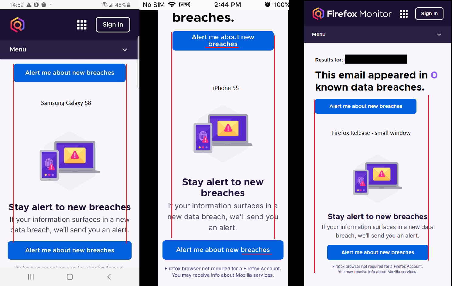
[Experiment] There are differences of alignment/size between the two “Alert me about new breaches” buttons on the mobile layout
[Affected Versions]:
- All
[Affected Platforms]:
- All
[Prerequisites]:
- You are on https://blurts-server-review.herokuapp.com/?experimentBranch=vb using a mobile browser or a desktop browser resized small enough for the mobile version to be displayed.
[Steps to reproduce]:
- Enter an uncompromised email address in the “Enter Email Address” field.
- Click the "Check for Breaches" button.
- Observe the two “Alert me about new breaches” buttons on the “/scan” page.
[Expected results]:
- The two buttons have the same alignment and size.
[Actual results]:
- The two buttons have different alignments and sizes.
[Notes]:
- This issue is also reproducible on the Control branch and in production, but it is less noticeable due to the two links being different types (text vs button).
How should this behave with breach results in there? It has a different padding line too. Can you point me to the spec and I can make it match? Specifically, the button isn't centered on mobile/tablet bc the rest of the headline text is also left-aligned.
Closing since we've redesigned the site and functionality since this was created. If you feel that this is still needed, please let me know.