Landing page: Firefox for Families
Description
Landing page for Firefox for Families campaign.
Creative review with channel owners Aug. 12
Go live Sept. 6
Design (Mozilla only): https://www.figma.com/file/zEWcXI6tFGtGcEvdwBWYz0/Firefox-Families?node-id=100%3A1597
To-do:
- [x] New page scaffold (template folder and view logic)
- [ ] Layout with placeholder content
- [ ] Interactive/Animated elements (horizontal scroll card content, cookie joke banner, marquee)
- [ ] Printable PDF in agreement section
- [ ] A11y review
- [ ] GA data attributes & UTM params
- [ ] Final content
- [ ] Final media
If time:
- [ ] Social share in agreement section
- [ ] Subtle content appearance animations on scroll
@maureenlholland there is not. We can work with studio team to come up with some options.
Please add your name beside the task so we avoid duplicate work and open a PR against the feature branch when ready so I can keep track of the updates
DESIGN/COPY NOTES from demo reviews (Mozilla only): https://docs.google.com/spreadsheets/d/17SH9BTWKnYtmU1ukek2fEKLqMFr4kc1ctDSeyEtV6sg/edit#gid=0
Grab-bag tasks:
P1 Responsive layouts (see notes at bottom)
- [x] Hero @nathan-barrett
- [x] Privacy @nathan-barrett
- [x] Mental Health @nathan-barrett
- [x] Bullying @maureenlholland
- [x] Public Wifi @maureenlholland
- [x] Download Fx @maureenlholland
- [x] Passwords @maureenlholland
- [x] Private mode @maureenlholland
- [x] Agreement @maureenlholland
- [x] Dad jokes banner (Styling: fixed to bottom, JS: dismiss on "Agree" click, New copy: "By using continuing to use this site, you consent to allow dad jokes") @maureenlholland
Other clean-up
- [x] Subnav responsive breakpoint collapse (around 950px) @maureenlholland
- [x] Black border between sections @maureenlholland
- [x] Add logo + white "Firefox" text wordmark for hero and download sections @maureenlholland
- [x] Download section: JS logic to check IF is Firefox AND is default, hide others and show mobile.
- [x] CTAs, subnav, banner: add/check analytics @maureenlholland
P2 NOTE: these tasks are moved to follow issue: https://github.com/mozilla/bedrock/issues/12091
- [ ] Tests for Download button and subnav links
- [ ] Download section fine-tuning: reduce heart size and incorporate design feedback: <3 emoji is sitting high, can lower on the baseline and close up spacing on either side
- [ ] Replace Stop & cursor combined image with separate images (one for text & one for cursor)
P3 Enhancements (with potential performance improvements from fewer images)
- [ ] Tech Talk lockup (can we do this with HTML/CSS instead of image?)
- [ ] Hero grid background (can we do this with linear-gradient and 3d transforms instead of image?)
Also all the individual sections will need a lot of polish, they are in basic blocky responsive layouts to facilitate a discussion on how we want to transition from desktop to mobile layout. Those will be individually added here once I can include comments on how those transitions should happen (i.e. across tablet sizes)
Update 24/8 after discussion with Melissa
General
- section max-width should be reduced to 1250px (update 26/8: this might be close enough to the Protocol xl content container width available with
mzp-t-content-xlclass, if not, we will override this class in the main F3stylesfile) - parental pro-tip title should stay center aligned, avoid single words on bottom line as much as possible
- subnav should collapse around 950px (before pushing links to next line)
Hero
- Tech Talk lockup shouldn't go below 500px width, card should bump to 2nd row centered when it runs out of room
Privacy
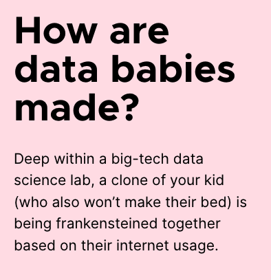
- min character width on content should allow "data babies" to stay on one line
- bump blurb under content & card first, then bump card if needed
Mental Health
- needs to start stacking around 1178px
- don't let the browsers get too wide when stacked
Bullying
- row 1: content, heart, card; row 2: blurb
- on smaller screens, add card to row 2
Public Wifi
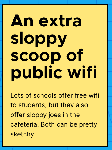
- min character width on yellow card should allow "public wifi" to stay on one line
- don't let cards get too wide when stacked
Passwords
- min character width on content should allow "word about" to stay on one line
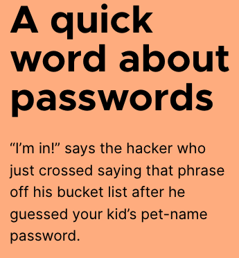
- show/hide appropriate-length password (mobile will have shorter text, desktop will have longer, see comments in Figma)
Private Mode
- bump blurb to row 2 first
- don't let browser/cards get too wide when stacked
Agreement
- min character width on content should allow "You made it!" to stay on one line
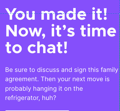
NOTE: we hit a color contrast accessibility error in this section, so need to darken the background violet to $color-violet-60