 modelica
Usability/formatting issues with generated HTML spec
This tickets is intended to collect issues with the generated HTML spec, so that we can find someone to fix it in one bigger round:
Mobile specific:
- [X] Menu button is tiny on mobile (I did not manage to press it, even when zooming in) #2932
- [X] Title link is pressed instead of menu button on iOS #2933
Desktop specific:
- [ ] Width of table of contents (left bar) cannot be adjusted in order to see full headings; reduce the need for this #3073
- [x] When clicking on some heading in the table of contents (left bar), the document jumps to the right spot. But, the selected heading is hidden by the header bar.
- [x] Text does not adapt to width of browser window. I only found this for for Chapter 2 in one column mode on Desktop. Strange.
General:
- [x] Missing full text search of HTML spec is handled in #2404
- [ ] In one-column mode, you cannot use the menu to navigate to a sub-heading, directly? Acceptable
- [x] The footer is missing white space between links (looks like: HeadingReferencesIndex)
- [x] Missing white space after latex commands, e.g. use LaTeXfor formatting
- [x] Formulas are displayed very small compared to surounding text on Firefox (Desktop) and Safari (Mobile). Did not find this issue on Chrome. E.g. DAE representation; All sizes adjusted in #3072
Test enivronment:
- Desktop: Firefox 84 and Chrome 87 on Windows 10
- Mobile: Safari on iOS 14.3 on iPhone 11 Pro
For me, this is close to a blocker for the 3.5 release. Or can we update web view after releasing the official documents?
I would say that these issues can be corrected after the release on the 3.5 branch and on master, as they don't influence the actual semantics of the specification.
I agree that they are annoying, but not completely breaking stuff. E.g., the mobile stuff sort feels awkward, but at least you can click on the main document on top and then use the table-of-contents so you can read the specification.
@GallLeo, it's great that you report all these issues, and unfortunate that it might be too late to fix them for the release of 3.5.
However, rather than just keeping committing fixes to the maint/3.5 branch and secretly publishing new builds, I think it might be time for us to try to take versioning more seriously, and actually release a second revision of 3.5 once we are more satisfied with the formatting. I find this important only because the files we need to modify are part of the same repository that holds the specification content, and I'd like to be able to look at the published HTML files and be sure that the version shown in the HTML has an obvious mapping to a version tag in the central repository.
Alternatively and a little bit less constraining, I think we should begin to use git-describe to automatically build the version strings seen in the documents, so that it would say something like Modelica Specification Version 3.5+4-a1b2c3d4 for a build of commit a1b2c3d4, which is 4 commits ahead of the tag 3.5. (For a tag build, the string should just be the name of the tag.) This way we can make changes and be open about publishing documents that don't correspond exactly to tags, but since non-tag builds get an ugly version string, there will be a strong incentive to soon tag and publish a new revision.
In my opinion, there has been a lot of improvement over where we started after the initial transition to LaTeXML, and I am well aware that much more can be done. However, getting attention to style during the development towards 3.5 has not been easy, and we seem to lack persons who have enough understanding of both web design and the technologies we use (LaTeXML, CSS, etc) to work effectively on these matters. Short of that, I've tried to step in to make our first release with LaTeXML look as good as possible and be useful both on large and small screens, and I'm not the least surprised that the result isn't up to standards. Maybe releasing a first version is necessary to make an expert somewhere realize we could really use a helping hand…
This tickets is intended to collect issues with the generated HTML spec, so that we can find someone to fix it in one bigger round:
Mobile specific:
- [ ] Menu button is tiny on mobile (I did not manage to press it, even when zooming in)
When using Safari on my iPad, I need to make a long tap to expand the menu. Did you try that?
Desktop specific:
- [ ] Width of table of contents (left bar) cannot be adjusted in order to see full headings
Because I didn't know how to do that. Note that the collapsed side bar is actually much wider when expanded, so I recommend using a more narrow window (which will trigger the collapsing). A side bar that would fit every line of the table of contents would be extremely wide (and wrapping lines causes worse trouble in the vertical direction instead), so any fixed (or default) size needs to be a compromise between showing enough of the section titles and not completely destroying the page layout. The reason that the sidebar doesn't collapse for all window sizes is because of feedback I received within Wolfram MathCore when working on the layouts.
- [ ] When clicking on some heading in the table of contents (left bar), the document jumps to the right spot. But, the selected heading is hidden by the header bar.
Good point. Given the structure of the generated HTML, can you see how to adjust the CSS to fix this?
- [ ] Text does not adapt to width of browser window. I only found this for for Chapter 2 in one column mode on Desktop. Strange.
True. This must be because of the extremely long pre-formatted Q-CHAR line.
General:
- [ ] Missing full text search of HTML spec is handled in #2404
- [ ] In one-column mode, you cannot use the menu to navigate to a sub-heading, directly?
Is the "one-column mode" the same as having a collapsed side bar? As far as I understand one must always first select chapter, and then find the sub-heading (since the menu is statically generated for each chapter).
- [ ] The footer is missing white space between links (looks like: HeadingReferencesIndex)
Right. I think we should just hide the special footer links with rel="bibliography" and rel="index".
- [ ] Missing white space after latex commands, e.g. use LaTeXfor formatting
Fixed by #2829.
- [ ] Formulas are displayed very small compared to surounding text on Firefox (Desktop) and Safari (Mobile). Did not find this issue on Chrome. E.g. DAE representation
I can't say I immediately see much of a difference between Safari on iPad vs desktop Chrome. However, the math font size is a compromise between matching normal text and inline code, and priority was given to the size of inline code since this is the more common context. This does make math look small compared to normal text. Maybe both math and inline code could be made a little bigger…
- [ ] Menu button is tiny on mobile (I did not manage to press it, even when zooming in)
When using Safari on my iPad, I need to make a long tap to expand the menu. Did you try that?
Background: You probably expect this kind of effect to be handled using a tiny bit of basic JavaScript. I tried that first, but had to give up as I couldn't figure out how to do it without modifying the LaTeXML XSLT. The reason I think one would need to modify XSLT is that I think one would need a new real content element (not a pseudo element like the current, CSS hoverable, hamburger). The problem I see with modifying XSLT is that I don't know how to make modifications in such a way that it will remain straight-forward to upgrade LaTeXML, which I believe will be important for many versions to come.
- [ ] Text does not adapt to width of browser window. I only found this for for Chapter 2 in one column mode on Desktop. Strange.
True. This must be because of the extremely long pre-formatted
Q-CHARline.
Fixed by #2831.
- [ ] The footer is missing white space between links (looks like: HeadingReferencesIndex)
Right. I think we should just hide the special footer links with
rel="bibliography"andrel="index".
Fixed by #2832.
General:
- [ ] Missing full text search of HTML spec is handled in #2404
Please also give the completely rebuilt document index a chance (I use it all the time, but the coverage of the index is clearly biased towards my needs and expectations), and help us improving it by reporting relevant search misses.
General:
- [ ] Missing full text search of HTML spec is handled in #2404
@GallLeo I set up a full proof of concept (see https://github.com/modelica/ModelicaSpecification/issues/2404#issuecomment-766108466). Please comment there!
General:
- [ ] Missing full text search of HTML spec is handled in #2404
@GallLeo I set up a full proof of concept (see #2404 (comment)). Please comment there!
This is now fully merged.
To me one possibility would be that we make a contract for someone to improve the remaining layout issues for the document.
As for:
- Formulas are displayed very small compared to surounding text on Firefox (Desktop) and Safari (Mobile). Did not find this issue on Chrome. E.g. DAE representation
To me the issue in Chrome and Edge is that there instead is too much white-space between the formulas. The size-difference between the formulas is noticeable but not too distracting at the moment. In Chrome/Edge b in text is 12 pixels and serifed f in formula is 12 pixels; whereas Firefox has 12 pixels in text and 14 in formulas I think.
Isn't the use of Mathjax in some browsers part of the problem here? Maybe it would be wiser to wait for native MathML support in all major browsers, so that the layout can be addressed without having to pay attention to what it looks like in Chrome with Mathjax?
This detail about math content aside, I think getting some help from a skilled web designer is a very good idea. However, wouldn't it make sense to raise this question on the MA level instead, to avoid that different MAPs spend resources on designs developing in different directions? Of course, the different MAPs using different technologies for producing their documents makes it easier said than done to achieve a complete coherent design…
Another problem with our HTML specification is that it isn't as easily accessible as it could be. If one starts at https://modelica.org/, and then go to Modelica Language, you end up on https://modelica.org/modelicalanguage.html, which isn't exactly something to be proud of when comparing to the other MAPs – we could really use some web design expertise here! While there's a link to specification PDF, there's no mention of the HTML variant.
Maybe it would be wiser to wait for native MathML support in all major browsers, so that the layout can be addressed without having to pay attention to what it looks like in Chrome with Mathjax?
Chrome and other Chromium-based browsers like Edge have a lot more than 50% of the market share (about 68%); followed by Safari (22%) and neither have implemented it. For Safari we also have to consider mobile support.
Another problem with our HTML specification is that it isn't as easily accessible as it could be. If one starts at https://modelica.org/, and then go to Modelica Language, you end up on https://modelica.org/modelicalanguage.html, which isn't exactly something to be proud of when comparing to the other MAPs – we could really use some web design expertise here! While there's a link to specification PDF, there's no mention of the HTML variant.
Redesigning the project pages is a different topic that's already being worked on.
Menu button is tiny on mobile (I did not manage to press it, even when zooming in)
Actually, all of the text is similarly small. The font-size is 1rem ~ 16px ~ 12pt which is the same as for https://specification.modelica.org, but the text on that page is much bigger. So this must have something to do with scaling of all the @media screen, div elements, etc in some way. I'm not sure how. On desktop, the sizes of text is the same in both pages.
It seems inserting <meta name="viewport" content="width=device-width, initial-scale=1"> makes the size OK in my emulated Chrome mobile. Putting the text here as I'm quite tired and might forget I was supposed to work on this.
One challenge to keep in mind regarding font size is all the listings which have been carefully formatted with hard line breaks to fit the PDF document. This makes the content rather wide, and if you try to fit that to a small phone screen in portrait mode, the browser needs to scale everything down to pretty much unreadable size. I've accepted this problem, and learnt to view the pages in landscape mode, allowing everything to scale up considerably and giving me highly readable font sizes – and icons for the table of contents and document index.
To me, this shows that this is a bigger problem than just scaling up font sizes, since readability of the listings is also essential to the reading experience. Having to scroll listings sideways is not an attractive option, and neither is allowing lines to break in uncontrolled ways. I'm just saying this so that we don't invest too much effort in scaling up text, if the end result is still so useless in portrait mode that the reader will flip their screen anyway and get the same experience I have today.
- [ ] When clicking on some heading in the table of contents (left bar), the document jumps to the right spot. But, the selected heading is hidden by the header bar.
It seems I've forgot to mention in the comments that this has been fixed. I'll tick it off in the opening comment. Feel free to untick and point out remaining issues with this if you are aware of any.
@sjoelund, how about adding a banner i "portrait mode on small screens", recommending the reader to switch to landscape mode?
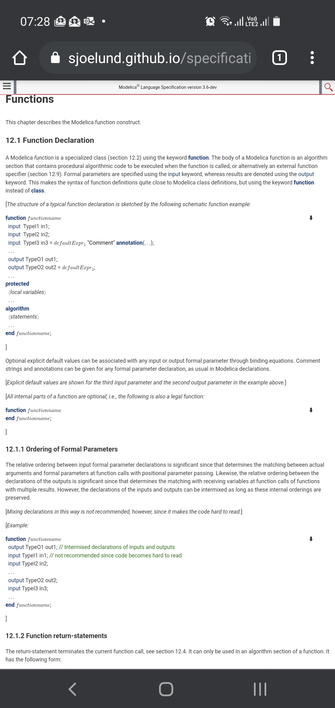
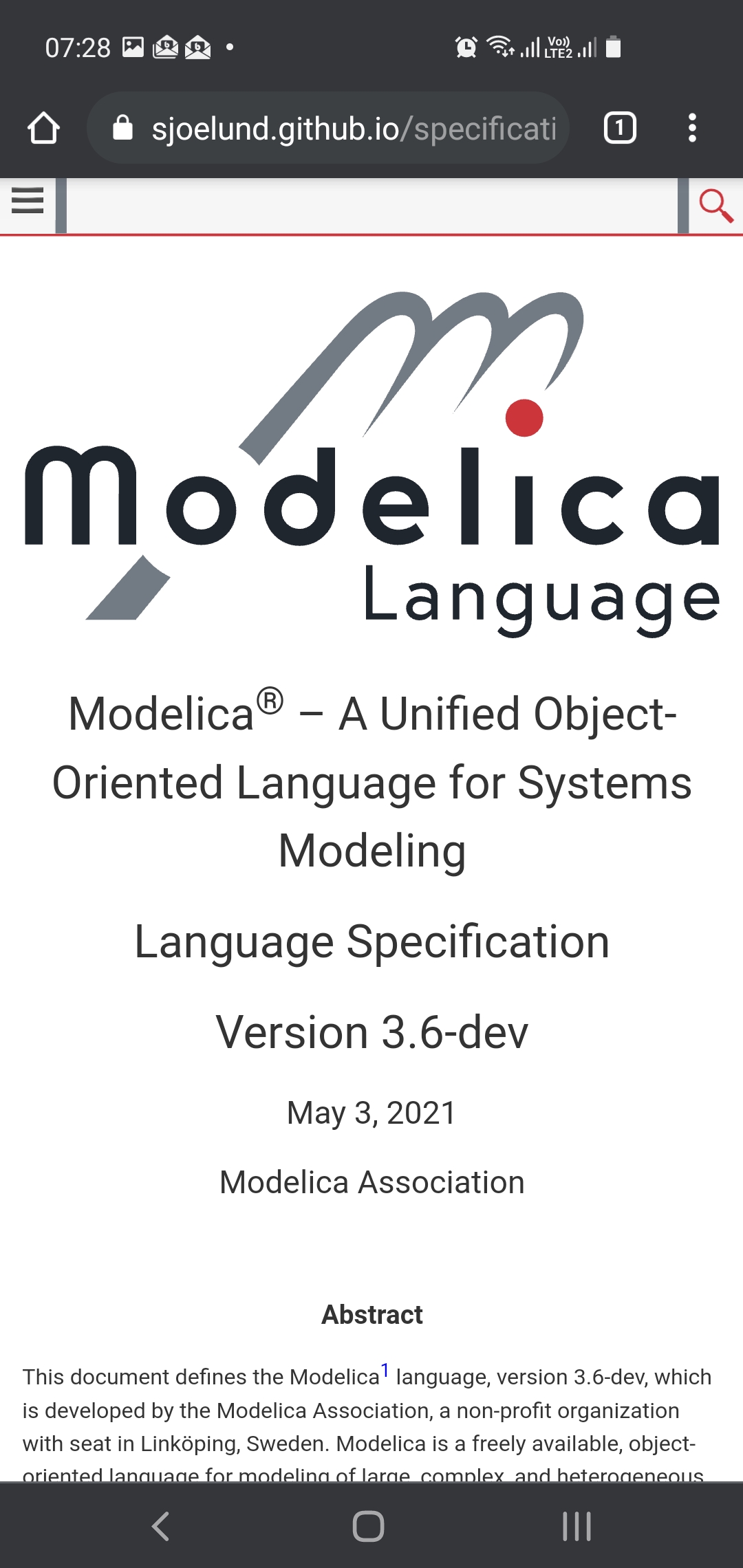
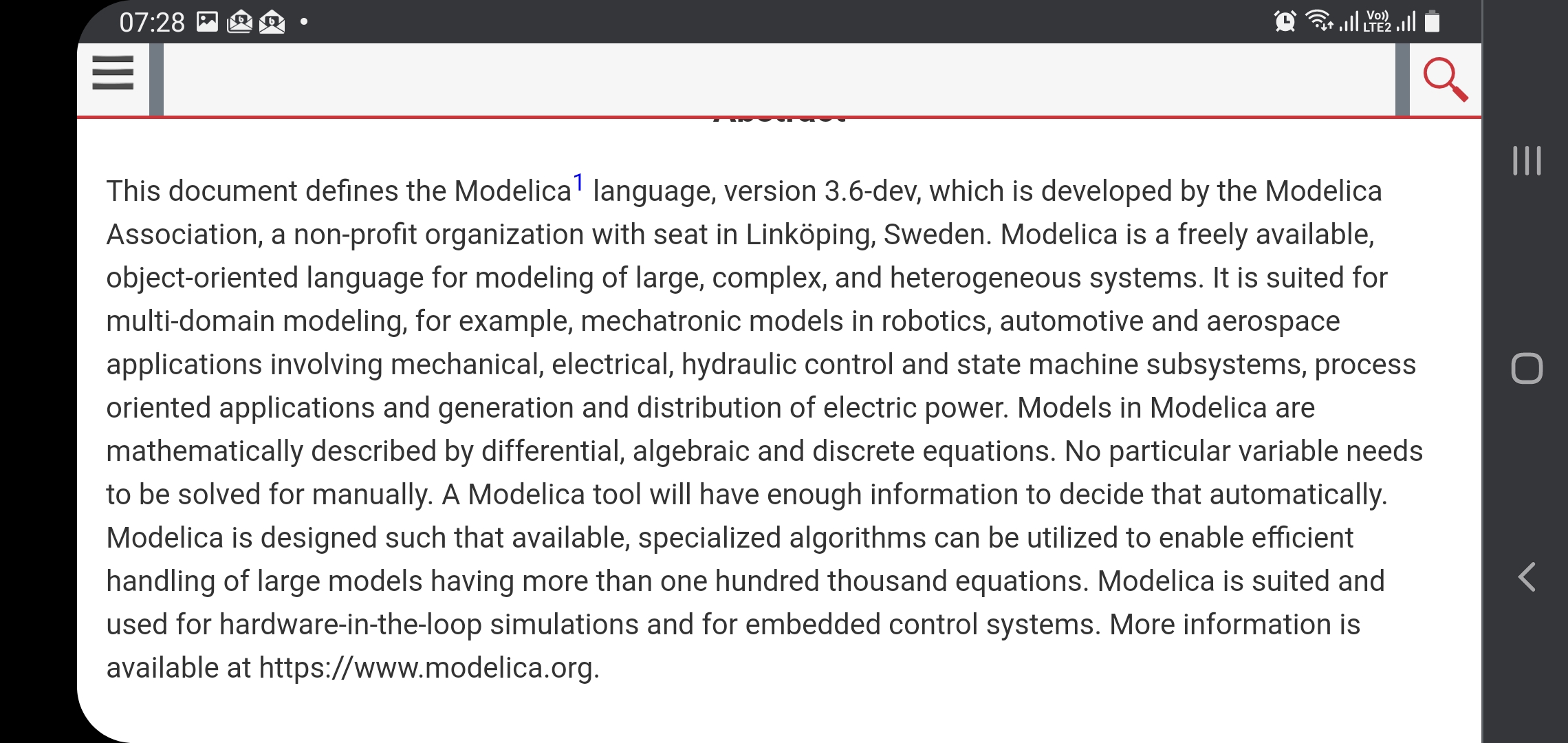
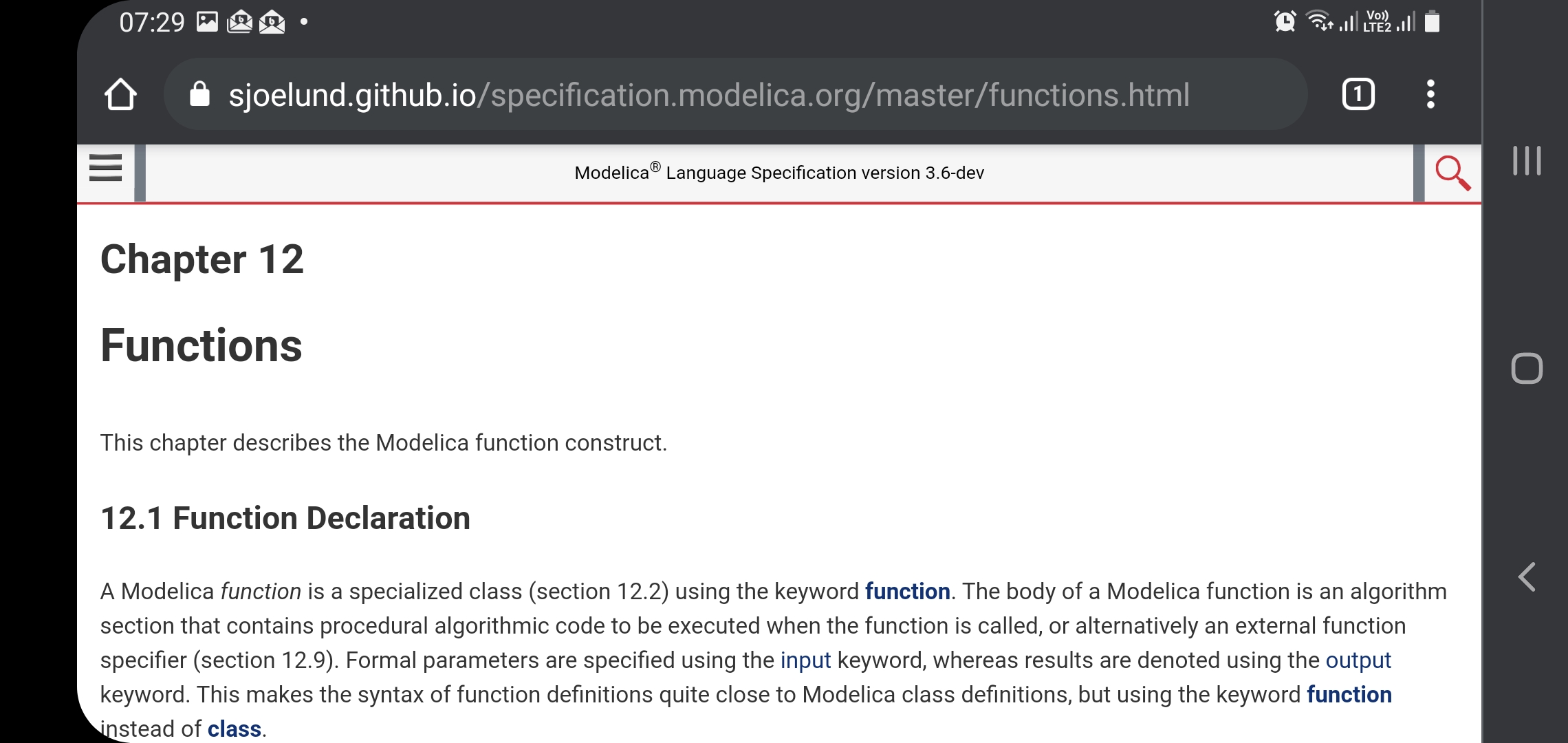
Attached are images of Chrome in landscape. The first page is with the meta viewport added (I guess you need to customize the latexml xsl transforms to get it in the document for real). The other page is without changes. Both have portrait and landscape modes for comparison. I think the landscape is viewable only in landscape (and then the button works).
I'm also unsure how to create a banner in a good way for portrait mode. And how to make that not appear when I try to use portrait mode on my computer (which is totally fine).
And for comparison, the recommended text size in portrait and landscape modes.
@henrikt-ma what do you think is the best way to add the tag? Have someone figure out what the best way to customize latexml is or a one-line sed-script to patch the generated files?
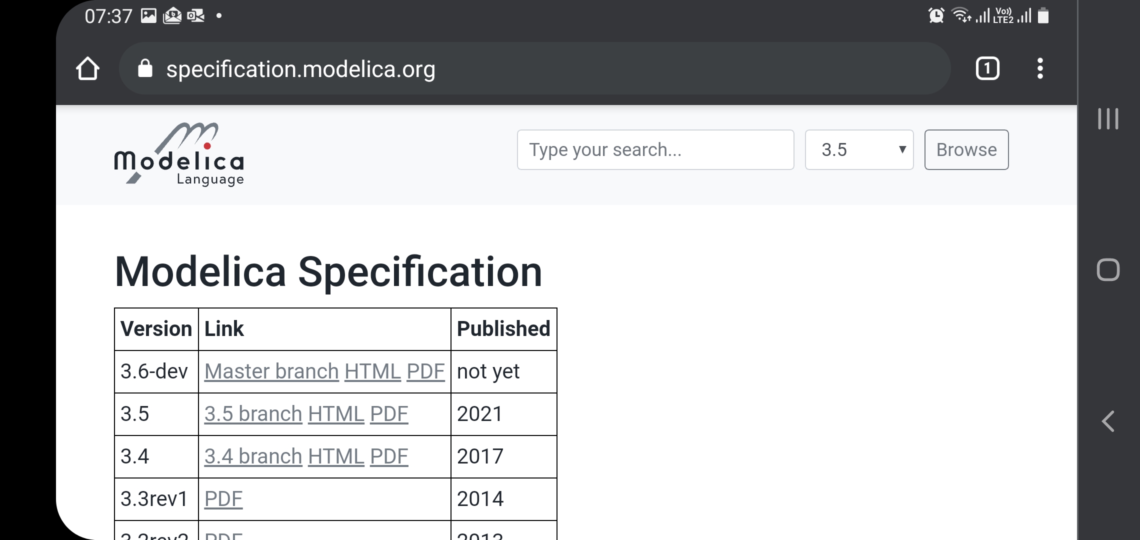
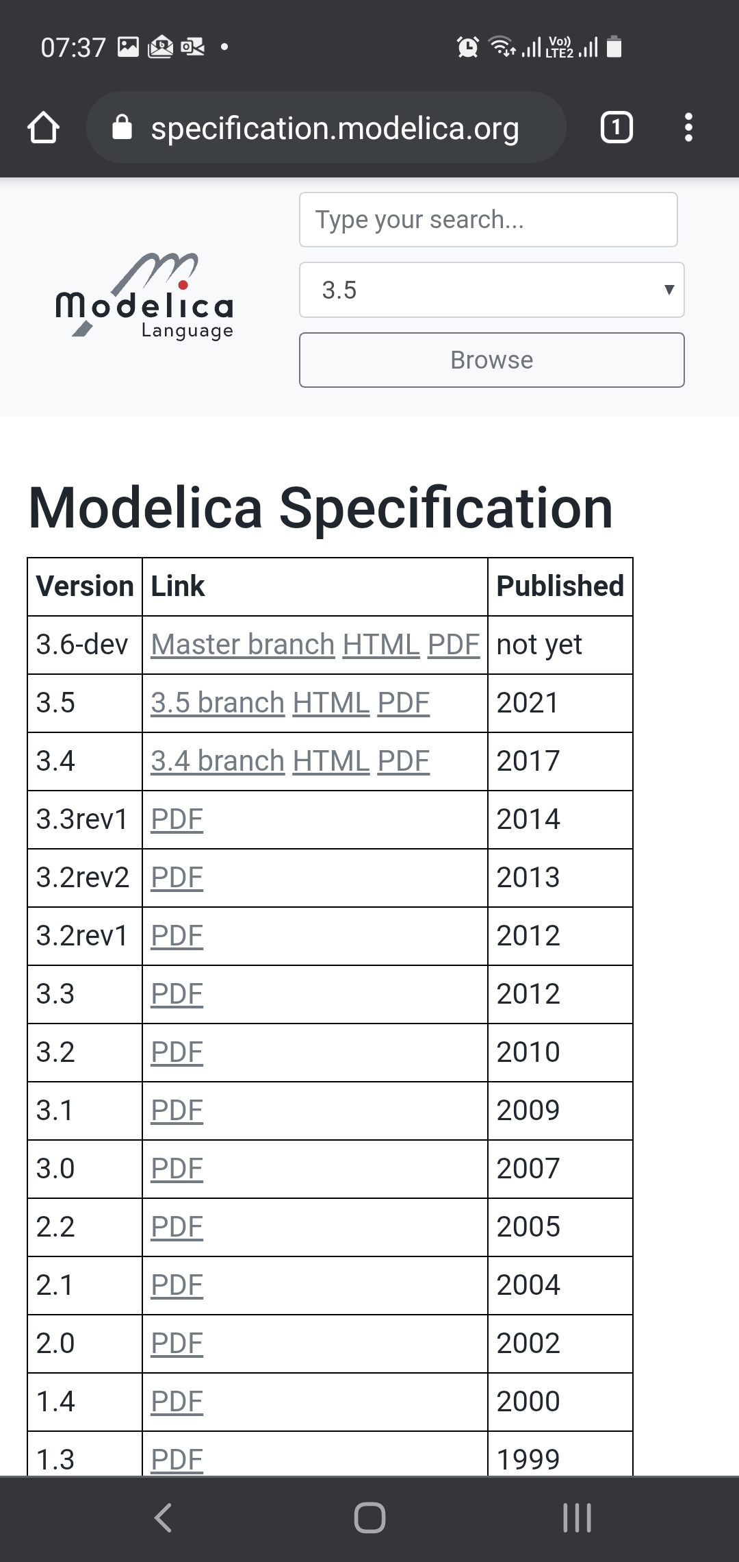
Because to me, it seems like the meta-tag fixes the problems. There is no change for desktop that I could see. And I guess you could try it in safari on https://sjoelund.github.io/specification.modelica.org/master/MLS.html
Attached are images of Chrome in landscape. The first page is with the meta viewport added (I guess you need to customize the latexml xsl transforms to get it in the document for real). The other page is without changes. Both have portrait and landscape modes for comparison. I think the landscape is viewable only in landscape (and then the button works).
I'm not sure what I'm supposed to see. That one has rounded edges and dark grey borders stealing precious pixels?
I'm also unsure how to create a banner in a good way for portrait mode. And how to make that not appear when I try to use portrait mode on my computer (which is totally fine).
The approach I had in mind was to do it based on media size and proportions, and the solution would mean that the banner would also appear on desktop if the window was made sufficiently narrow (which would make the page unreadable anyway). There might be better ways, but I am by no means a CSS expert.
And for comparison, the recommended text size in portrait and landscape modes.
Sure, that's very easy to read, but I think we should concentrate on something that is more relevant for the document we have, with lots of text on each page, and rather wide listings with hard line breaks.
@henrikt-ma what do you think is the best way to add the tag? Have someone figure out what the best way to customize latexml is or a one-line sed-script to patch the generated files?
I've tried hard to avoid modifying the XSLT of LaTeXML, as I'm not sure how it could be done without introducing conflicts for future upgrades of LaTeXML. Hence, patching the generated files sounds lite a pretty good option to me, and we could always switch to another solution in the future.
Because to me, it seems like the meta-tag fixes the problems. There is no change for desktop that I could see. And I guess you could try it in safari on https://sjoelund.github.io/specification.modelica.org/master/MLS.html
I don't have an iPhone, but on an iPad I can't notice any difference.
I'm not sure what I'm supposed to see. That one has rounded edges and dark grey borders stealing precious pixels?
The rounded corners are not a problem, but I would say they are stupid as they are not even at the edge of the screen. The main problem is that the text is not really readable in portrait mode right now. If that meta viewport tag is added, the text size is much more similar to the default size. You can then also click the menu at the top. I'll attach a photo from a camera so you can see how tiny it looks. The edge that has some reflection is the curve of the screen. Basically, the home button is where something easily clickable starts.
Because to me, it seems like the meta-tag fixes the problems. There is no change for desktop that I could see. And I guess you could try it in safari on https://sjoelund.github.io/specification.modelica.org/master/MLS.html
I couldn't see any difference with that one. And to me both portrait and landscape mode work on an iphone (if shrunk a bit using some weird pinching gesture); and the index works - but the top-left navigation bar doesn't.
I couldn't see any difference with that one. And to me both portrait and landscape mode work on an iphone (if shrunk a bit using some weird pinching gesture); and the index works - but the top-left navigation bar doesn't.
Did the top-left navigation work on the other pages where I didn't make any changes (or via specification.modelica.org)? Because otherwise it seems we have some additional problem. @henrikt-ma said you need to press in a certain way to get hover things working in Safari? I don't know anything about that myself.
https://dev.webonomic.nl/fixing-the-iphone-css-hover-problem-on-ios suggests some fixes, but I can't test those...
I couldn't see any difference with that one. And to me both portrait and landscape mode work on an iphone (if shrunk a bit using some weird pinching gesture); and the index works - but the top-left navigation bar doesn't.
Did the top-left navigation work on the other pages where I didn't make any changes (or via specification.modelica.org)?
No.
And looking more closely I think the actual problem is not correctly understood.
If you open specification.modelica.org and use the index to navigate to e.g., chapter 9 and then go to the left-upper corner it isn't that the navigation bar isn't working - the issue is instead you get to the top of the document. As if the top-bar (linking to the top of the document) is too wide to the left.
If you open specification.modelica.org and use the index to navigate to e.g., chapter 9 and then go to the left-upper corner it isn't that the navigation bar isn't working - the issue is instead you get to the top of the document.
Is that the top of chapter 9 or back to the index? If it's the index, we could probably try to make the top header a bit smaller for the title. It might be that you are pressing close to that part and it thinks there is a link nearby and you intended to press that.
If you open specification.modelica.org and use the index to navigate to e.g., chapter 9 and then go to the left-upper corner it isn't that the navigation bar isn't working - the issue is instead you get to the top of the document.
Is that the top of chapter 9 or back to the index?
Back to the start of the entire document, similarly as clicking the title-bar in chapter 9.
It might be that you are pressing close to that part and it thinks there is a link nearby and you intended to press that.
Possible.
If it's the index, we could probably try to make the top header a bit smaller for the title. It might be that you are pressing close to that part and it thinks there is a link nearby and you intended to press that.