 microsoftgraph
Allow additional custom sections in Person Card and treat them same as default sections
Proposal: Allow additional custom sections in Person Card and treat them same as default sections
Description
Currently the additional information feature of the person card is limited to adding some information to the main primary view of the card, and this limitation prevents providing much information without negatively affecting the UX.
Rationale
The current Person Card code is already designed to easily provide for additional sections as well as allow for the additional details to simply be expanded to include a show more view and provide it an icon. Without much functional change to current component, this feature would dramatically expand the customizability for developers of the Person Card component
Preferred Solution
Following the same templating format currently in place, additional-information should provide for a "show-more" template, as well as take an icon as a property. Expanding further to an ideal solution, instead of a single static conditional additional details section, follow same template format described but provide a section name prop. Ideally additional information or any other section would be identical it terms of section header/title/show more to maintain clean UI etc that already exists.
Additional Context
Hello 01, thank you for opening an issue with us!
I have automatically added a "needs triage" label to help get things started. Our team will analyze and investigate the issue, and escalate it to the relevant team if possible. Other community members may also look into the issue and provide feedback 🙌
Thanks for this feature request @01! I would love to hear more about the scenarios you are thinking about. What would you be achieving with this and how would this solve your business needs! From there, we will be able to review and decide if this fits within the scope of MGT! Thanks!
@sebastienlevert currently using the Person and PersonCard in a corporate ITSM application used be IT service agents engaging in in escalated live chats. The scenario has standard person/employee data as provided by the Graph API being of use as well as IT issue data about the person being of value as well (Service Now), and chat specific information. The need and desire is to provide all this information in a unified UX while being able to take advantage of underlying functionalities of the Graph Toolkit (caching, presence querying etc )
I love this scenario! This is absolutely something to consider to allow mashing up data in a more "native" way with the person card. As of today, you won't be able to achieve this but we will be reviewing the capability in the following sprints!
If you had to suggest a developer scenario, how would you like to provide this data to the component? What would be the easiest approach for you to provide the data and the configuration to the component?
@sebastienlevert No need to fix what's not broken. Having looked in depth at the component(s) code everything is already in place to allow for this feature. Design pattern already exists for the "sections", just allow for BasePersonCardSection as a template to developers.
The easiest approach from a developer user standpoint would be to have a "section template" instead of "additional information" with a title and icon property for the section template to have a "show more" template within that.
A iterative approach could be simply for "additional information" to simply be expanded to provide a "show more" template and a property icon and allow for multiple developer provider sections down the line .
Agree! So something like this (this is absolutely pseudo code that will require more thoughts) :
<mgt-person-card>
	<template data-type="section">
		<mgt-person-card-section icon="gear" title="New Section">
			<template data-type="basic> <!-- Would be on the "home" of the person card -->

			</template>

			<template data-type="full"> <!-- Would be on the specific "tab" of the person card -->

			</template>
		</mgt-person-card-section>
	</template>
</mgt-person-card>
Adding @nmetulev regarding feasibility of something like this with the current templating, especially if we want to have more than one section (which might be a limitation for now.). @01 would you be Ok with a single configurable section, at launch of such feature?
@sebastienlevert This is exactly what I had in mind, and yes even the additional information template being slightly expanded to follow this design this would be great
We will be adding this to our backlog. No ETA on any of this, but I really see the value. If you are up for the challenge, we also take community contributions and we'll be happy to provide guidance! Thanks!
@sebastienlevert that is great to hear. To consider contributing, I will have to check on my companies corporate policy in regards to contributions to open source projects since it would directly relates to my work.
Im sure once the task is evaluated, it will be found to be small change. Currently "additional-views' is just treated uniquely from all other sections.
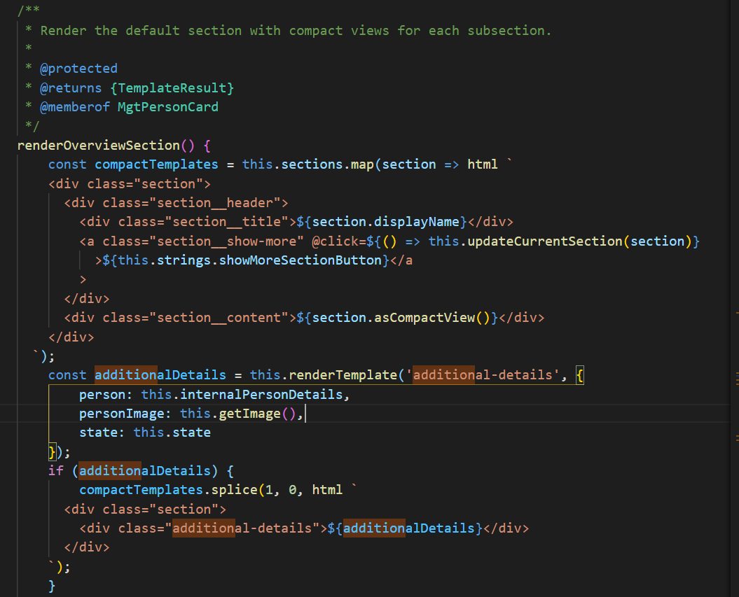
Simply making it its own section extending BasePersonCardSection would be all that is needed. Looks like it already treats "additional-information" as part of the compact templates so half way done