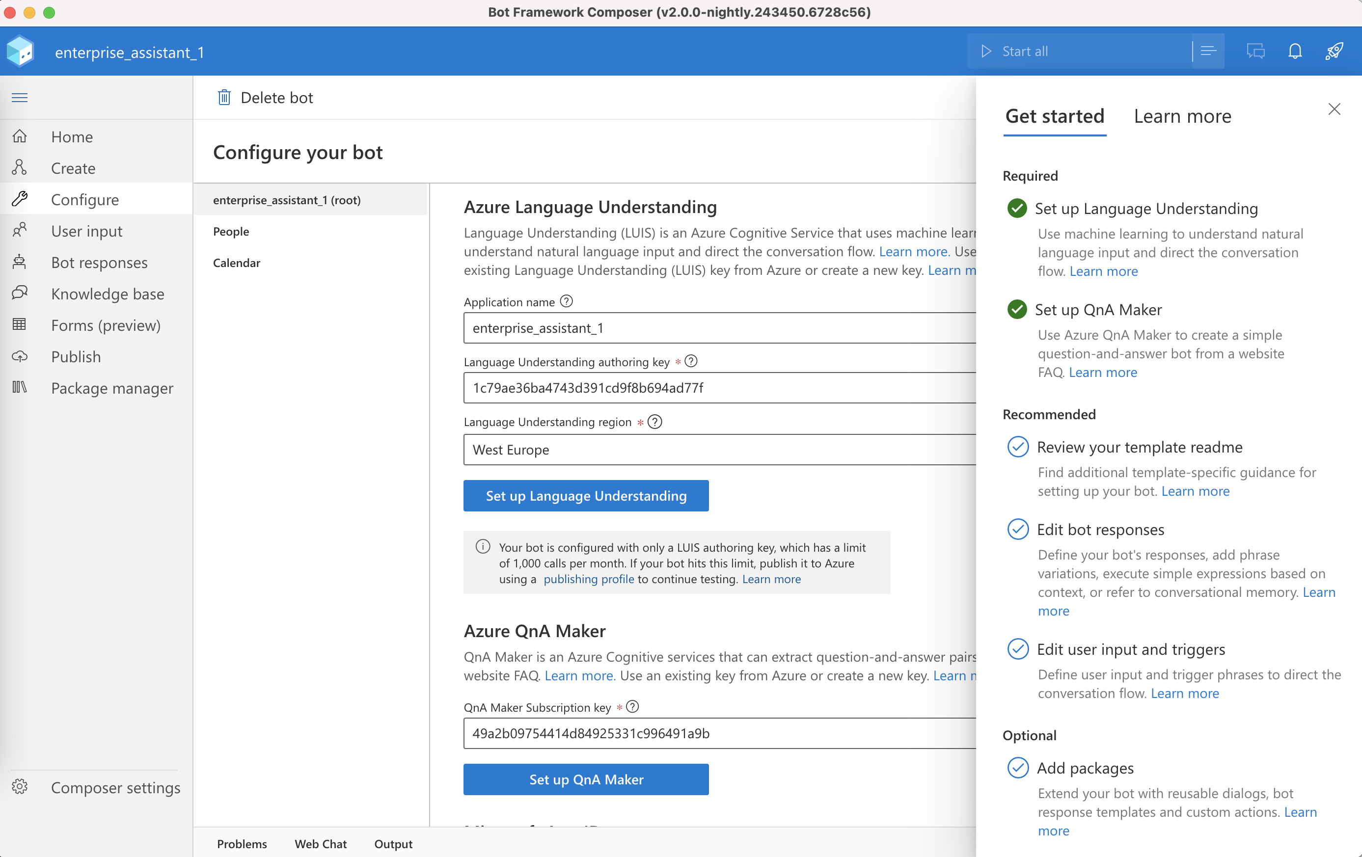
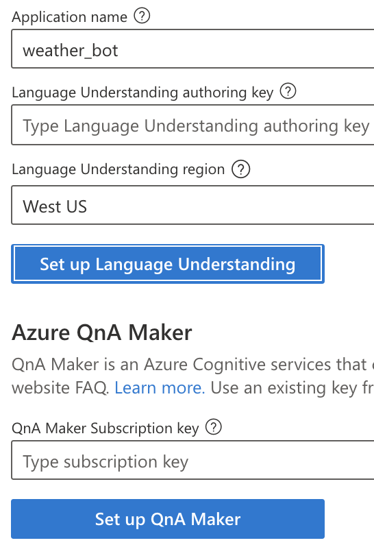
UI/Fluent : Once LU and QnA are set up, the 'set up' buttons in Configure no longer need to be blue
Typically, only one button (the one that is the most likely or recommended action) is the 'primary action', indicated as blue vs gray-outline.
On our Configure page has 3 primary actions (depending on the template)
- set up LUIS
- set up QnA
- retrieve App ID
Even when all 3 are populated (either manually or through the Rocket Menu), all 3 buttons are blue, while at this point none of them are primary....
Normally, only modals have buttons. Each of the pages have a toolbar for buttons, or inline actions are indicated through an icon + blue, clickable copy (eg: + Add). Preferably, we following this practice/guideline throughout the app.
If we do believe buttons are in this case needed, only 1 (the first one) should be primary ( blue). Once filled out, creating another LUIS key or QnA is not very likely, so we may want to go back to the 'icon + blue copy' style UNDER the fields.
Thoughts?
The buttons aren't in the "in focus" state, like in the keyboard navigation sense; they are just blue. The focus state looks like this (top button with the outline):
What they are is using the primary button style in Fabric/Fluent for web https://uifabric.azurewebsites.net/#/controls/web/button:
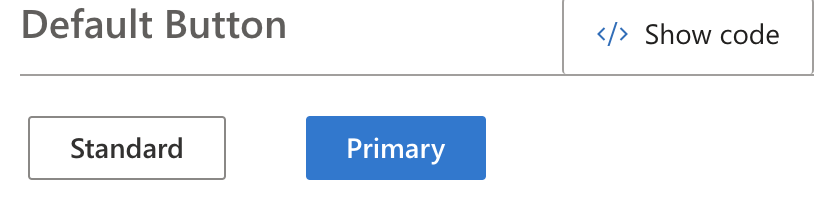
We could switch to the Standard style (gray outline), but I think that could be worse in that they look too much like the text fields that would be right above them.
We could switch to the action button (what Fabric calls the icon+text button), but I think it will also get lost in this layout. I think if we change the buttons, we would need to make some adjustments to the layout of this page.
I understand - it's not literally the 'in-focus' state. It's the primary action. I'll update the write up above to correct & prevent confusion. In the short term, we should change the behavior to only 1 blue primary. And no primary when all 3 options are filled out. I agree - I'd like to revisit the layout, our use of 'icon + link' buttons and more effectively use the contextual toolbar for primary actions.
Agree--I wasn't sure what the right convention was here so we just took the easy path. 😜 This is probably not the only config page refinement that's needed so we should probably add that as an R14 item @Dewain27.
@emivers8 I've bumped this from R14 as the design ask seems to still be in discussion. Teeing up for R15