how to extend the y-axis?
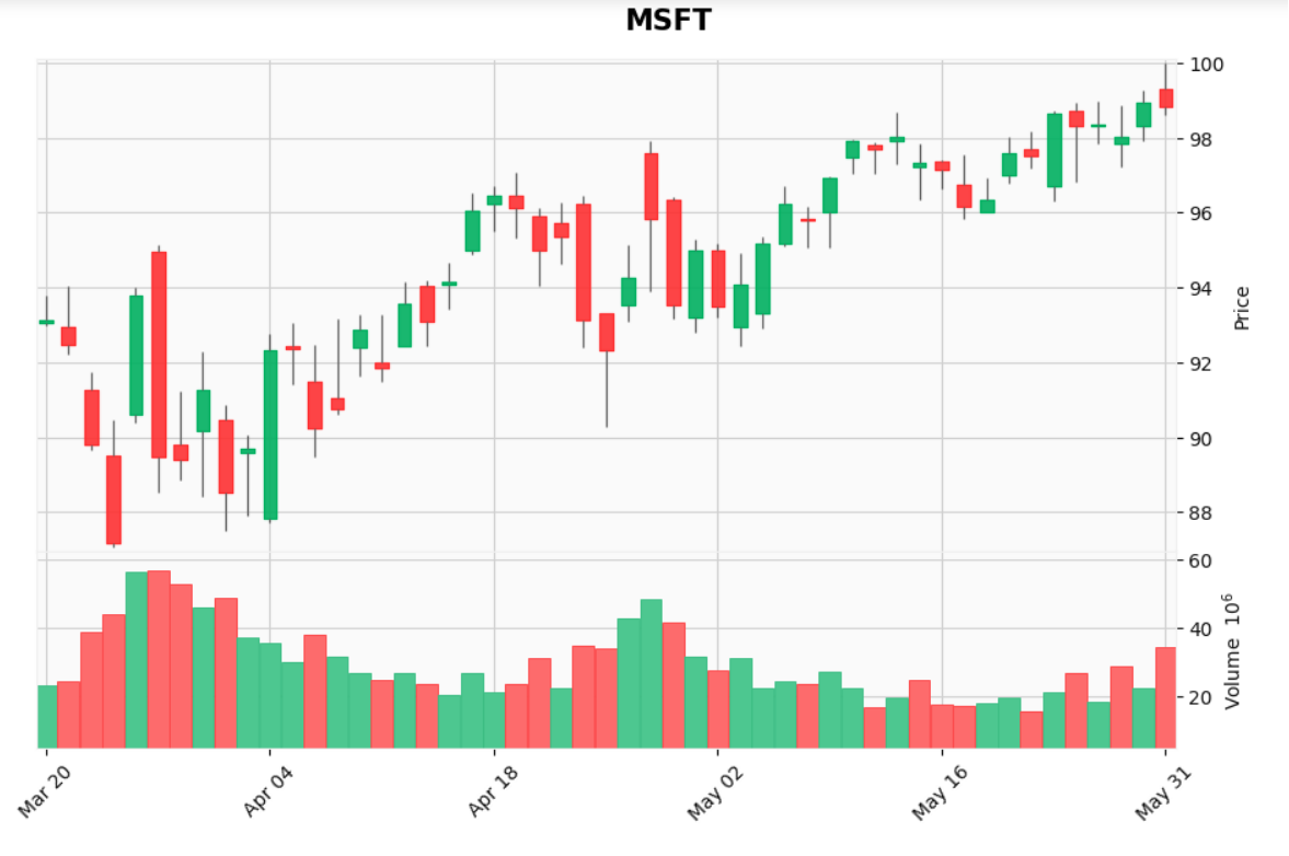
Perhaps the best way to explain this problem is by the picture below. As you can see, there are three blue lines drawn, but the top line is out of plot. How can I extend the y-axis on the graph so that the top line is fully visible?

This code below created the plot:
fig, axlist = mpf.plot(data[start_date:end_date], figratio=(20,12),
    type='candle',
    alines=seq_of_seq_of_points,
    volume=True,
    tight_layout=True,
    style='yahoo',
    addplot=apd,
    returnfig=True)

fig.suptitle("SPY", y=1.05, fontsize=30, x=0.59)
You can use kwarg ylim to extend the y-axis, for example ylim=(120,170).
Also, from what I can see, there is no reason to use returnfig=True; rather you can pass a dict into kwarg title, thus:
mpf.plot( data[start_date:end_date],
    figratio=(20,12),
    type='candle',
    alines=seq_of_seq_of_points,
    volume=True,
    tight_layout=True,
    style='yahoo',
    addplot=apd,
    title=dict(title="SPY",y=1.05,fontsize=30,x=0.59),
    ylim=(120,170) )
There is something else that is very strange. As you can see in the chart above, the year is present on the x-axis as part of the date. But when I plotted another plot with the same lines of codes as above, the yeas was suddenly missing from the datetime on the x-axis, as you can see in the picture below. How can the year be made visible again?
By default, mplfinance only displays the year if your data crosses one or more December to January boundaries. This feature is part of mplfinance's "automatic" formatting of the axis, which also includes things such as displaying the time as well, if the data appears to be intraday data.
You can override the "automatic" formatting of the x-axis with the datetime_format kwarg.
For examples of using this kwarg, see cell In [8] in the plot customizations tutorial.
For the full set of available formats, see strftime.org.
There is something else that is very strange. As you can see in the chart above, the year is present on the x-axis as part of the date. But when I plotted another plot with the same lines of codes as above, the yeas was suddenly missing from the datetime on the x-axis, as you can see in the picture below. How can the year be made visible again?
- Use Pandas To Find the Max High Present In the dataframe.
- Add % Value to Max
- Set it as ylim