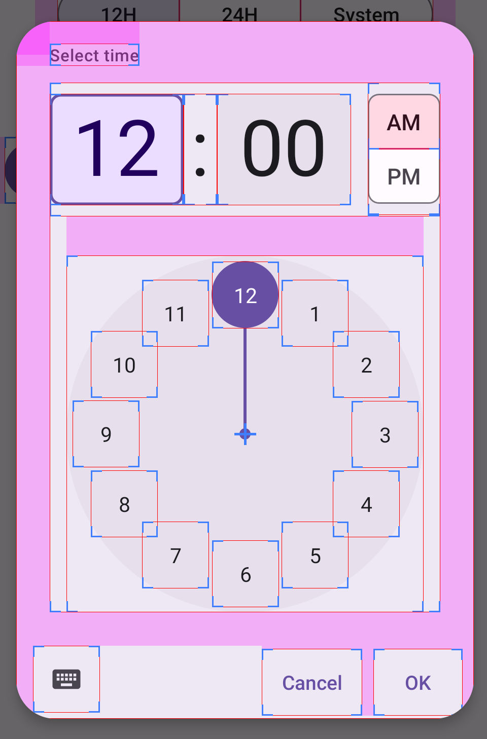
[MaterialTimePicker] Fix divider alignment on the clock display
And we continue to pick up the lost fixes 😄
The divider (colon) should be aligned as intended by font designer. Do not try to align it yourself, the hardcoded indentation may be incorrect with a different font.
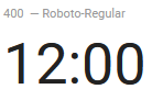
| Before | After |
|---|---|
 |
 |
Hi @pubiqq, thank you for your great contributions, they are really appreciated!
Sorry that some of your other and valid suggestions were not all included previously, it is easier/faster for us to review and merge one change at a time.
Regarding this alignment issue, as per my initial testing, a lot of our screenshot tests are impacted as the divider appears slightly lower. I will reach out to our design team to see what we can do.
Regarding this alignment issue, as per my initial testing, a lot of our screenshot tests are impacted as the divider appears slightly lower.
Yes, I understand that, but it happens because font designer intended it that way:
But ok, let's see what your design team says first.
Chiming in here on the design side– agreed, the proposed "after" with dividing colon height matching that of the adjacent input fields and also aligning with spec, guidelines, and design kit implementation.