 master-co
🐞 Breakpoints different behavior on different devices?
What happened?
I just found out that my responsive layout looks different on mobile and desktop with the same breakpoints fulfilled.
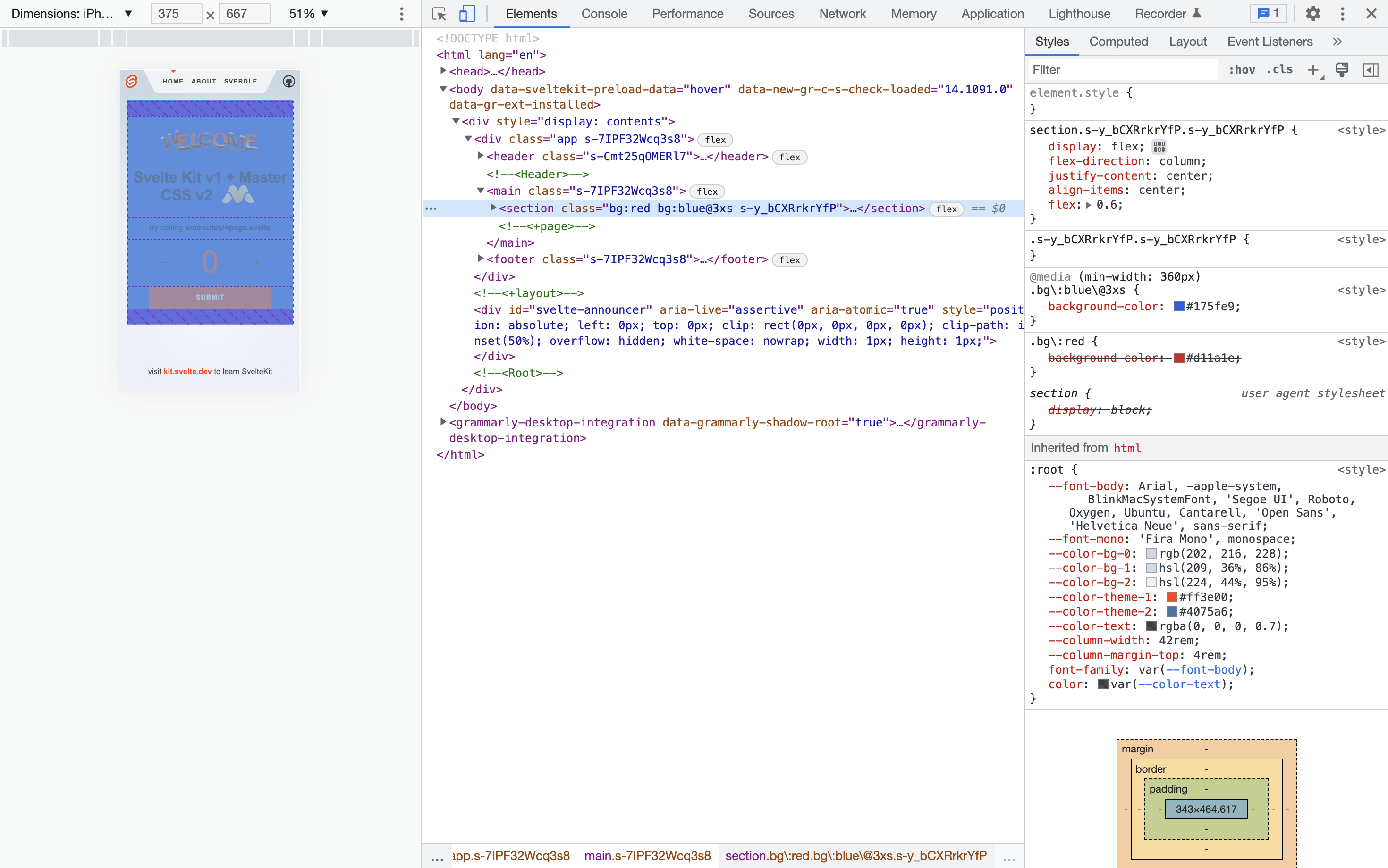
This should display red background on screens up to 359px wide and blue on screens from 360px
<div class="bg:red bg:blue@3xs">
And this will not work as expected when I will change screen dimensions for width 375px (google chrome dev tools).
above will display red screen
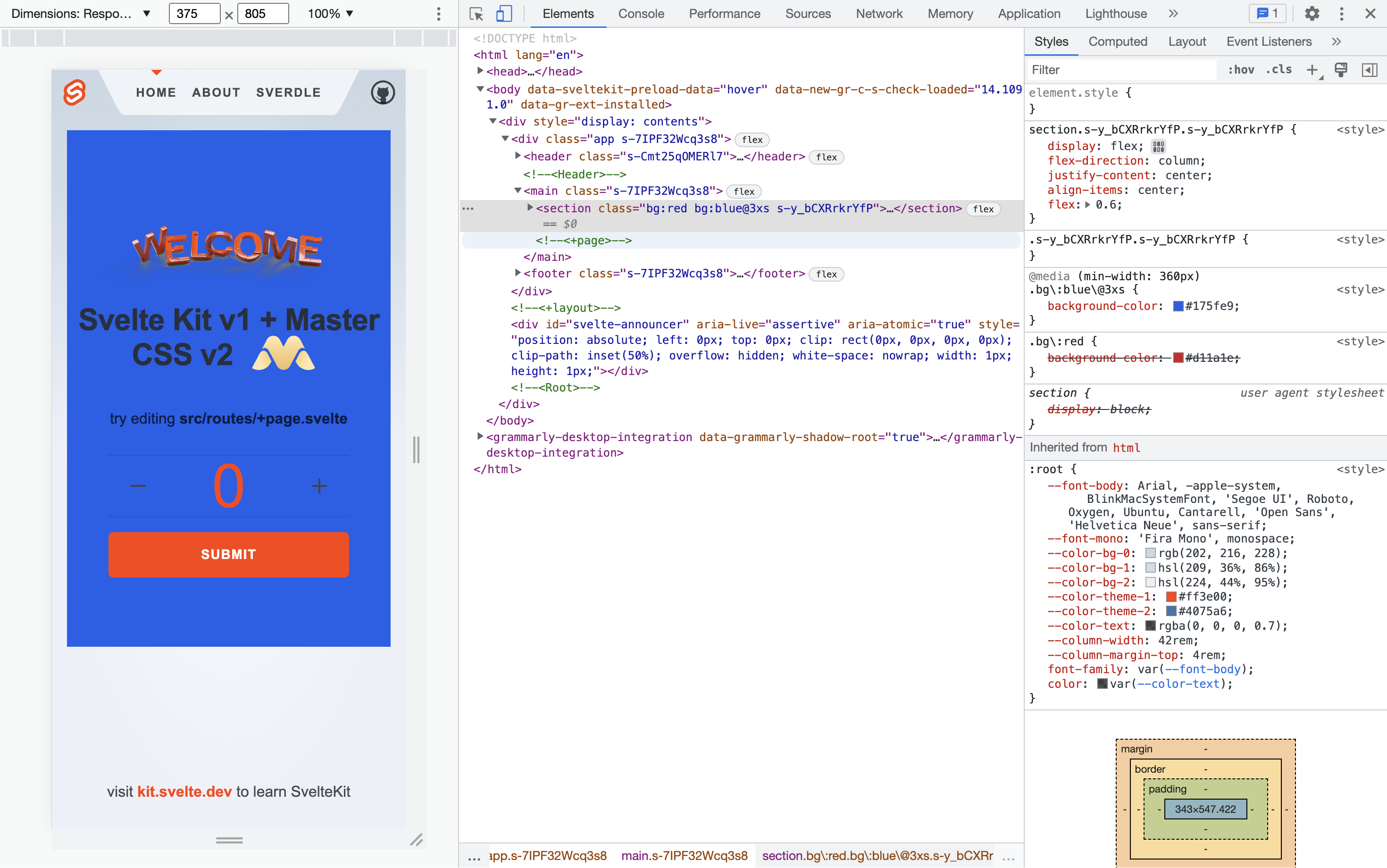
This will work as expected if I change it to IPhone SE with a width of 375px (google chrome dev tools).
above will display blue screen
This will also work correctly on the mobile phone, so it's very rare to happen in real life in this particular example. But, these is 2 source of truth and highly affect DX.
Not sure if this makes any difference, but tested with AOT on SvelteKit
Version
2.0.0-beta.98
Relevant log output
No response
What browsers are you seeing the problem on?
Chrome
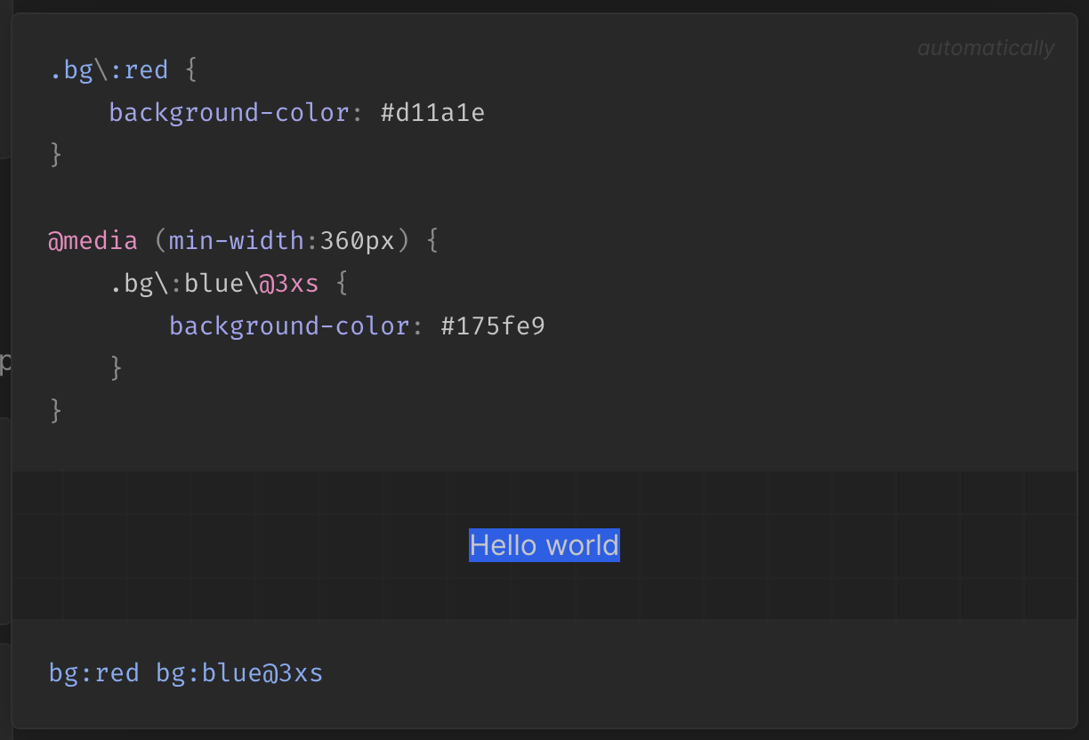
This is how it looks on my side with this code:
<div class="bg:blue bg:red@3xs">TEST</div>
https://user-images.githubusercontent.com/53402105/209559256-1cf9f954-adee-4a60-b1db-1893415a902b.mov
This is even more interesting, and may explain the lack of opportunity for reproduction on your side
https://user-images.githubusercontent.com/53402105/209559942-a7405054-a9ce-4a63-ac09-db07f5b15429.mov