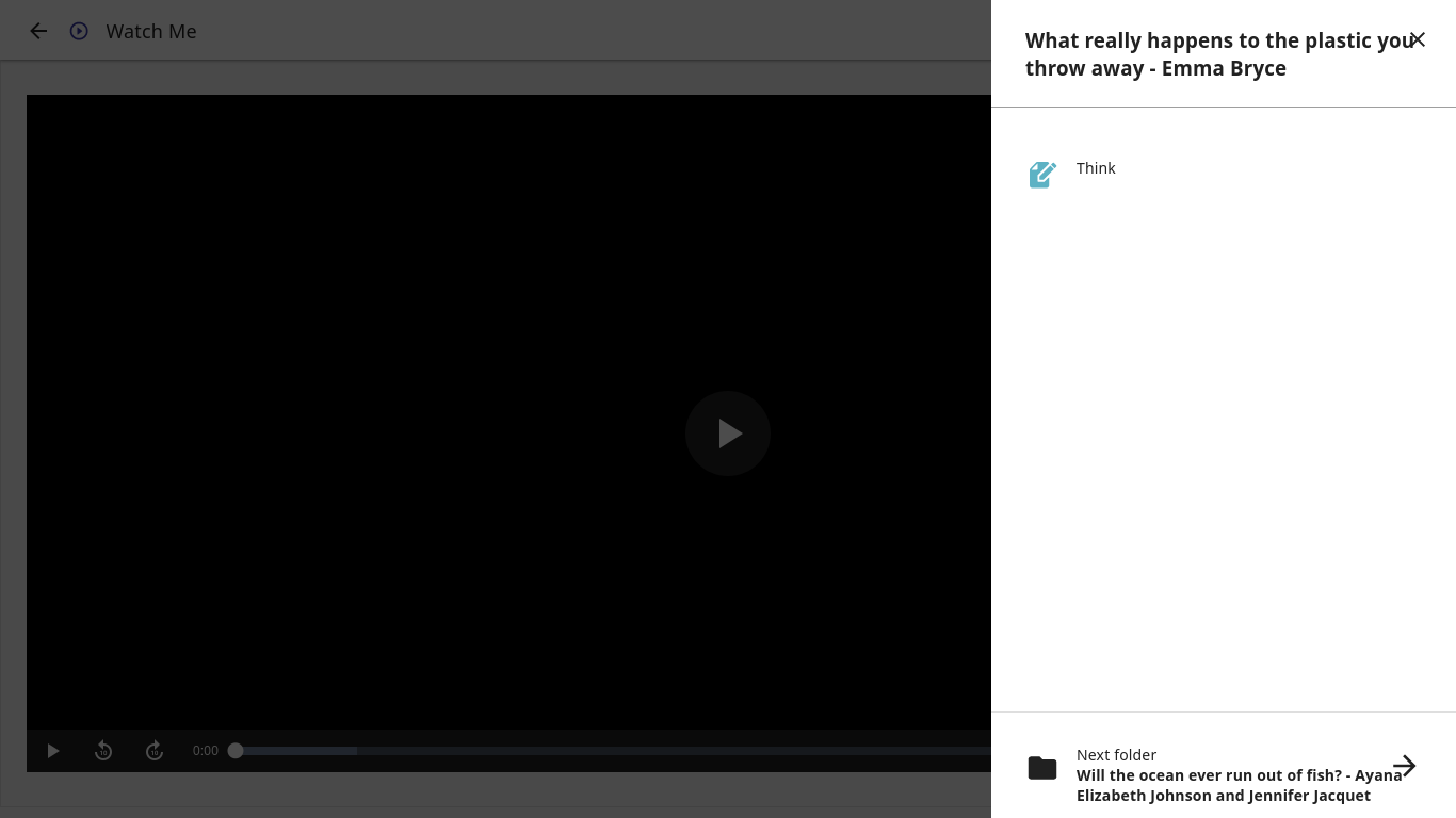
Controls overlapping content in folder resources panel
Observed behavior
In the "folder resources" panel for some resources, both the close button and the arrow icon overlap with text:
User-facing consequences
This does not block interaction, but it makes text difficult to read and it looks ugly.
Steps to reproduce
This occurs using Ted Ed content at https://kolibri-demo.learningequality.org/en/learn/#/topics/c/5900e6eab432596d88ab8cf455a77995?last=TOPICS_TOPIC_SEARCH&topicId=68ad96dcf36f54db9367e76ee7afc015.
Context
The screenshot was created using Firefox with a 1366×768 resolution.
The same issue was also seen using the Kolibri desktop app for GNOME: https://flathub.org/apps/details/org.learningequality.Kolibri.
Kolibri version: 0.15.1.
Could you specify the Kolibri version? I assume 0.15.1, but want to double check.
I tested this on develop and 0.15 and see the issue in both. I figure a fix for this should probably both:
- Address the text width to avoid overlapping with the icons
- Use the TextTruncatorCSS component on the content title there to avoid overflow of longer titles
Yep, looks like you got it, but just to confirm this was with Kolibri 0.15.1.