add relational diagrams for example datasets
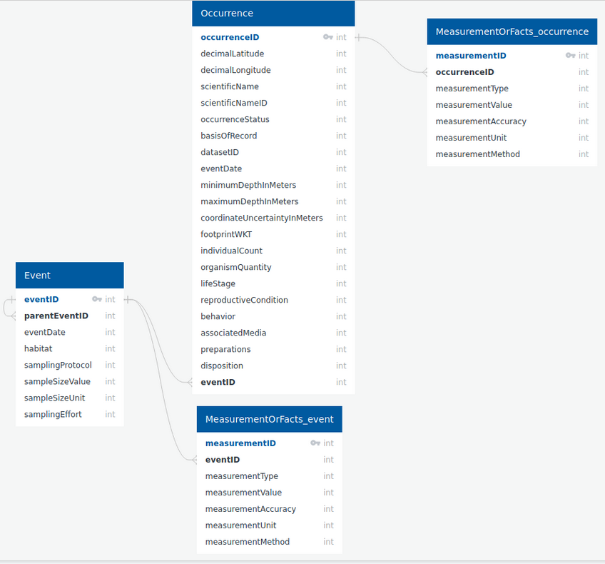
I have previously used quickDBD to create diagrams of how the occurence, MoF, event, etc files/tables connect with each other. I find these views tremendously useful and would like to encourage including them for the example datasets.
Then again... does anyone else find database diagrams useful or is it just me?
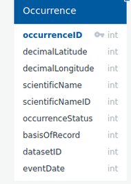
bare-minimum example (tier 0):
more detailed example:
it would be interesting to put that subsample example in this visual https://github.com/ioos/bio_data_guide/issues/41
Yes very helpful. Only question for me is if separating event MOFs from occurrence MOFs will give the impression they are separate files?
When I made this I think I was thinking that they were separate files.
So each row in the MoF table has both an eventID and measurementID column and only one should ever be filled out?
All of them will have an eventID but only the ones that are linked to occurrences will have occurrenceIDs. See the table at the very bottom here.
All of them will have an eventID but only the ones that are linked to occurrences will have occurrenceIDs. See the table at the very bottom here.
Ah, that makes perfect sense. I will update the diagram before posting it elsewhere.
There's also a great R package for this called dm https://cynkra.github.io/dm/
I personally find them very helpful though they made need some explanation for those unfamiliar with them.