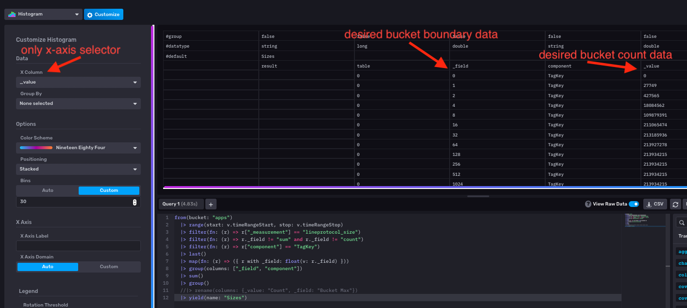
Histogram should be less opinionated and accept a data column for the count axis (y-axis)
Currently, Histogram calculates the count axis, generally the y-axis, on its own based on the given data table.
There should be flexibility to allow a data column to be specified in the config for the count axis.
I can't edit the description but the gist is there.
There should be sane defaults, currently in place, for the histogram which is generating a count for the buckets and using the _value field range to define the range of the x-axis. This default is generally very useful for looking at a histogram view of a single value timeseries (or different numeric fields in that timeseries).
However, there are situations where the histogram data is collected at the source. Prometheus metric reporters (as well as dropwizard metrics, pick your http server implementation metrics) do this (sending out un-aggregated data would be a lot of network traffic). This is also a reasonable approach in many situations where only the aggregated histogram data is useful/meaningful.
For these sources, the histogram is modeled in line protocol as a single field representing the bucket limit (e.g. "1", "10", "100", etc) and the _value as the counts in the corresponding field. Given a single instant in time, I have a column of bucket boundaries (_field) and a column of bucket counts (_value). I want to plot this as a histogram directly by specifying which columns are the x- and y-axis data.
This request is a specialization of a general ability for 2D visualizations: where the creator can select which columns will be x and y data sources. We have great defaults but all 2D plots should allow this customization for datasource.
I'd love to get some traction on this. I needed to plot prometheus histogram data again today and I can't do it with our ui. The best I can do is a linear graph (I can't use stair-step because the stepping is inbetween datapoints instead of at them - for a histogram this matters).