Request for minor tweaks in UI to improve the user experiance and make the design more fluent for GitHub
Thanks a lot for considering my suggestions as requested in issue-30.
After using git-master these days, I want to add a few more suggestions for UI improvement, which I thought would make the extension more user friendly its design more fluent and appealing.
Note:
- I have numbered all the changes in the last picture of this comment and numbered the suggestions here as per that picture only
- The red rectangles shown in pictures suggest that this part of the current design can be changed as suggested by green rectangles in other pictures and in the last picture.
Suggestions:
- (1 & 2 talks about UI improvement while viewing a file)
-
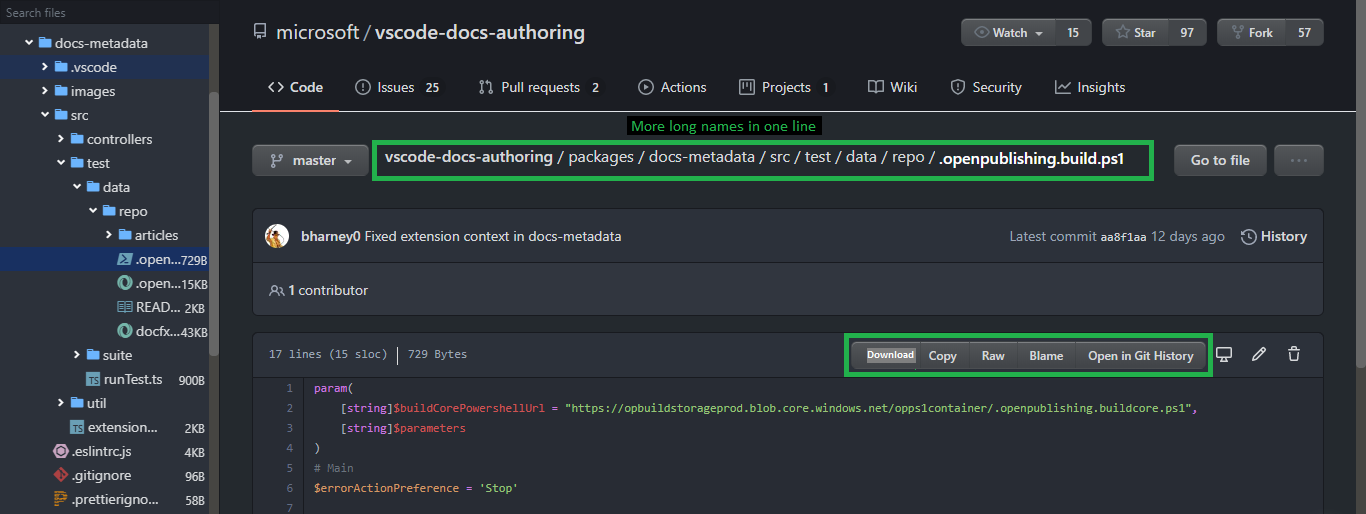
While viewing a file the size shown beside the download button (after opening a file) can be removed as it is redundant and is shown by default in GitHub (as can be seen in the snapshot below)
-
The download button can be moved just beside the copy button to make the UI more fluent (as can be seen in the snapshot below) as the user can download, copy, or view as raw from one place only

- (3 & 4 talks about the position of existing buttons in side tab)
-
The Pin button can be moved from top-right to bottom-left
-
The settings button can also be moved from top-right to bottom-left
- (5, 7 & 8 talks about the future plans to add support for some famous themes, fonts & ligatures to make the code more readable and easy on eyes as discussed in the issue-30)
- (6, & 9 talks about just the rearrangement of positions of existing buttons)
-
If there is a plan to add support for some famous themes such as material theme, vs code default dark plus theme, jetbrains themes etc. then this button can be used to change the themes (as currently Octotree, github-one-dark-vivid, github-dark-theme etc. extensions are there to change themes)
-
If theme support is added then the toggle button for light and dark theme would be better just beside the theme button
-
If there is a plan to add support for some famous fonts such as Fira Code, Jetbrains Mono, Cascadia Code, Victor Mono etc, then this button can be used to toggle fonts (as Octotree, github-one-dark-vivid extension currently uses Fira Code to make the code more readable)
-
If font support is added then this button can toggle on/off the ligatures if supported by the font (as their might be some people who may like to turn off the ligatures)
-
The position toggle button is better suited at the end (showing 'click me' if you want to push me that side :) )
- (10 talks about position rearrangement after moving Pin & Settings icon in the bottom to utilize that space)
- Moving the branch name just beside the repository name makes the view more pretty and also utilizes the space created by moving Pin and Settings icon (giving the folder structure a slightly more space) as can be seen in the last picture
-
Picture highlighting the change in current view

-
Picture (called as 'Last picture' in above sentences) shows the final modified view (numbering all the changes requested above) and shows the final UI

-
Please don't forget to add all these supports for 'Gists' too :)
-
Excited to think that version 2.0.0 would be a great release with at least support for gist and with this tweaked UI (The support for themes, fonts and ligatures can be added later)
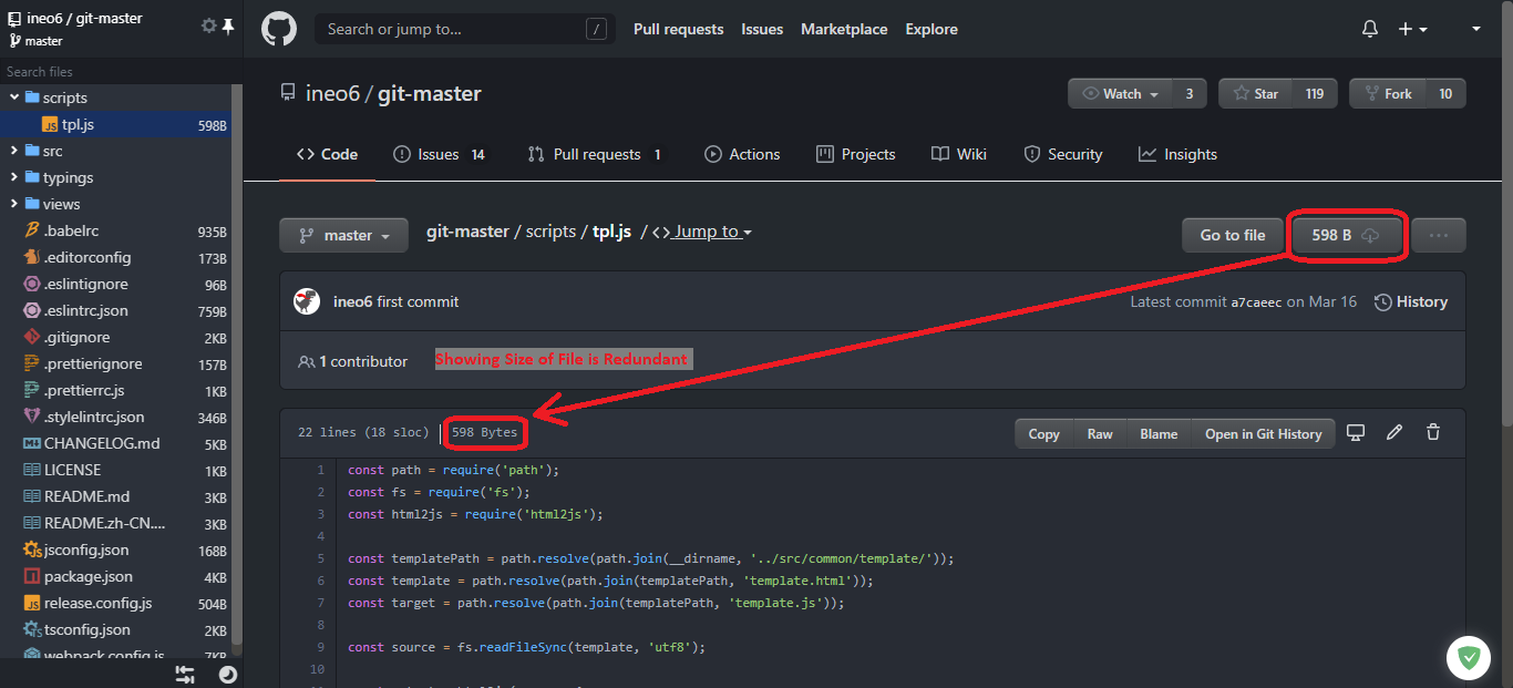
Just got one more little reason to suggest moving the download button 😊
- Moving the 'download' button beside copy button would provide more space to accommodate much bigger filenames as can be seen below (Just an improvement of user experience)
Current view
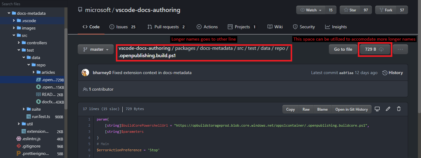
After making the changes