Bodoni
 Bodoni copied to clipboard
Bodoni* by indestructible type*

I want the Google Fonts version to be the same as the upstream, since users will get the fonts from both places, and if they diverge, their documents will not...
Screenshot with ×+± (Bodoni Moda version 2.004, from https://github.com/google/fonts/pull/2833)
Could you provide checksums for the releases? Want to add the font as an AUR-Package
How to reproduce: - Choose low optical size (6pt-11pt), italic - check yd, or ys letter combinations 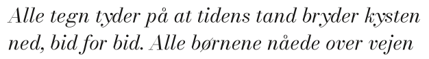 I think it rubs with the generally more wide kerning of the...
Especially AVA, LY, OWO, OVO, YAY, AC, UA, AWA, LW, JA, DA, PA, BA, OA, AG, DW. Basically anything with A, V, W, Y. See the following link for some...
It would be easier if we had a video call ^^' this is my email: [email protected] to organise it. thanks
Example with 1=×÷+−¬±≠≤≥◊3 : Also, ∏∑ are too small and +−±×÷¬=≠≈~≤≥∞|¦◊^∏∑ should remain upright, never italic or slanted.
In all font weights and optical sizes of the italics there is a slight issue with the lowercase _'k'_ character, the two lines of the intersect with an internal gap....
A user suggested there ought to be more kerning of V https://fonts.google.com/specimen/Bodoni+Moda?preview.text=VA%20va%20Va%20VW%20