Immersive Design Review
The new immersive layout comes with a number of new design features:
- It derives a lot from the dotcom designs, and so may look different from the previous old template designs.
- It uses the Guardian Grid rules laid out in Source (via the new
gridmodule), and updates any elements taken from the existing dotcom designs to align to this grid when they diverge. - It introduces an updated layout for the related content and footer at the bottom of the article, which differs from the way these sections look on other AR articles.
Before we release immersive articles to (Beta) users it would be a good idea for Design to review them to make sure they're acceptable, and suggest any necessary changes.
List of things to tweak:
- On the headline, make sure that the top padding matches the left padding (look at the current app designs for an example).
- On the standfirst, make sure that the top padding matches the left padding.
- Make sure that the standfirst text matches the width of the headline text.
- Drop the related content heading into the left column on wider breakdpoints.
- Check that the headline doesn't get pushed too far below the fold by the app chrome.
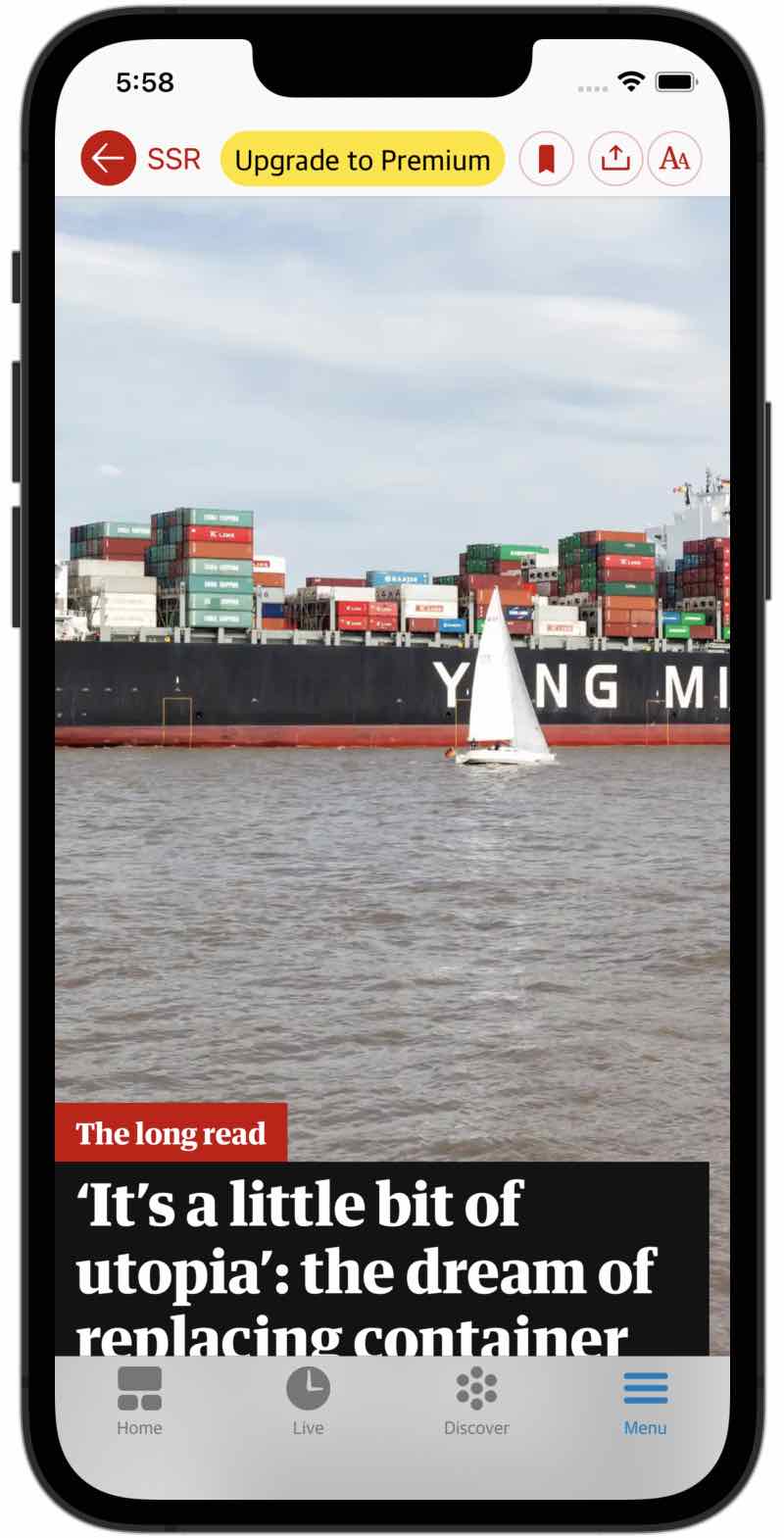
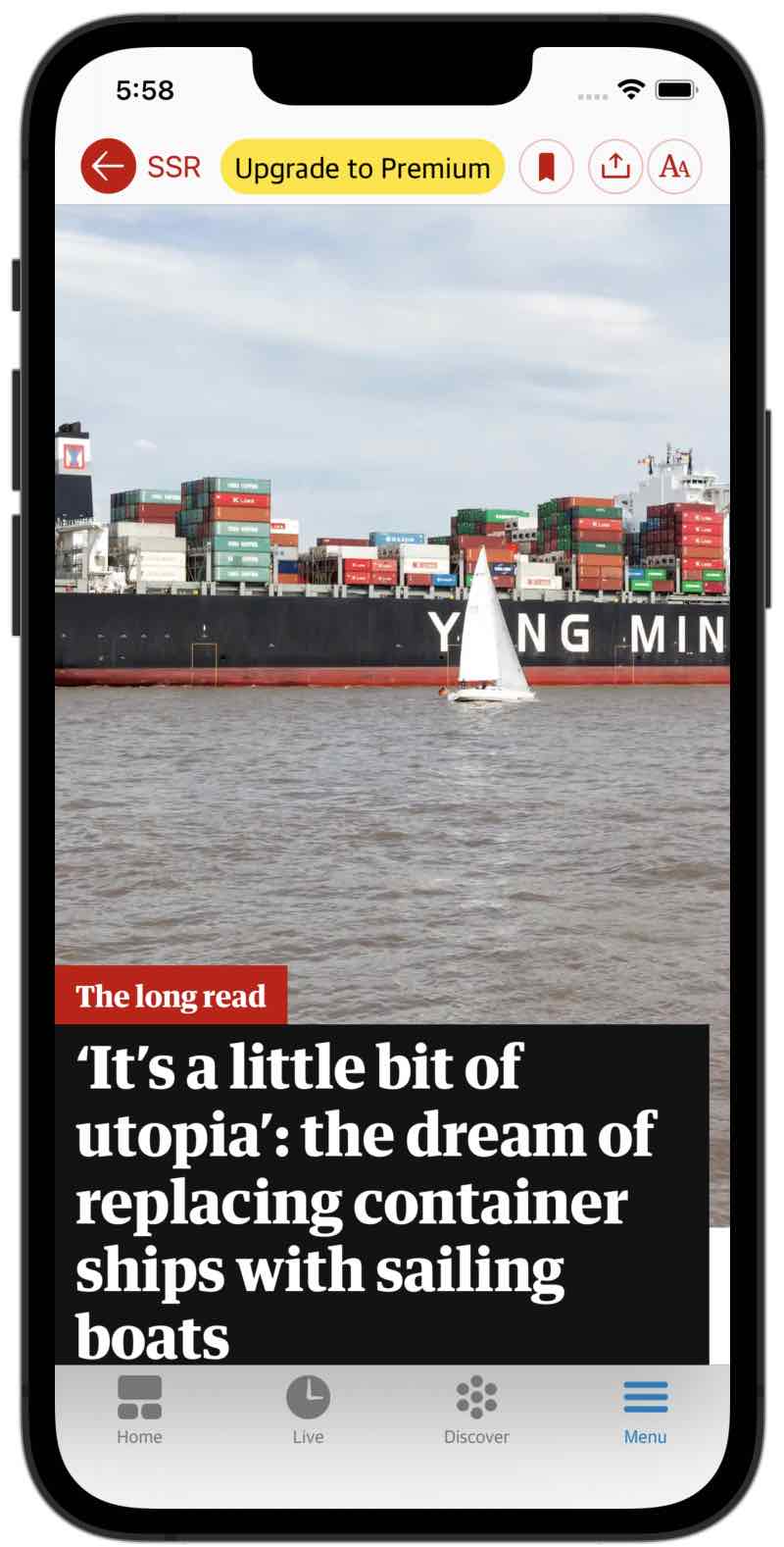
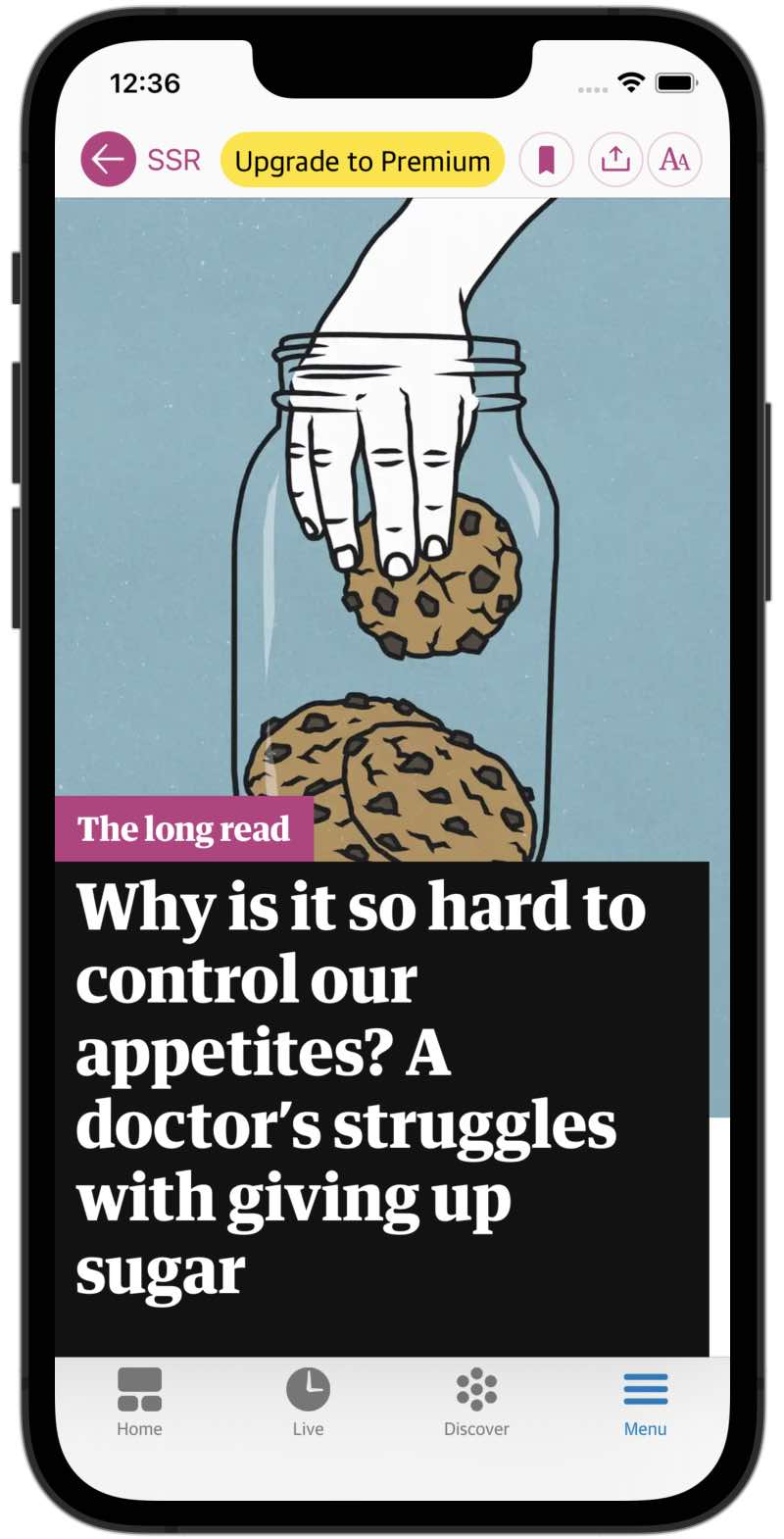
@ajbreuer you were right about the headline being cropped! With the app chrome included the new immersives looked like the screenshot on the left below. I've reduced the main media height and now we get much more of the headline text, as seen on the right. I can reduce it further if needed?
These were taken on an iPhone 13 Pro (same dimensions as a 12, 12 Pro and 13).
| Before | After |
|---|---|
 |
 |
@ajbreuer you were right about the headline being cropped! With the app chrome included the new immersives looked like the screenshot on the left below. I've reduced the main media height and now we get much more of the headline text, as seen on the right. I can reduce it further if needed?
These were taken on an iPhone 13 Pro (same dimensions as a 12, 12 Pro and 13).
Before After
Thanks @JamieB-gu I think we could reduce it a bit more, maybe one more line of headline
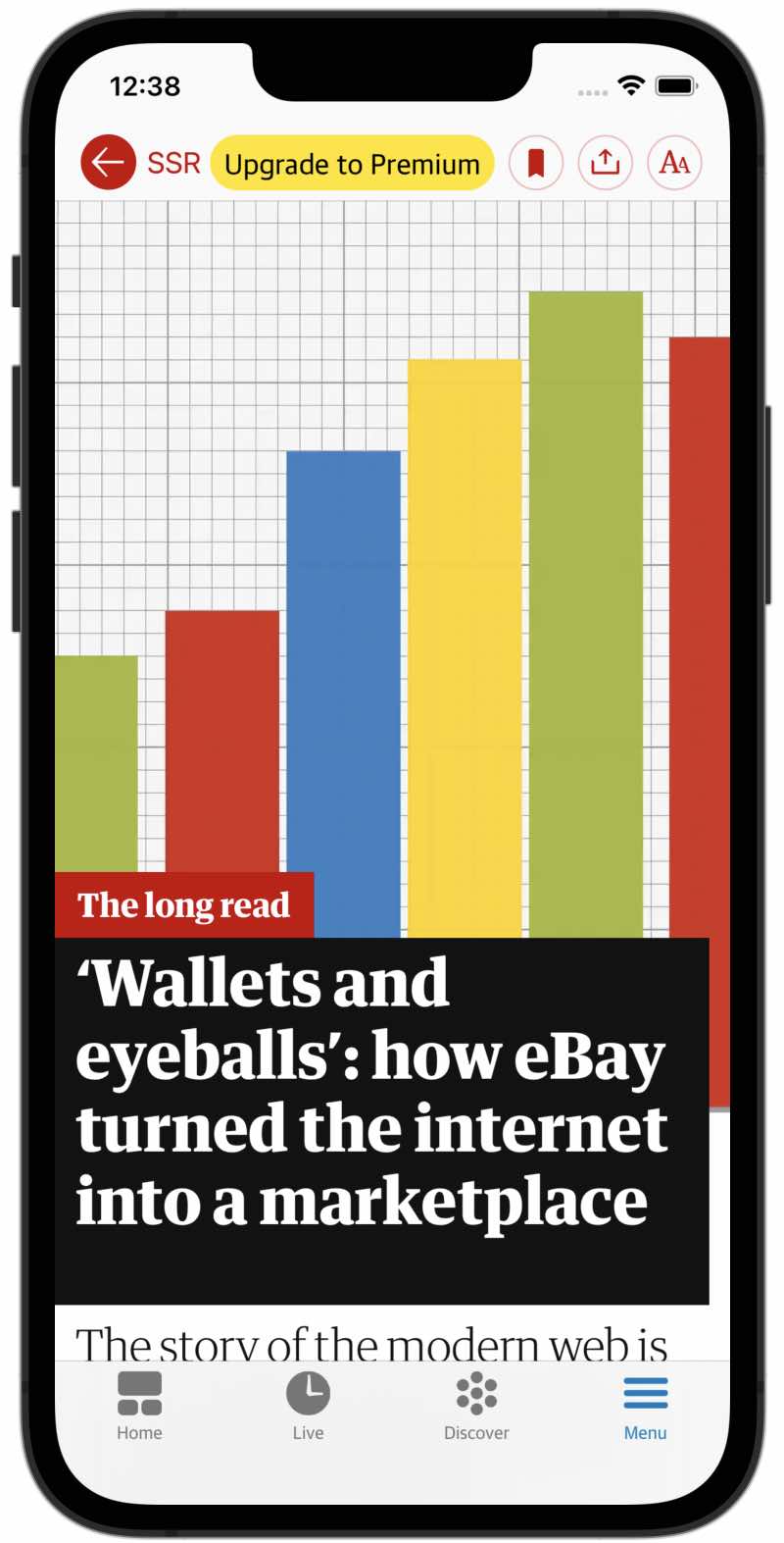
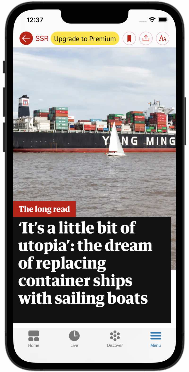
@ajbreuer I've dropped it down a bit further. Here are some examples with different length headlines.
| Four Lines | Five Lines | Six Lines |
|---|---|---|
 |
 |
 |
@ajbreuer I've dropped it down a bit further. Here are some examples with different length headlines.
Four Lines Five Lines Six Lines
Thats great! thanks @JamieB-gu
All but one of the above points have been addressed in #5690. The remaining point, (4), will be addressed as part of this milestone: https://github.com/guardian/dotcom-rendering/milestone/58