 glin
glin
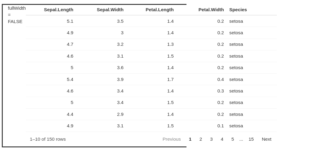
horizontal overflow when fullWidth = F
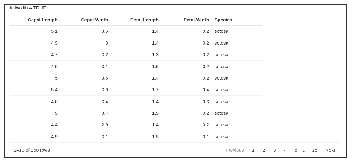
When fullWidth = FALSE and column / table size is constrained, the table will overflow its container. With fullWidth = TRUE horizontal scrolling turns on when the container gets too narrow, but other table elements (eg highlighting, page numbers) no longer align with the table when the container is large. Is it possible to constrain the table size of a table (e.g. by constraining column or table with) but also have horizontal scrolling activate when the container becomes to narrow for the table? Here is a minimal reproducible example in shiny where you can compare the overflow behavior when resizing the browser window:
library(shiny)
library(reactable)

ui <- fluidPage(

  fluidRow(
    div(
      class = "col-sm-8",
      style = "border-style: solid; margin: 1em;",
      p("fullWidth = TRUE"),
      reactableOutput("Tab1")
    )
  ),
  fluidRow(
    div(
      class = "col-sm-8",
      style = "border-style: solid; margin: 1em;",
      p("fullWidth = FALSE"),
      reactableOutput("Tab2")
    )
  )
)

server <- function(input, output) {

    output$Tab1 <- renderReactable({
      reactable(
        iris,
        highlight = T,
        defaultColDef = colDef(width=150)
      )
    })
    output$Tab2 <- renderReactable({
      reactable(
        iris,
        highlight = T,
        fullWidth = F,
        defaultColDef = colDef(width=150)
      )
    })
}

shinyApp(ui = ui, server = server)
Hi Radovan - Unfortunately, that does not change the behaviour. With width: __._%; set in style and fullWidth=F in reactable, the table still overflows and there is no horizontal scrolling when the container is too narrow for the table:
With width: __._%; set in style and fullWidth=T in reactable the extra table elements (e.g. hover highlighting and footer) still expand to fill the container when it is bigger than the table :
But adding a width specification to the div style does not change the behavior. With fullWidth=T horizontal scrolling will work when the container gets too narrow, but the other elements (eg footer) expand to fill the container when it is wider than the table. Of course, if you know the table size you can set the container width to match, but when table size dynamically responds to the data this is not possible (ie, in you r top example, the footer will expand beyond the table when the container is wider).
Thank you for the input, but this workaround is based the size of your particular browser window. On a different display, (or by resizing the browser), the div size given in % will no longer match the table size. And setting the div width in a fixed unit will not allow it to grow/shrink. This approach does not address the initial issue I raised.
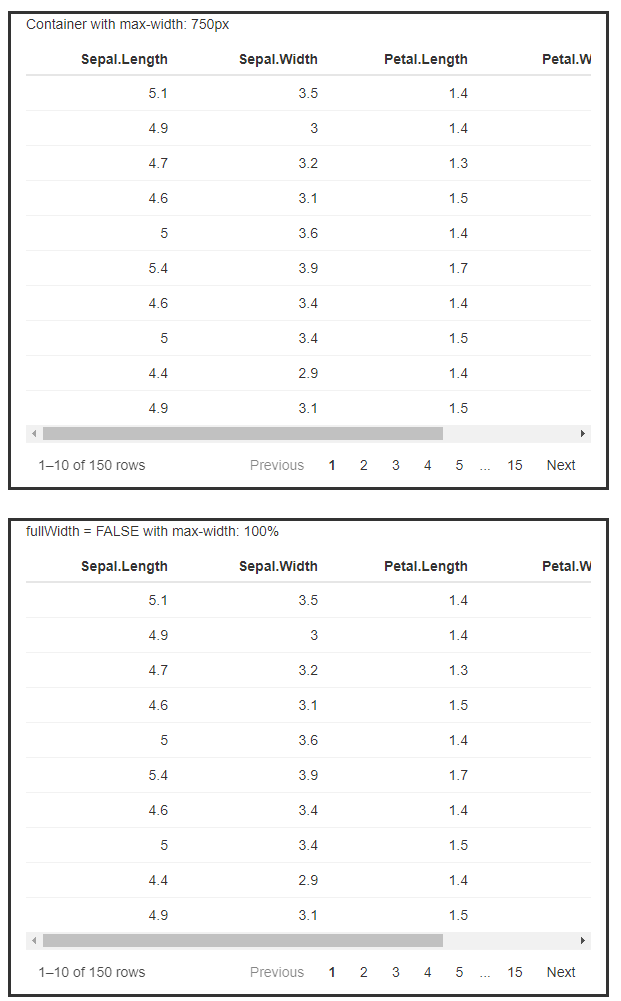
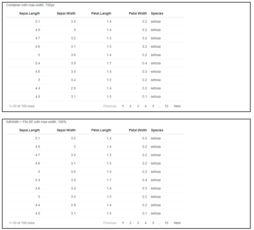
I think this is a bug with fullWidth = FALSE, so thanks for reporting this. A workaround I've found is to add reactable(style = "max-width: 100%") so the table element doesn't extend past its parent. But also, the first idea I had was to constrain the widget width using an outer container element with a max width.
Either way should work, so here's an example app showing both:
- A table inside a parent container with
max-width: 750px(150px * 5 columns), and default column width changed to 150px min width - A table with the
fullWidth = FALSEand themax-width: 100%workaround
library(shiny)
library(reactable)

ui <- fluidPage(

  fluidRow(
    div(
      class = "col-sm-8",
      style = "border-style: solid; margin: 1em;",
      p("Container with max-width: 750px"),
      div(
        style = "max-width: 750px",
        reactableOutput("Tab1")
      )
    )
  ),
  fluidRow(
    div(
      class = "col-sm-8",
      style = "border-style: solid; margin: 1em;",
      p("fullWidth = FALSE with max-width: 100%"),
      reactableOutput("Tab2")
    )
  )
)

server <- function(input, output) {

  output$Tab1 <- renderReactable({
    reactable(
      iris,
      highlight = T,
      defaultColDef = colDef(minWidth=150)
    )
  })
  output$Tab2 <- renderReactable({
    reactable(
      iris,
      highlight = T,
      fullWidth = F,
      defaultColDef = colDef(width=150),
      style = "max-width: 100%"
    )
  })
}

shinyApp(ui = ui, server = server)